The theory of obtaining purple from other colors. Proportions
For paints with different compositions, there are several options for combining them to bring out a specific tone.
The following equipment is required for work:
- Brushes.
- A small container of water or a glass. It is recommended to change the water every time so that the brushes do not become clogged.
- Palette. Should be light in color, as a colored surface may distort the colors. You can take plastic or other material with similar properties.
- Standard palette: black with white, greenish, yellowish and reddish.
- Rough canvas. It allows you to check the quality of smears.
If you don’t have a palette, you can replace it with a plate, cup, bowl, plastic or glass container. All equipment must be clean.
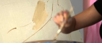
When combining colors, the paints must be uniform, identical in consistency and quality. Otherwise, the final result will be of low quality and blurry.
It is recommended to use palettes from the same set, because they are more compatible with each other. Other moments of merging will be influenced by the density, appearance, wateriness with oiliness and brightness of the colors.
How to get purple from water paints
Mixing purple from paints on water is quite simple, but can cause some difficulties, because it is quite difficult to achieve saturation of the created shade. However, to solve the problem, experts use whitewash. In their absence, saturation is corrected with a certain volume of water.
The basic purple tone is created by merging red with blue in a 1:2 ratio. Afterwards, various colors are made from the prepared base, additionally using white with blue, pink, black or other tones.
How to get purple from oil paints
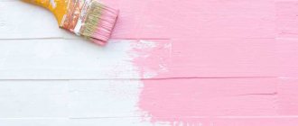
Unlike watercolors and acrylics, oil paints are characterized by greater fluidity. In this regard, such compositions must be mixed very well.
Despite the fact that this property of the oil has several disadvantages, it makes it possible to achieve uniform tones. With partial unification, it is permissible to make diverse inserts.
This technique can be done in 3 ways:
| Way | How to do |
| Physical or mechanical | When using foundation for correction, certain colors are mixed in a special container. As a result, you can get a new color. When combining paints physically, all actions must be thorough so that there are no streaks or untreated areas. Thanks to this, you can achieve a uniform and pure shade. |
| Overlay | It is permissible to carry out immediately on the canvas. An additional translucent and thin layer is applied on top of the base tone. As a result, the illusion of combining colors is realized, which makes it possible to achieve a new palette in the drawing. This technological process is quite difficult to use and requires certain skills in glazing. Therefore, beginning artists use this method in rare cases. |
| Optical Fusion | Strokes of different colors are distributed at a close distance from each other, placing them at an angle, which makes it possible to create the illusion of unification. Thanks to this method, you can create an even tone. But a certain level of drawing knowledge is required. |
Oil paints are often mixed using the physical method. More experienced artists use other options at the drawing stage.
Color Mixing Chart
Today it is considered fashionable to use non-standard colors not only in clothing, but also to create modern paintings and drawings. Using different shades, you can convey the depth and precision of an image, and most often, many artists can achieve the desired result only by mixing other colors.
There are chromatic shades, which are placed side by side in a circle of color combinations, as well as achromatic ones - located far from each other or opposite, when mixed, a shade with a predominant gray tint is obtained. Of course, to get the expected result, you need to understand the color scheme and the correct proportions when mixing, but it is also important to use materials that have a similar chemical composition. This can dramatically change the result, or you may end up with a completely different color than you want.
In order for the result to be as accurate as possible, it is better to mix a small amount of paints, because... with large volumes, you may not be able to guess the proportions accurately. The table we offer greatly simplifies the task of finding the right shade; it is used in various areas of life.
Color Mixing Chart
Thanks to the knowledge of proper color mixing, you can create real masterpieces. Good luck with your creativity.
How to make purple from gouache paints
Mixing purple from gouache paints is possible by performing a series of step-by-step actions.
This:
- Apply a base tone to the surface - blue or blue.
- Mix red or pink to it until the desired result is achieved.
- Lighten the acquired tone with white or darken it with a minimum amount of black, which can be changed to dark green.
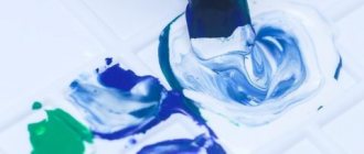
When interacting with gouache, it is not advisable to combine colors on a sheet of paper or adjust the tone by diluting with water. A new color scheme is obtained by combining 2 shades on a white plastic palette, in a glass or plastic container.
To obtain a muted or dull color, purple can be mixed immediately with white and black. To make a rich purple color, you can add a little yellow to the blue and red composition.
How to Mix Purple Color
It is advisable to change the liquid used more often so that the shades come out cleaner and the images are clearer. When pure red is combined, the result is pink; when blue is used, it is cyan.
Origin of the word
Where does the word "lilac" come from? This color designation is relatively new in the Russian language and has a rich and controversial history. The word comes from French, where lilas means lilac and its color. But it came to French from the Arabs, where it meant a completely different plant - indigo. Its flowers are indeed purple, with a pinkish tint, but they are much darker and bluer.
Interestingly, the dye obtained from it has a dark blue tint. The beginning of this chain of borrowings can be found in India, where nilas means "dark blue". As you can see, both the sound of the word and the color it denotes are completely different from what is now in the Russian and French languages. But this often happens with words.
All this, of course, is educational, but it is unlikely to help you understand how to get the purple color. The method for obtaining this color will depend on what material you need to use. You need to work with different types of paints in different ways, and when selecting a color on a computer, completely different manipulations will be carried out.
How to make purple from acrylic paints
Purple color can be purchased when mixing acrylic paints. They are much more convenient and easier to interact with than oil ones.
Step-by-step instructions for creating purple from acrylic paints:
- Distribute the base blue on the palette.
- Include auxiliary red in small portions to achieve the desired result.
- Adjust the resulting tone with a white or black tint.
It is quite difficult to calculate the amount of acrylic, so the colors should be combined gradually, testing the finished result each time.
How to Mix Purple Color
After drying, acrylic paints may change color slightly. In this regard, before using a new color, it is recommended to make a smear on the sheet, waiting until it dries. Thanks to this, you can prevent errors when designing a work.
Working with different types of paints
The main thing when creating the desired shade is the purity of the colors . You need to remember this. Usually, sold paints do not contain pure pigment; red, as well as blue, may contain traces of yellow, which can have a negative effect on the final result. But paints can be checked with white before use. If you dilute a little red in them, you should only get pink, and not cream, for example.
When working with watercolors it is difficult to achieve intense color, such is the specificity of the paints themselves. On paper it will be transparent, you need to remember this. There is also no white in watercolor, so to create pale shades you will have to use water.
Gouache gives more saturated colors , but it has its own characteristics. After drying, a drawing painted using paints of this type is several tones paler. A black sky risks turning gray, a deep blue can turn blue, and so on. This also applies to purple. Therefore, when working, it is worth using darker shades of gouache to get what you need.
Making purple from existing base colors is not difficult, it is important to use pure shades and do everything slowly. Then it will be possible to create this mysterious and noble color on the palette in order to use it to paint a picture or drawing, express the necessary emotions or decorate something with it.
How to make purple from watercolor paints
You can mix purple color from watercolor paints in the following way:
- Prepare blue and red watercolors in similar proportions.
- Apply blue as the first layer, turn on red and stir well to avoid streaks.
- To increase the pallor of the resulting tone, add a small volume of water and stir.
The nuances of creating purple from watercolor paints:
- Watercolor is normally diluted with liquid, so lightened tones can be achieved by adding water.
How to Mix Purple Color
- To achieve bright or dark shades, you will need to include dark blue, pink, black or red.
- To mix watercolors, you need to take only pure paints, which should be free of inclusions or stains, otherwise the color will be dull, with the presence of a brown or gray tint.
- It is recommended to adjust shades with a small amount of impurities, since such paints deteriorate in a short period of time and absorb other palettes.
- Combining paints is allowed on a paper sheet or palette. When choosing the first option, it is permissible to make strokes on a rough sheet or mix them at the drawing stage.
What colors do you need to mix to get purple?
Bright purple color is extremely rare in wildlife. All sorts of variations and halftones are much more common. These are flowers of lilac, iris, orchid, wisteria, violet. To learn how to get a lilac color close to natural, it is advisable for a novice painter to study the laws of the color spectrum.
In fine art, to obtain purple, two basic colors are mixed - red and blue. Depending on the proportions, the resulting color scheme goes into a cold or warm range, combining the characteristics of these basic colors.
So, in order to achieve delicate lavender or violet undertones, the resulting color is diluted with white or pale pink. To prepare dark plum, blueberry, blackberry or eggplant tones, on the contrary, you will have to add black or brown pigment to the resulting color scheme.
How to make purple from gel polish paints
You can mix purple color from gel polish paints in the following way:
- Using a brush, drip a small amount of each shade (blue and red) onto the palette.
How to Mix Purple Color
- Use a plastic or wooden stick or brush to stir the mixture.
- If you are satisfied with the result, add the palette in similar proportions or continue combining shades to achieve the desired tone.
It is advisable to photograph or mark a successfully composed combination of proportions of colors so that in the future the color and ratio can be accurately reproduced.
There are nuances that must be taken into account so that the combination of gel polish paints can fully satisfy the needs of the artist:
- If the required shade is needed in sufficient quantities, it is recommended to mix colors with a reserve. This is because it is quite difficult to achieve the same match several times.
- It is the lightened shades that should be added to the dark ones, but not vice versa. Due to this, you can achieve a certain result with minimal consumption of materials.
- Under the influence of light, the resulting shade will begin to harden. To reapply the tone, it is recommended to keep it in an opaque, dark container.
Features of obtaining different shades
The purple tone has many different variations. To create them you will have to stock up on perseverance and imagination. This is the only way you can get all the shades of this mysterious color.
Let's take a closer look at some of the shades.
Lilac
Instead of red, take pink color. Mix with blue. Moreover, pink is added to blue, and not vice versa. Otherwise, you won’t be able to achieve the tenderness of lilac.
Iris
To get this option, dark blue is poured into bright red.
Indigo
Add black paint drop by drop to the blue color. Do it carefully so as not to overdo it.
Purple
A mixture of red, blue, green. The first one acts as the base. Subsequent colors are added to it in equal parts.
Lilac
The purple tone is diluted with white.
Eggplant
This rich shade is made by mixing dark blue and scarlet.
Bilberry
Add a couple of drops of black to the purple base.
Lavender
To obtain this delicate shade, you need to add gray to the purple base. Literally a little bit. Checking the results obtained periodically. Approximate ratio of white to purple: 5 to 1.
Plum
Add red to bright purple and you get “plum.”
Grape
Add a few drops of red to the blue base. The main thing is to do it gradually, periodically checking the resulting combination.
Amethyst
First they make lilac, and then pour in red.
Glycine
Add a gray tint to the blue color.
Fuchsia
It comes from red, indigo and lilac.
Orchid
Lightening is obtained by diluting the base with water.
Blackberry
By adding black to the base, you can see the color of this delicious berry.
Violet
It is obtained by lightening purple with white.
Adviсe
The purple palette includes many different shades used in decoration and painting. To achieve a certain tone when mixing paints, it is necessary to carry out correction.
For these purposes, it is recommended to use the following tips:
- To achieve lavender colors, it is permissible to mix gray with purple.
When creating a landscape, purple can be replaced with blue
- To depict a night landscape on canvas, purple can be slightly darkened with indigo or blue. The result is a cool but bright shade.
- To achieve a juicy plum, dark purple should be diluted with pure red.
- To bring blue without auxiliary darkening to violet, it is allowed to add a minimum amount of blue. It is permissible to lighten the finished shade with white if a delicate bluish-lilac color is required.
- If you combine reddish with purple for the second time, dark shades will come out in the form of eggplant, berry and wine.
- Black needs to be introduced little by little, because it can darken the purple. As a result, the composition will lose its shade and become dark gray. To prevent such a situation from occurring, it is better to use dark indigo.
Adding pink will make purple tones warmer
- To make the shade more juicy, you need to include a minimum amount of warm pink. When changing the saturation and ratio, a grape and amethyst tone emerges.
When mixing purple, be sure to monitor the cleanliness of the working surface and brushes. The entire work can be ruined if small particles of other paint get in. As a result, the color will be clogged with gray or brown inclusions. Therefore, every time the instruments need to be rinsed well with water.
Using lilac color in design
The walls and ceilings in the rooms, painted in the colors of spring fragrant grapes, give the room a slight sprinkling of fabulousness. Even the smallest room becomes light and joyful! The main thing is to maintain balance: you shouldn’t paint everything the same lavender or purple – the variety of the palette allows you to show maximum imagination.
An excellent option is to have one wall accented with powerful plum or piercing eggplant, and the ceiling with the most delicate pale lilac. In this “situation”, lavender mixed with a warm, almost white cream or creamy color will suit the walls. This way we will not lose harmony, but will make the room visually more voluminous and interesting.
Pure snow-white color combined with any shade of faint amethyst or delicate wisteria is a great choice! White balances any emotions, and lilac colors are the same spiritual harmony. Having chosen the appropriate option, we begin the experiment of mixing paints.
How to get purple color in different ways
First, it’s worth figuring out what color purple is. If you ask people whose field of activity is far from working with color, you can get different answers. For example, some believe it is a shade of red. Many people believe that lilac is violet. Perhaps we can agree with this. Lilac actually refers to shades of violet. However, unlike this color in its pure form, it is somewhat lighter and a little warmer, and has hints of pink. Lilac color is considered more natural than violet - it is used to color violet and lilac flowers.
Primary and secondary colors
As you know, there are three primary colors (red, blue, yellow) and three additional colors (purple, orange, green). These are the basic colors. By combining them, you can get all the other colors and their shades (in theory, yes, in practice the situation is a little different). In the figure, the primary colors are represented by circles, and additional colors are formed at the intersection of the pairs. These pairs show how mixing the colors of the main row produces additional ones.
Primary and secondary colors of the palette
In practice, mixing colors is an interesting process, but often the result is difficult to predict. We work with paints, and they are a mixture of a coloring pigment and a binder base. That is, they have their own properties due to the presence of that very base. After all, paints come in different types - oil, acrylic, aniline, etc. Accordingly, the result will be slightly different. When you work with paints from the same company for a long time, you can almost accurately predict what will happen if you add this or that component.
It is also worth remembering that if you mix light rather than paint, the result will be different. Paints are only a reflection of light and not all laws work with them in the same way.
Obtaining additional colors: orange, purple, green, their shades and brown
Pairwise combination of primary colors gives us additional shades:
- Orange is obtained by mixing red and yellow.
- You get purple if you add blue to red.
- Green can be obtained by mixing yellow and blue.
Mixing colors should be in equal proportions. In this case, we get a “neutral” tone. If you are not satisfied with the result obtained, you can add one of the components, “shifting” the shade in one direction or another.
Additional colors and their shades
Please note that red and blue do not always produce purple. Often this mixing of colors produces a “mud color.” This is because your red contains yellow, that is, it is not the main one, but only one of the shades. To get purple, there must be pink or purple instead of red. On the other hand, mixing pink and yellow will not produce blue. So to get a specific color, first experiment with a small amount of paints. Once you are sure of the result, you can repeat it as needed.
If we add to the resulting additional colors the primary ones that are already present in them, we get the same color, but of a different shade. We didn't introduce any new colors, we just changed the concentration of one of the existing ones. This is how we get mixed colors: yellow-orange, red-orange, red-violet, blue-violet, blue-green and light green.
How to get brown color when mixing colors of an additional row
What happens if you add one that is not in it to the additional colors? The result will be a mixture of all available primary colors, and it will give us a brown color (when working with light it will be gray, but with paints it will be either brown or very close to it). So, to get brown, you need to mix all the primary colors: yellow + red + blue. Or add “missing” to one of the additional ones:
- add yellow to purple;
- to green - red;
- add orange to blue.
That is, to get a brown color, you can mix three primary colors or add the missing primary color to the additional ones. Interestingly, if you mix the same light waves, you get gray light. But paints are only a reflection of light, so there are certain differences.
Color wheel - how to make it
If the colors - primary and secondary - are placed in a circle, according to how they turned out, we get a traditional color wheel. We divide the circle into 12 parts. At the vertices of the triangle, fill the sectors with primary colors.
Drawing up a color wheel
Their derivatives, obtained from equal shares of neighboring colors, are in the center of the sector. These are called “first-level complementary colors.” To the right and left of them we place the shades that were obtained by adding another part of the corresponding component. This is how we get our own color wheel.
Mixing colors creates a color wheel
Please note: mixing paints from different companies gives different shades. Therefore, creating a color wheel is useful if you are going to be working with certain paints for a while. Looking at the result and knowing how you got it, you can understand what you can add to get the desired shade.
Getting shades
All colors that exist in nature are called chromatic. This is all the variety of colors and their shades. In nature, three colors are not found in their pure form - white, black and gray. They are called achromatic. By adding achromatic colors to others we get different shades.
Each color can be darker or lighter
For example, we get pink by adding white paint to red. For blue - add the same white to blue. And so with all the colors that are present in the color wheel. The lighter the shade we want, the more white paint. Sometimes - for very light shades - it is easier to achieve it by adding the desired dye to the white paint. These light shades are called pastels.
To obtain pastel shades with a “dusty” effect, gray is added to the primary colors. Please note that multiple achromatic colors can be added. For example, we got the desired “degree” of pale purple, then added a certain amount of gray to it. The tone was a little more subdued.
On the computer
Of course, selecting the desired shade on a computer will differ from the process of mixing paints. How to do this depends on what shade you need - approximate or exact. If you need purple, then you can rely on your taste. Then the algorithm is very simple. Simply place the eyedropper on the color wheel and select the desired color. Then the square on the taskbar that shows the selected color will turn purple.
If it is important to strictly convey a specific shade, then accuracy cannot be done without numbers. When choosing a font or background color on the site, its designation is entered using letters and numbers. And when selecting colors in Photoshop and other similar graphic editors, you need to specify several data. In RGB mode, color is set by adding the red, blue and green light from the screen. You need to set the required numbers for each color. Red and blue will be used, and since purple is a fairly light color, their intensity will be high.
CMYK mode is designed for printing, so it simulates the addition of colors in this process. Although it can be called not addition, but subtraction. The more colors overlap each other, the darker the color. And the colors used are slightly different - crimson, blue and yellow. In lilac, raspberry and partly blue will predominate, and in order for the color to be light, a little intensity is needed. You can also use a color catalog on your computer.
Source