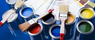
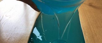
Every person who has ever held a brush and paint in his hand knows that you can get a lot of shades from two or three colors. The rules for mixing and matching colors are determined by the science of coloristics. Its basis is the color wheel known to many. There are only three primary colors: red, blue and yellow. Other shades are obtained by mixing and are called secondary shades.
What colors of paint should be mixed to get brown?
Brown is considered complex; when creating it, you can use all the primary colors. There are several ways to get brown:
- Classic: green + red in proportions 50:50.
- The main trio: blue + yellow + red in equal quantities.
- Mixing: blue + orange or gray + orange. You can vary the intensity of the hue by adding less or more gray.
- Optional: green + purple + orange. This shade has a pleasant red or red tint. You can also mix yellow + purple - the color will have a yellowish tint.
| Combination | Proportions | Resulting shade |
| Green + red | 1:1 | Brown |
| Blue + orange Gray + orange | 1:1 | Tan |
| Yellow + purple | 0,8:1 | Tan |
| Red + yellow + blue | 2:2:0,5 | Red-brown |
| Light brown + indigo (black) | 1:1 | Chocolate |
| Green + purple + orange | 1:0,8:1 | Red-brown |
How to make burgundy color from paints
From time immemorial, burgundy has been considered a royal color. It was used in clothing and heraldry by royalty all over the world. This noble shade symbolizes power, superiority, wealth, abundance. Today, various shades of burgundy are widely used in modern interior design, at fashion shows of famous couturiers, in makeup and manicure.
Getting burgundy color
You can get a traditional burgundy color by mixing blue and red paints. To avoid turning into a purple tint, it is recommended to strictly adhere to the ratio of mixed pigments - 4 parts red to 1 part blue. It is necessary to thoroughly mix the paints until a uniform color is formed.
To obtain burgundy shades you can use:
BlueRed
| Ultramarine | Kraplak red |
| Prussian blue | Cadmium red |
| Indigo | Cinnabar |
| Azure blue | Red quinacridone |
| Cobalt blue | Iron oxide red |
| Indanthrene blue | Venetian red |
| Varnish blue | Alaya |
| Turquoise | Carmine |
| Cerulean | Kraplak pink |
A few tips for getting special shades:
- adding a small amount of light ocher will create a soft and warm undertone of burgundy color;
- replacing red paint with bright scarlet will give a rich burgundy-crimson hue;
- to obtain light and delicate undertones, the resulting color is diluted with white;
- when adding black paint to the base color, you get muted dark shades;
- a proportional increase in blue color in the color scheme will give it a deep, cold tone.
In any shade of burgundy, red should predominate. It is the basis for creating the milestone halftones of a given color scheme.
: how to get shades of burgundy?
When adding yellow to burgundy, care must be taken to ensure that the desired warm shade does not develop a dirty brown undertone.
These recommendations are suitable for obtaining burgundy shades when working with:
- watercolor;
- artistic gouache;
- acrylic paints;
- tempera;
- oil paints;
- stained glass paints.
Basic shades of burgundy
Burgundy color can be cold or warm tones, brightly saturated or soft pastel. The main halftones of burgundy include:
- crimson - rich, dark red tone, reminiscent of the color of blood;
- ruby - a delicate shade of pink-burgundy, named after the gemstone of the same name;
- carmine is a red-purple dye made from cochineal;
- sangria - delicate burgundy with a lavender tint, the name of the shade comes from the Spanish wine of the same name;
- burgundy is a rich, dark ruby red tone, its name is associated with the region in eastern France;
- Marsala - muted burgundy red with a brown tint;
- massaka - dark crimson, shimmering blue;
- pomegranate - a rich raspberry-cherry shade, named after the fruit of the same name;
- sanguine - a warm brown-raspberry shade with a terracotta undertone;
- maroon (eng. maroon) - red-brown undertone, the color of red clay;
- Falun Red is a deep red shade with a copper tint, named after the mine of the same name, located in Sweden.
shades of red with a predominance of burgundy colors
Instructions for obtaining different shades of burgundy
So how do you get the different shades of burgundy? If you are just starting to experiment with different colors and need clear instructions, you can use the diagram below.
The desired shade Proportions of mixed colors
| Bordeaux (basic) | red + blue 4:1 |
| Maroon | red + blue + black 4:1:0.5 |
| Light burgundy | red+blue+white 4:1:1 |
| Ruby | bright red + lilac 2:1 |
| Pomegranate | dark red + purple 2:1 |
| Crimson | red + purple 2:1 |
| Carmine | red + magenta 1:1 |
| Massaca | dark red + raspberry + blue 2:1:0.5 |
Features of mixing artistic paints
Different types of artistic paints produce unique effects when mixed. This depends on their chemical composition and the components necessary for diluting the pigments. Each material has its own subtleties and characteristics. This requires the painter to have a professional approach to work.
Watercolor paints
Watercolor paints are diluted with water. To obtain bright and rich shades in painting, it is necessary to take this nuance into account. Depending on the volume of water added, the watercolor paint will behave differently.
A small amount of water added to the paint will give bright shades, but at the same time the lightness and transparency for which watercolor painting is valued will disappear in the work.
To obtain burgundy shades from watercolors, you can use the following names for shades of blue and red paint, depending on the manufacturer:
- Venetian red + ultramarine;
- cinnabar + indigo;
- cadmium red + Prussian blue;
- kraplak red + azure blue;
- scarlet + blue varnish.
Oil paints
Painting with oil paints requires a professional approach. This is a capricious material that requires special knowledge of different techniques and methods of mixing. With the help of oil paints, artists achieve a special volume and the necessary texture in their work.
To work with oil, a special solvent is required. When mixing colors, thorough mixing of all components is required until the composition is homogeneous without inclusions or streaks.
In addition to the traditional mixing of colors on a palette, in oil painting, professionals often use illusionary mixing, which is created by applying paints of different colors close to each other. You can also use the method of multi-layer painting, when a tint layer with a translucent structure is applied on top of the main layer of paint.
You can learn more about the nuances and techniques of working with oil paints.
To obtain burgundy shades use:
- cadmium red + cobalt blue;
- iron oxide red + indigo;
- red kraplak + Prussian blue;
- scarlet + indanthrene blue;
- red quinacridone + ultramarine.
Acrylic paints
Acrylic is a universal paint that allows you to work on almost any surface. When dry, acrylic paint forms a smooth, glossy surface. The color obtained by mixing paints may differ after final drying. These subtleties must be taken into account when working with acrylic.
When working with acrylic as a palette, it is better to use the same material on which the work will be done. When mixing the desired color, a small amount of paint is left on the palette until completely dry in order to see the final color.
To obtain burgundy shades use:
- cinnabar + cobalt blue;
- carmine + indigo;
- Venetian red + ceruleum;
- cadmium red + turquoise;
- scarlet + ultramarine.
Tempera paints
Tempera paints have a dense, opaque and matte structure. When dry, tempera produces deep pastel colors, which, unlike acrylic, do not have a glossy sheen. Tempera works best on wooden surfaces, as it contains glue.
What colors of paint need to be mixed to get purple?
The easiest way to get purple is to mix equal proportions of red and blue. True, the shade will turn out a bit dirty, and it will need to be adjusted.
To make the tone cooler, take 2 parts blue and 1 part red and vice versa.
To achieve lavender and lilac, the resulting dirty purple needs to be diluted with white. The more white, the lighter and softer the shade.
Dark purple can be obtained by gradually adding black or green to the original color.
| Combination | Proportions | Resulting shade |
| Red + blue | 1:1 | Basic purple |
| Basic purple + white | 1:1 | Lilac, lavender |
| Basic purple + black | 1:0,5 | Dark purple |
| Red + yellow + blue | 1:0,5:1 | Purple |
| Basic purple + red | 1:1 | Red-violet |
Features of working with acrylic dyes
Masters who prefer to work with acrylic dyes to create artistic masterpieces have developed a special mixing scheme. This scheme can be divided into parts according to the creation of the desired tones:
- light;
- dark.
By mixing different tones, it is possible to obtain the following color shades:
- green;
- lilac and violet;
- orange;
- earthen.
Enough for drawing? Well, it’s now worth considering the rules for mixing different colors to create each tone.
Light
Titanium white is used as a basis, and color is added to it in small portions. The less tinting paint is added, the lighter the shade will be. In this way you can get all the light shades of the palette.
Dark
Dark tones are created a little differently: black is added in small quantities to the main palette. In this way you can get any dark tone. You just have to be careful when adding black, otherwise you can create a dirty brown color instead of the desired dark brown color. However, even if the first result is unsuccessful, the second and subsequent ones will be much better, because experience comes with practice.
Having created the necessary tones, you can create the necessary color scheme by mixing different shades.
Green color
There is no green color in the palette of paints required for purchase; it will first have to be made by mixing blue and yellow, and the shade and further tinting result will depend on the initial ratio of the dye. What proportions to take can only be determined experimentally by mixing colors. It’s difficult to even describe all the options for color combinations, there are too many of them. You can find them in the artistic color chart, which should become the best friend of every artist and decorator.
Lilac and violet
These cool tones can be made from blue dye by mixing it with light pink paint (mauve) or a red tint (purple). You can add black or white to the resulting compositions to obtain a variety of shades.
Orange
If you mix red and yellow in different proportions, you can get an orange color, and its saturation will depend only on the original color ratio. If you add white to the result, you can create shades such as melon, peach or coral.
Earthen
Burnt umber, mixed with all components of the color palette, allows you to get a wide range from beige (a mixture of white and brown) to dark wood (brown and black).
What colors of paint need to be mixed to get red?
Red is considered a base color and is present in any artistic palette. However, you can get red by mixing violet (magenta) and yellow in a 1:1 ratio. You can also mix a carmine shade with yellow to create a more intense red. You can make it lighter by adding more yellow and vice versa. Shades of red can be obtained by adding orange, pink, yellow, and white to the base red.
| Combination | Proportions | Resulting shade |
| Magenta + yellow | 1:1 | Basic red |
| Magenta + yellow | 2:1 | Burgundy |
| Carmine + yellow | 1:1 | Rich red |
| Basic red + yellow | 2:1 | Scarlet |
| Basic red + pink (white) | 2:1 | Pink-red (adjust saturation with auxiliary color) |
How to work with a table
Working with the table does not present any great difficulties; it is enough to find the desired color in it, and next to it it will be indicated which paints need to be mixed to obtain the desired color. For example, you need olive-colored paint. If you look at the table, to obtain this color you need to mix yellow and green.
Everything seems to be simple. But the table does not indicate the ratios of dyes, only the names of the colors needed for mixing are given. Then what should we do? Like everyone who works with different colors of paints, you will have to develop your own color sense, which helps you choose the color in the required proportions.
Acrylic paint mixing chart
For beginners, we can advise the following:
- To create the required tone, add the tint color to the base in small portions and check the result on an unnecessary surface.
- Even if the color shade as a result of tinting seemed correct, you should not immediately take on the main drawing when remixing the paint that ended during the process. It is better to wait for the control smear to dry. When drying, the color may change slightly, and then it will be necessary to carry out additional tinting of the color mixture.
When drawing, you can use a universal table suitable for working with dyes on any basis, or you can use a diagram developed by craftsmen who prefer to work with acrylic paints. But no matter what method is used, only mixing experience will help develop the necessary color sense that helps in choosing color relationships.
What colors of paint should be mixed to get beige?
Beige color is a neutral and independent color; it has many shades, which can be achieved by varying the amount of white and yellow shades added.
The easiest way to get beige is to mix brown and white.
To make the color more contrasting, you can add a little yellow.
Flesh beige can be obtained by mixing scarlet, blue, yellow and white. The ivory shade is created by mixing golden ocher and white paint.
| Combination | Proportions | Resulting shade |
| Brown + white | 1:3 | Beige |
| Scarlet + yellow + white + blue | 1:1:2:0,5 | Nude beige |
| Golden ocher + white | 1:2 | Ivory |
What is white color - definition
White is a color that has a spectrum of electromagnetic radiation in which the power of all wavelengths in the visible zone is uniform. From a physical point of view, this color represents the total reflection of light rays that fall on the surface of an object. But there is a condition: the surface should not be perfectly smooth, otherwise the rays will begin to be reflected in parallel and begin to carry a reflected image.
Along with black and gray, white is classified as an achromatic color. This tone occupies a special place in the palette of dyes - it does not belong to warm or cold, the only one of all has a complete antipode - black. You can clearly see white by combining all the colors of the rainbow through a prism.
Getting color by mixing paints
What tones need to be mixed to make white? You shouldn't even try - the end result will still be brown paint, which will not be useful in your work. You will have to mix the rays of light, only then can you see white, but this will not bring practical value in painting. But whitewash has its own shades that artists use. All of them are obtained by mixing with other colors - gray, beige, and many others. Here are the most popular shades:
- alabaster – white-yellowish, matte;
- amianth - dirty white;
- snow-white – bright, a special type of classic white;
- pearl – the color of pearls, slightly pearlescent;
- marengo - white with splashes of black;
- milky - white with beige-yellowish notes;
- platinum – white-smoky.
When mixing watercolors, gouache paints with white, you can get lighter colors - pink, light green, blue. Painting pictures, repairing ceilings and walls cannot be done without whitewash; it can be tinted perfectly and gives a huge scope for imagination!
What colors of paint need to be mixed to get green?
Green color can be achieved by mixing yellow and blue in equal parts. The result will be a grassy green hue. If you add white color to it, the mixture will lighten. By mixing brown or black pigment, you can achieve emerald, marsh, olive, dark green shades.
| Combination | Proportions | Resulting shade |
| Blue + yellow | 1:1 | grassy green |
| Blue + yellow + white | 1:1:0,5 | Light green, salad |
| Blue + yellow + black | 1:1:0,5 | Swamp, dark green |
| Yellow + blue + brown | 1:2:0,5 | Gray-green |
Varieties of green and their production
There are about 15 main shades of green – from light (pale) to turquoise (blue-green). But there are more than 110 tones that are very similar to the main one, but have some nuances. For example, introducing a drop of blue into the base gives a “cooling” effect, and this color can be found in paintings of winter landscapes. On the contrary, adding a bright yellow color to the base makes the main tone warmer, it turns out light green, bright and spring.
Pale green
Soft pastel tones of green look very beautiful and calm, which is why they are often used in interiors, as well as for painting walls in medical institutions, kindergartens, and schools. Psychologists recommend using a pale green shade in bedrooms and children’s rooms, because it promotes harmony, is useful for hyperactive children, and relieves stress. To get this color, you need to add white to the classic paint. You can also mix yellow and blue equally, and then whiten the tone to the desired degree of lightening.
Olive
This color is considered very noble; interior designers respect it for its softness, richness and luxury. Olive is a dark yellowish-green color - the shade of the fruit of the olive tree. Making it with your own hands is difficult, but doable. To do this, add yellow drop by drop to the greenery, then add a little brown paint to darken it.
Bottle green
The color of bottle glass also belongs to the category of dark, this is a shade of the third order. The basis is the same mixture of blue and yellow, but the latter in slightly increased quantities. After the paint is ready, black color is added to it. How much is needed is determined experimentally. But if you overdo it, the shade will be dirty gray, and white will only lighten it, but will not save the situation. Some artists introduce blue instead - then the finished bottle color will have a bluish tint.
Coniferous
Coniferous is prepared as follows: a slightly yellow color is added to the classic green, and then a drop of black paint. As a result, you can get everyone’s favorite New Year’s shade, which is widely used for holiday drawings and landscapes. If you add white paint to match, you will get “pine needles in the fog,” which is also useful in painting.
green fern
Not all the names of green tones are familiar to the average person, but artists know them well. For example, to obtain a “fern green” tone, combine classic green with a drop of black, then dilute the color with white. This shade is considered a transition from light to dark tones. The color is popular in the manufacture of billboards and banners; it is used for painting house facades and interior wall coverings.
Forest greens
Usually, to reflect the color of greenery, leaves, and natural shades of nature, classic green or this color with the addition of a minimal amount of yellow paint is used. If you need to make the forest gloomier, add a little black paint to the color. Forest greens can be used in the fight against depression; the tone is great for wallpaper and interior paint.
Light green
Green mixed with yellow and white gives a very beautiful shade - light green. It is so optimistic that it is used mainly for children's summer clothing, and only individual parts are painted in the interior. An original combination is light green with pink - usually these colors are ideal for children's toys. Modern fashion designers, when sewing clothes for adults, use light green to add catchiness, expressiveness and a certain exoticism to the style. By the way, if you add a lot of yellow to green, you get a lemon color.
Bolotny
Khaki, or marsh color, is obtained by combining green, brown and a drop of red paint. This tone is very practical in clothing and camouflages well, which is why it was chosen as the main one for military uniforms. Swamp color is also used to create military-style clothing, and in the interior it is intended to ensure peace and tranquility.
What colors of paint need to be mixed to get gray?
The classic tandem for getting gray is black + white. The more white, the lighter the finished shade.
- You can also mix red, green and white. The color will have a slight yellow tint.
- A blue-gray shade can be created by mixing orange with blue and white.
- If you mix yellow with purple and white, you get a gray-beige shade.
| Combination | Proportions | Resulting shade |
| White + black | 2:1 | Light gray |
| Red + green + white | 1:1:2 | Gray-yellow |
| Orange + blue + white | 1:1:2 | Gray-blue |
| Yellow + purple + white | 1:0,5:2 | Gray beige |
Visible spectrum colors
There are 4 primary colors, the combination of which can lead to the creation of almost the entire palette:
- red;
- green;
- blue;
- white.
These are the primary colors of the optical spectrum, included in the range of visible light radiation. Separately, it is worth noting the yellow color, which is also the base color for most color shades.
On video: how to mix colors correctly.
When studying the light spectrum with a magnifying glass, on a computer or TV screen, you can see that a white pixel seems to consist of different shades. Thanks to this effect, many people began to think that when mixing basic colors, the result is white in any case. It does not matter what dye is used for such mixing.
What colors of paint need to be mixed to get black?
Black is a basic monochrome color. It can be obtained by mixing magenta with yellow and cyan. Also, artists often mix green and red, but the resulting shade will not be jet black. Rich black color is produced by a mixture of orange and blue and yellow and violet. To get the shade of the night sky, you can add a little blue to the finished color, and a drop of white to lighten it.
| Combination | Proportions | Resulting shade |
| Red + green | 1:1 | Dark brown, almost black |
| Magenta + yellow + cyan | 1:1:1 | Black |
| Blue + orange | 1,5:1 | Night sky |
| Orange + purple | 1:2 | Black |
Combining and mixing colors of the visible spectrum
A fairly well-known optical experiment consists of quickly spinning a circle, sectorally divided into 7 colors in the order of their arrangement in the rainbow. A rotating disk colored in this way is visually perceived as white. The multi-colored circle is transformed into a monochromatic white one. This effect is used when overlaying the main components of the spectrum on a television screen or monitor: red, blue and green.
To obtain a white tone, a combination of multi-colored light is used. The result in the form of white color is obtained due to additive mixing, that is, due to the “addition” of the shades used. Obtaining new colors when mixing paints is carried out under the influence of the opposite principle, subtractive mixing, when colors suppress each other.
Therefore, when printing on a digital or inkjet printer, it is impossible to obtain a truly white background. By default, it is assumed that the media, for example, paper or cardboard, has the desired tone and the dye is simply not applied to the corresponding area of the sheet of paper. To print directly in white, special toners with the appropriate dye are used.
What colors of paint need to be mixed to get blue?
Blue is the main color in the palette and it is quite difficult to obtain it by mixing. It is believed that it can be obtained by adding a little yellow to green, but in practice the result is more of a blue-green tint. You can mix purple with blue, the shade will be deep but dark. You can lighten it by adding a drop of white.
| Combination | Proportions | Resulting shade |
| Yellow + green | 0,5:1 | Blue-green |
| Purple + blue | 1:1 | Blue |
| Purple + light blue + white | 1:1:1 | Light blue |
| Basic blue+ black | 3:1 | Dark blue, blue-black if you add more black |
Oil paints
If you compare this material with watercolor or acrylic, then oil is more fluid. Because of this, you need to mix compositions of different colors very carefully. On the one hand, this is a drawback, but on the other hand, this feature allows you to obtain the following effects:
- If thoroughly mixed, a uniform tone will be obtained. This material is perfect for both complete painting of surfaces and partial decoration.
- If you mix partially, then different colored veins will appear on the coating.
Thanks to partial mixing of oil paint, you can achieve a unique effect
Mixing
Now about how to mix oil paints. A chart is also used to mix oil-based paint colors. It indicates the colors obtained by combining various tinting components. In addition, here you can find such an indicator as a combination of shine. If you add a little gloss to a matte base, there will be practically no result, but if you do the opposite, the shine will be slightly muted.
Mixing methods:
- Mechanical. In this case, we are talking about mixing two or more materials of different colors in one container. Color saturation is controlled by the number of compositions of bright shades. The desired color is created even before the wall or ceiling is processed.
- Color overlay. Gradual application of several strokes on top of each other.
- Optic. This is the most complex method, which is available only to specialists. It involves mixing glossy and matte bases while applying paint to the surface. You can mix paint colors only on the surface being treated, otherwise you will get a more even tone.
Peculiarities
The first method fully corresponds to the data in the table. When it comes to color application, the result is unpredictable. One of the simplest options for optical illusions is glazing: a dark tone is applied to the surface, after it dries, a little lighter paint is applied, and then a completely light one. As a result, each color will be visible through the top layers.
So there is no specific pattern. To find out which colors need to be mixed, it is not enough just to take and look at the table; it is important to constantly practice and not be afraid of experiments. This way you can create a new effect that will make the interior unique. It is also important to remember that a mixed shade is very difficult to replicate, so you should remember the proportions.
Now the question of how to mix paints correctly does not seem so difficult.
What colors of paint need to be mixed to get yellow?
The basic yellow color cannot be achieved by mixing other shades. Something similar happens if you add green to orange. Variations of yellow are obtained by adding other tones to the basic one. For example, lemon is a mixture of yellow, green and white. Sunny yellow is a mixture of basic yellow, a drop of white and red.
| Combination | Proportions | Resulting shade |
| Orange + green | 1:1 | Dirty yellow |
| Basic yellow + green + white | 1:0,5:0,5 | Citric |
| Basic yellow + white + red | 4:1:1 | Sunny yellow |
Whitewash from different colors is nonsense
Let's start by debunking the myth - if you mix paints of all the colors of the rainbow, you cannot get white. Dyes contain pigments that absorb certain ranges of light waves, which allows you to see colors and their shades.
White color cannot be obtained by mixing paints
Achieving reflection of absolutely all rays by mixing the palette available to you (which, in theory, could ultimately result in the perception of a white surface) is impossible under any circumstances.
The fact is that pigment-rich paint necessarily reflects at least two light waves of different colors, but one to a greater extent than the other. For example, red can also reflect the orange range, but only slightly. However, if you add yellow, the red will be absorbed by it, but the secondary color will be reflected, and you will see an orange surface. Blue paint can reflect green and violet waves to a certain extent, which will not be visible due to the underlying light wave. But absorb it with another pigment, for example, red, and you get a purple color.
What colors of paint need to be mixed to get pink?
The easiest option is to mix red and white. The more white, the lighter the shade. It is important to know that the tone depends on which red you choose:
- Scarlet + white will give a pure pink color.
- Brick red + white – peach pink.
- Blood red + violet give a fuchsia shade.
- Orange-pink can be obtained by adding yellow paint to scarlet and white.
| Combination | Proportions | Resulting shade |
| Scarlet + white | 1:2 | Pink |
| Brick red + white | 1:2 | Peach pink |
| Purple + blood red | 1:1 | Fuchsia |
| Scarlet + white + yellow | 1:2:1 | Orange pink |
What colors of paint need to be mixed to get orange?
Orange color can be obtained by mixing red and yellow.
- A less saturated shade will be obtained if pink pigment is added to yellow paint.
- Terracotta orange is the result of mixing base orange with blue or purple.
- Dark shades are achieved by mixing red, yellow and black.
- If you add brown instead of black, you get red orange.
We vary the intensity of the tone by adding more white or black.
| Combination | Proportions | Resulting shade |
| Red + yellow | 1:1 | Orange |
| Pink + yellow | 1:1 | Light orange |
| Red + yellow + purple | 1:1:0,5 | Terracotta |
| Red + yellow + black | 1:1:0,5 | Dark orange |
| Red + yellow + brown1 | 1:1:1 | Ginger |
Color mixing options to create shades of gray
The tone that is obtained by combining white with black is considered classic. The finished color can be changed as follows:
- introduce a drop of blue or green, making it cold, pearlescent;
- add yellow or ocher to get a warm ash color;
- make a duet of mouse and antimony to create a metallic shade;
- combine gray with pink to create a beautiful ash pink, dusty color.
If you add red to black and white, you will get an interesting copper-gray tone. Also, an unusual ash color is prepared by combining yellow, white, and violet - this combination also ultimately gives an achromatic shade. When mixing watercolors, gray comes from the duo of blue and brown. The scope for imagination is quite rich, and many experiments ultimately make it possible to produce the shade the artist needs!