Pearl color and its psychology
The pearly tones of the room create a feeling of impeccable purity, sublimity and nobility. This color symbolizes luxury and gives strength, creates a certain atmosphere of calm and lightness. In such a kitchen it is not only comfortable to relax, but also easy to create: the sophistication and mystery of the interior inspires masterpieces, and the freshness and comfort that this color exudes promotes digestion. That is why its use in the kitchen could not be more relevant.
Pearl color includes various shades of white, cream, and beige. It can be pearl ash, flax, olive, lavender. Please note that in each case the color will vary, and the state of the shade will change, complemented by straw, pink, gray or green. If you want your kitchen to look not sterile like white, not ordinary like gray, and to be much more interesting than beige, you definitely need a pearl color. Let's take a closer look at each of the shades.
Compatibility
Let's consider the most popular colors that can go in tandem with pearl in the interior of different rooms:
Living room in modern minimalist style
- The blue one can be an excellent companion. This light, unpretentious color is able to emphasize the luxury and nobility of pearl, its romanticism and unparalleled beauty, therefore it is often used in the interior of halls, living rooms, and bedrooms. The interior of such blue bloods will become truly French, chic and unique. It must contain smooth fabrics capable of reflecting light, such as velvet, silk, satin. Objects made of glass, porcelain, and crystal are suitable as accessories. All details should emphasize the pearl shine and beauty of the walls.
- Colors from a warm color range can also be an excellent additional solution in the interior using pearl tones. For example, peach will bring coziness and warmth, and will not spoil the luxury of the main color. It can be used on some wall areas or other surfaces.
- Pink will help enhance the romanticism of the interior. If you need to add a bright accent, then it is permissible to consider options with shades of red, purple, for example, crimson or lilac.
- However, the color of pearls is truly multifaceted; its use together with gray or silver will be relevant in an interior created in a modern high-tech style. In this case, there should not be a large number of interior details, large wall surfaces, simple and clear forms, a minimum of accessories and household items.
Shades of pearl and its combination with other colors
A kitchen in pearl tones does not need to be complemented with other colors; it will always look perfect. Monotonous pearl enlarges the room, visually making it wider and more spacious. Stretch glossy ceilings and facades, glass surfaces and aprons enhance the effect, adding expressive highlights even in a dark room.
Pearl flax
The natural color of linen goes well with wood surfaces such as oak, beech or alder. With such a play of colors, the kitchen interior becomes simply chic. For example, you can use an apron and countertop in this idea.
Light furniture looks good in combination with dark, for example, a chocolate-colored apron and a brown tabletop.
Tones such as caramel, milk, beige, cream are also worthy of attention - their combination with pearl linen will make the kitchen much softer and more comfortable. This contrast is very suitable for a large happy family.
Light pink decorative elements will add femininity and airiness, while more saturated ones will emphasize certain details of the furniture.
The kitchen interior in the color of pearl linen complemented with purple gloss will create a furore.
Pearl Ash
This light pearl color has the greatest ability to visually increase space, so it is especially suitable for very small and narrow kitchens. Its use is also relevant in dark rooms with little natural light. Sometimes additional bright decorative elements will not be superfluous - without them the interior will be too calm.
Beige veins on a light tone express the attractiveness of ash wood. And in combination with pearls it creates an elegant and luxurious interior.
Pearl ash belongs to cool shades of flowers. To make the room visually warmer, brighter and more lively, it is better to combine it in the interior with soft pink, cream, beige, light orange, etc. To complete the look, use lilac or bronze decorative elements, such as a vase in the center of the table or a figurine at the entrance.
Do you want to create an exotic interior? Combine two completely opposite colors into one: black cherry and pearl ash. These cool shades will complement each other and create amazing contrast.
And if you add one or two dark green items to the interior, your kitchen will become simply unforgettable.
Light coffee tones will make cold ash warmer. However, try to maintain a smooth transition: for example, the main color of ash in the interior can be complemented with coffee-colored chairs or one highlighted wall of this shade.
Kitchen design in pearl ash color is not only beautiful, but also practical. The age-old problem of fingerprints and palm prints on the headset will bypass you - on such surfaces they are simply invisible.
By the way, the ash wood species itself is distinguished only by positive properties, such as strength, moisture and heat resistance, durability, and resistance to mold and fungi.
Pearl olive
Pearl olive combines several shades: green, gray, yellow. This color symbolizes naturalness and freshness; it is soft, restrained and calming. It is worth noting that such a pleasant color has the properties of absorbing natural light, so it is better to use it in rooms located on the sunny side.
In the interior, pearl olive creates a feeling of confidence, calm and harmony, and has a beneficial effect on digestion. In such an environment it is easy to give in to dreams, relax or have a pleasant conversation. An interior in the color of pearl olive is usually chosen by conservative people; it is appropriate both in the traditional classic style and in fashionable modern designs.
Olive color can be combined with any shade; with it you can give free rein to your imagination and bring to life even the most daring decisions. Olive works especially well with a variety of natural colors.
Pearl olive neutralizes bright and saturated colors, making them more calm and pastel. You can try any variations with it, add gold, green, blue, pink, white, honey to the interior - olive will adjust any of them to suit you, strengthening or weakening the companion color if necessary.
Pearl Lavender
The color of lavender is not lilac, not purple, or even pink. It is rather a color that absorbs all these shades, but unlike warm lilac, it is a cold tone. With the help of lavender, amazing compositions are created, often complemented by the color of silver or gold. However, I would like to immediately note that it is quite troublesome to arrange the kitchen interior in this color on your own.
Designers rarely use lavender color in the interior, especially in the kitchen. It is believed that too much of this color in one room contributes to the deterioration of appetite and digestion, and has an irritating effect. However, it is worth remembering that it goes well with gray, soft pink, cream, gold and silver.
The addition of neutral, light and soothing colors results in a dreamy and romantic interior. For example, you can decorate one wall in lavender color and add several decorative elements, and make the rest of the interior in soft pink, white or cream - this way you will create a cozy and comfortable atmosphere. Colors such as blue, red, orange or yellow are more difficult to fit into the interior, but it is quite possible.
There is a wide variety of shades of lavender: bright, pale, with admixtures of gray, etc. A very delicate and beautiful color - pearl lavender. It's not as bright as pure lavender, but it's not quite as light as pearl either. This shade is more like a light beige with a slight hint of pink. If lavender has a place in your kitchen, then it is best to use this shade.
What spaces can be decorated in a pearl palette?
Modern designers are often inspired by nature to create stylish and comfortable interiors. Spaces inspired by pearls and mother-of-pearl are very sensual and elegant. Their color scheme often includes light shades of gray, pastel blue, soft pink and beige. In the illustrations for this material, we showed that such a palette can be used to create an interior in any style, from neoclassical to Scandinavian and eclectic.
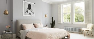
The pearl color palette is suitable for decorating any space from the kitchen to the bathroom. This range is especially suitable for the bedroom and lounge area: calm shades will promote relaxation.
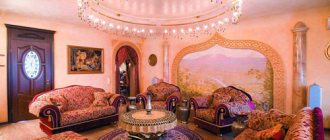
Mother-of-pearl shades will help make the living room space visually more spacious, and will also become an excellent backdrop for original furniture in any style. Objects and decoration made of silver metal and mirrors will fit well into such an interior.
When decorating your office, it is better to choose warm shades of a pearl palette, then nothing will irritate or distract from intellectual activity.
Where you can let yourself go is in the kitchen! Complement the restrained bed shades with bright and rich ones, for example, peach, raspberry and green - the interior will immediately become energetic and will charge you with positive energy.
How to choose an interior style
In pearl tones you can create a kitchen of any style, from classic to high-tech. This color is universal, suitable for both large and very small kitchens. You can choose almost any color as a companion, which gives free rein to your imagination and creativity.
Classic
The classic style in pearl colors is gaining popularity. Most often, for this style, a background color of pearl ash or linen is chosen, and decorative elements of a different tone allow you to focus on the necessary details. A classic kitchen in pearl pink tones will create the mood of a romantic idyll, and combining it with shades like burgundy will create a luxurious and rich interior.
In the interior of a classic kitchen, it is advisable to use furniture with rounded shapes.
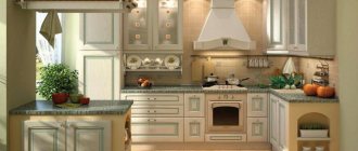
Retro kitchens
For rustic, Scandinavian, country or Provence style, the colors of pearl linen or olive are perfect. They complement styles and create maximum warmth and comfort.
For such kitchens, it is preferable to use matte facades. The apron should also not stand out from the overall interior, so artificial aging and light abrasions on the surface of the tile will come in handy.
When decorating a kitchen in the style of Scandinavian minimalism, use a richer tone in combination with the main pearl color. You can, for example, highlight your work area by painting it green or orange. For the dining room, calmer shades would be appropriate.
An interesting solution would be a room made in the color of pearl linen with rough rough walls, for example, lined with stone. Expensive textiles and careless surfaces will complement the idea.
High tech
High-tech style is straight forms and strict lines, simplicity and functionality. Pearl lavender is ideal here - it neutralizes the severity of metal decorative elements and tempered glass, thereby creating a more homely atmosphere. For the apron, you can use gray or brown MDF panels. The upper cabinets of furniture are usually lighter, the lower ones are several shades darker.
Art Deco
Elements of laconic form define the entire luxury of the style. The dining area is decorated with tiles with a metallic sheen, and spotlights zone the room. The rich palette of walls and apron plays with the color of the furniture.
Eco style
Pearl linen is the best solution for eco-style. Additions are not necessary here; monochrome color and linen fabrics in the interior (for example, curtains or tablecloths) will do the job quite well. Kitchens in this style and color radiate purity, improve mood, and create a feeling of freedom.
Different textures are appropriate here: gloss, matte or thematic pattern, density or weightlessness, roughness or smoothness - just choose what you like, and it will be the ideal option.
Minimalism
The minimalist kitchen, decorated in pearl olive color, is a delight. She looks beautiful and unusual. The absence of a large number of piled-up objects, straight geometric lines of furniture, a slightly subdued but exuding shine background makes it truly luxurious.
It is the kitchen set that plays the role of the central and leading element. A beige or cream background will make the kitchen warmer and more comfortable, while a creamy or milky background will create an atmosphere of calm and ease.
Using color zoning you can create an unusual design. For example, a kitchen apron can be designed according to the mosaic principle, and the wall near the dining table can be highlighted in bright green or orange. Purchase textiles, dishes, and floor mats in bright spring colors.
Glossy facades in chameleon or metallic colors will become indispensable: by reflecting light, they visually enlarge the room, making it fresher and brighter.
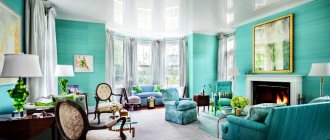
Compatibility
Let's consider the most popular colors that can go in tandem with pearl in the interior of different rooms:
Living room in modern minimalist style
- The blue one can be an excellent companion. This light, unpretentious color is able to emphasize the luxury and nobility of pearl, its romanticism and unparalleled beauty, therefore it is often used in the interior of halls, living rooms, and bedrooms. The interior of such blue bloods will become truly French, chic and unique. It must contain smooth fabrics capable of reflecting light, such as velvet, silk, satin. Objects made of glass, porcelain, and crystal are suitable as accessories. All details should emphasize the pearl shine and beauty of the walls.
- Colors from a warm color range can also be an excellent additional solution in the interior using pearl tones. For example, peach will bring coziness and warmth, and will not spoil the luxury of the main color. It can be used on some wall areas or other surfaces.
- Pink will help enhance the romanticism of the interior. If you need to add a bright accent, then it is permissible to consider options with shades of red, purple, for example, crimson or lilac.
- However, the color of pearls is truly multifaceted; its use together with gray or silver will be relevant in an interior created in a modern high-tech style. In this case, there should not be a large number of interior details, large wall surfaces, simple and clear forms, a minimum of accessories and household items.
Whatever colors of companions you use, try not to pull the blanket over them; let pearl remain the main color of the walls.
By the way, from the color palette there are those that are not suitable for mother-of-pearl, first of all, brown, which distorts the vision of this color, makes the space heavier and introduces notes of gloominess into it.
The benefits of pearl color in kitchen design
- Ability to expand space. Light pearl color will easily make the room visually wider, taller and more spacious. In addition, pearl shine will fill the kitchen with freshness and tranquility. It does not irritate, does not “press” or repel.
- Practicality. Minor scratches, smudges, stains from cleaning, fingerprints and palm marks are practically invisible on pearl surfaces.
- Uniqueness and ability to harmonize with various shades of other colors. Pearl color is multifunctional; it can serve as both the main background and complementary. There are a lot of options for using it. Even if you decorate the kitchen entirely in this color without adding other colors, it will not be boring.
- Nobility and livability of color. If you want to achieve the effect of a chic and expensive kitchen, pearl color will help you with this. Even the most inexpensive furniture in pearl color can give the room a delightful look. And in combination with dark velvet tones, the kitchen will look like a king.
Solving a geometry problem
The advantage of light interiors comes down to unobtrusiveness and a feeling of freedom, where nothing irritates or tires. Conducting colors will ensure the creation of visual illusions. The walls can noticeably stretch out or become squat, and the interior can be perceived as more massive or dissolve against an airy background. However, if you like specific colors, it doesn’t hurt to do some independent decorating.
Decorate your wall design with gentle motifs of sky and water, mother-of-pearl, pearls, pastel colors and a number of delicate shades, according to your spiritual impulses. The desire to fill a room with more active energy can be expressed by saturating one of the sides, for example, with amber or caramel.
This technique will also be relevant in the case when you need to open a closed perimeter. Lighten the wall that requires distance, and darken the rest a little - and the narrow room will become wider. The geometry of the square “box” will be corrected by one of the verticals, made in a richer tone. The conclusion is clear: cold colors give a three-dimensional perception, while cozy and dark colors have the opposite effect.
The need to reduce the height is due to the color of the ceiling, which is exactly one tone different from the base one. A wide stripe at the top of the vertical to match the top plane and decorative borders create exactly the same impression. The desire to have an original ceiling can be reinforced by the use of suspended ceilings with a laconic inclusion of a light, delicate shade. In the solidarity of light and idea, the plot will look unobtrusive and stylish. A crystal chandelier will reflect a thousand kaleidoscopic variations, and in the mirror of light planes the contents of the room will literally “hang” in the air.
Deciding on the apron, countertop and facades
In a classic kitchen, the apron is best made of ceramic tiles, and in comparison with the overall color of the design, this particular area can be much brighter. Various compositions are possible here: from pink and yellow-blue to brown and black. Dark wood countertops are always trendy, especially when paired with a pearl base.
In small kitchens, a glass or mirror apron would be appropriate - it will significantly expand the room.
In the eco-pearl style, the kitchen provides a combination with dark wood surfaces. For example, pearl, as the main dominant color, is complemented by a tabletop made of dark wood and an apron made of the same material.
In high-tech style, to avoid a boring and monotonous interior, use a variety of textures for decoration. Although it is often done in gloss, matting also has its place.
Blind facades, a minimum of decor, a lot of metal, plastic, artificial stone and glass are important design elements of this style. Kitchen apron made of tempered glass, MDF panels, mirrors, porcelain stoneware, stone. Wallpaper or tiles are not used here - preference is given to paint or plaster. Pearl color will soften the cold nature of the design a little, but at the same time it will combine surprisingly beautifully with all the details of the interior.
The duo of black and orange in combination with pearl looks amazing. For example, an orange tabletop and chocolate ends of the set. Bright colors push pearl into the background, attracting attention, but even in this case it does not lose its accent, making the kitchen warmer and more comfortable.
As for the facades of the set, there is also a choice:
- Painted MDF. Using enamel paint, sanding and varnish, you can achieve any shade and ideal smoothness of the facade. A fairly popular option, which also has its drawbacks: it is easily scratched and chipped, and it quickly fades in the sun.
- Solid wood. The facades are made either from solid wood (which is more expensive), or a paneled facade is constructed, where the front side is made of wood, and the inside is made of inexpensive MDF.
- Frame made from MDF profile. Chipboard, glass or plastic installed in an MDF frame. Cheap, there is a large selection of shades.
- Frame made of aluminum profile. MDF or glass installed in an aluminum profile. Simple, beautiful and inexpensive.
- Made from MDF with plastic coating. Practical and inexpensive. The plastic is resistant to minor damage and is not afraid of sunlight.
- Made from MDF with film coating. MDF board covered with PVC film. It comes in all sorts of colors and is resistant to moisture, steam, and damage. Inexpensive, practical.
The countertop is an integral part of the kitchen set. It is worthy of attention and careful selection: if you spend a lot of time in the kitchen preparing food, then its durability is important to you. After all, this is precisely the main requirement for it.
Pay attention to its integrity: if there are seams, then there is a high probability of dirt accumulation in them, and then cracks.
Countertops are also made from a variety of materials. The most reliable, light and durable ones are made from artificial stone, but wood products require careful care. Chipboard countertops have the shortest service life.
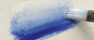
Wallpaper paint
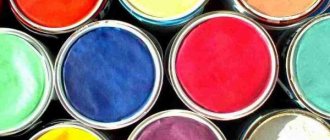
Pigments with pearlescent effect.
Natural mother of pearl is obtained from oyster shells and rejected pearls. But the price of such raw materials is too high for use in paints.
Therefore, pearl color for paints and varnishes is made from ground mica or glass. Due to the refraction of light on their grains, a rainbow tint effect appears. Wherein:
- on natural mica, ordinary opaque mother-of-pearl is obtained;
- on particles of the synthesized mineral it is translucent;
- On glass, mother-of-pearl is absolutely transparent.
The shade, level of hiding power and gloss of the paint depend on the diameter of the grains and the number of their layers. The smaller the particles, the less shiny they are. However, the hiding power of the paint increases.
Colors based on mica and glass:
- non-toxic and environmentally friendly;
- UV resistant;
- resistant to chemical and thermal effects;
- do not conduct electric current.
Ready-made composition of golden tone.
Pearlescent wallpaper paint for painting is produced by manufacturers only in three tones:
This allows users to tint the material with their own hands to achieve the desired shade.
Water-dispersive compositions are best suited for painting wallpaper. Most often they are made on the basis of acrylic resins.
The advantages of such compositions:
- they are environmentally friendly;
- they have good hiding power;
- they dry quickly;
- The material has low cost.
How and which headset to choose
When it comes to choosing furniture, there is no need to be modest - you need to carefully consider all the options, their pros and cons, and weigh the pros and cons.
Typically, a kitchen set includes the following designs:
- cabinets, cabinets;
- cabinet furniture: pencil cases;
- free-standing furniture: sofas, chairs, tables;
- wall cabinets, shelves;
- movable elements: transforming tables, various furniture on wheels.
Decide what task your headset will perform and follow the tips:
- Take accurate measurements of the kitchen.
- Decide on the number of items and equipment available. This way you will understand how spacious a headset you need.
Choose a kitchen based on the layout:
- Linear - furniture is placed along the wall.
- Two-line - furniture is installed along two parallel walls.
- U-shaped - suitable for large kitchens. Each side is functionally selected for a specific area. This could be a dining area, work area, sink or food storage area.
- L-shaped - a universal option, suitable for both large and small kitchens, installed along two perpendicular walls.
- Island - appropriate in a large kitchen, part of the set is located in the center of the room.
In all these headset options, for any kitchen area, you should adhere to the rule of the working triangle.
To do this, it is necessary to place three important areas: the refrigerator, stove and sink in close proximity (maximum 1.5 meters) from each other. In order not to accumulate significant mileage, it is better to think over the area of the working triangle in advance.
The next stage is choosing a model. Take into account such characteristics of the set as its contents, type of cabinets, methods of fastening doors and opening them, furniture legs, appearance and design of facades, and countertops. Cabinets can be floor-mounted or wall-mounted, although these two types are usually used at once.
The shape of the cabinets can also be different: straight or angular. Corner ones deserve a special word: they not only fit well into the interior, but also significantly save space, which is convenient in small-sized kitchens.
There is also a very interesting option - cabinets under the ceiling. They are especially relevant in small kitchens, where you have to fight for almost every centimeter of free space. Such a set successfully accommodates numerous small items, and a lot of pearl color visually expands the space.
Pay attention to the contents of the kitchen set: ideally, it should contain not only standard shelves, but also drawers, a stand and drying rack for dishes, containers for chemicals, spices, etc.
The method of opening doors also plays an important role:
- swing - standard and simple. The inconvenience is that when opened they take up free space and are inconvenient in small kitchens;
- folding ones are similar to swing ones, but they open not to the side, but up or down;
- Lifting - open upwards, fold when opened. A very convenient option;
- sliding - with the help of guides they move to the side. Convenient but expensive option.
You don’t have to settle on one specific option; you can get creative and choose several.
Features of mother-of-pearl panels and their perception indoors
The tone of the cladding can be very different.
Mother-of-pearl color is natural, because natural pearls are painted in it. It makes the design experience sensual and imparts elegance to the style of the room. Mother of pearl is characterized by different tones and tints:
Advantages of pearl cladding:
- It looks elegant and rich, giving the room a unique chic.
- The wallpaper creates the feeling of a silky surface with a soft sheen.
- Based on the time of day and lighting in the room, the shade of the finish may vary.
- Such wallpapers create a unique play of light and shadow.
Due to its advantages, pearl color is most often used as a dominant color. Sometimes panels with this color play the role of an accent or contrast.
Nuance 1. Types of wallpaper with a pearlescent tint
Vinyl panels on non-woven fabric.
You can use different types of pearl wallpaper in the interior:
- non-woven:
- vinyl based on paper and non-woven fabric;
- paper, fiberglass, vinyl, non-woven for painting.
The ornament on the canvases can be very different.
The pattern of the panels can be:
- monochrome;
- floral;
- abstract;
- geometric, etc.
Nuance 2. Using pearl-colored wallpaper in different rooms
Mother-of-pearl panels look best in small rooms. However, they can be used in all rooms of the home:
| Photo | Description |
| a guest room. |
In it, mother-of-pearl cladding will become a wonderful backdrop. It will visually expand the space and provide the opportunity to use bright accents. This will promote close communication and good rest.
Walls, floor, ceiling
The interior of the kitchen begins with the finishing of walls and laying of floors; they determine the future design of the room. With a large palette of shades and materials offered by manufacturers, you can achieve the desired effect.
In combination with pearl color, it is better to avoid dirty gray, blue, marsh, blue-green tones of the floor, walls and ceiling so that the kitchen does not look unkempt and faded.
Some tips:
- It is better not to use more than three colors in a room, otherwise the design idea will simply get lost in a large number of shades.
- Try to make the ceiling a tone darker or lighter than the floor; it is not recommended to do them in the same color.
- Walls and floors, tablecloths and curtains should be brighter than kitchen furniture, especially if it is of light, discreet colors.
- If the kitchen set and walls are the same pearl color, then it is advisable to make the table, worktop, chairs, etc. darker.
- Traditionally, a light kitchen is best paired with floors that are several shades darker or completely dark.
The main pearl color can be used to decorate not only kitchen furniture, but also walls. However, in this case, it is important to take into account the side of the world on which the windows of the room face. For example, for dark, poorly lit rooms, light, cold tones are more suitable, and for those where there is enough sunlight, pearl can be combined with gray, cream or beige.
This principle applies not only to the color of the walls, but also to the shade of the set. If the kitchen is completely made in cold colors, elements of wooden furniture will help make it warmer. In turn, chrome, metal, gloss and glass, on the contrary, will help cool a too warm interior. Thus, with the help of minor details you can change an already formed design.
A few color rules will help you make a large kitchen more comfortable, and a small kitchen visually larger:
- light colors and gloss expand the space;
- dark colors absorb light and narrow the room;
- cold tones make objects heavier and distant;
- Warm colors bring objects closer, making them lighter and airier.
From all of the above, it becomes clear that to decorate small kitchens it is necessary to use light shades of furniture, walls and ceilings. However, you can use the effect of optical illusion and get more advantageous and interesting options as a result. Let's look at a few examples.
- We decorate the walls in cream color, and the furniture in pearl color. We install a light two-level ceiling. We make the apron a tone lighter than the walls. As a result, we get an expansion of the room due to the illusion of a distant wall and an increase in height thanks to the ceiling.
- We decorate the walls in gray or cream and install a pearl set. The ceiling is a glossy stretch fabric. The floor, apron and worktop are made in dark brown or chocolate color. Thus, the dark tone does not absorb light, but, on the contrary, creates the effect of depth. The glossy ceiling combined with pearl color reflects and enlarges the room.
Companion colors such as cream or beige will help create a feeling of warmth in large kitchens. However, it is also advisable not to overdo it with the warmth of the room, because it is cold tones that make the room fresh and give strength.
More information about what color is best to paint the kitchen was discussed here.
Pearl also allows for the creation of a monochrome design, when the entire interior is designed in the same colors: from the furniture to the walls. To prevent it from looking monotonous, you can liven it up with patterns or materials with different textures. This could be a mosaic apron, furniture patinated with gold and silver, patterned textiles or glass facades with patterns.
To implement the English style, use a kitchen set in the color of pearl olive and wallpaper in a medium square. This color set will also fit perfectly into a retro-style interior, provided it is combined with light walls, an apron a tone darker, and the presence of checkered textiles.
What do you think of Sherlock Holmes' understated British kitchen design?
A glossy kitchen in yellow-pearl color with dark countertops and light walls will create an atmosphere of freshness and mood.
Decor and textiles
Pearl is a neutral color, it can harmonize with any shade of curtains and curtains. By combining warm colors with cold ones, you can create original compositions, because depending on the color scheme of the curtains and the main pearl one changes its tone, becoming more comfortable or, on the contrary, fresher.
Don't shy away from rich velvet tones: pearls combined with burgundy, dark green or dark purple will look rich and conservative.
In a pearl kitchen with a brown set, cream, milk or coffee curtains will complement the interior. If the walls are darker than the set, then a white or milky curtain will add a fresh and elegant note.
A warm spring interior will be created by soft pink curtains, where a light set is combined with soft orange or peach walls.
Light green curtains will help achieve cool notes in a kitchen with pearl furniture and beige walls. But be careful, such a color scheme must be implemented carefully so as not to make the room completely cold and uncomfortable.
If the kitchen is small and completely decorated in light colors, white-pink, white-orange or white-peach curtains will add warm and delicate notes.
Bright purple or lilac will look harmonious in combination with a pearl set and milky walls.
When choosing curtains, it is also important to consider the style in which the kitchen is designed. For example, if it is high-tech, it is better to use Roman blinds or blinds of a single color. And the tandem of pearl, silver and gray in the Scandinavian style will be complemented by rough linen curtains.
A few secrets of decorating the interior in monochrome pearl color:
- Wooden pieces of furniture will warm up the pearl interior and add a touch of rustic charm.
- Decorative elements (candles, vases, figurines) in soft pink, peach, mint, turquoise and cream colors will create an airy and romantic atmosphere.
- Floor mats in pink, peach or cream will warm up a light tile floor, while white or pale beige will soften the severity of dark laminate flooring.
Setting up the light
To complete the interior in pearl tones, it is necessary to create a functional lighting system. If you used finishing materials or objects decorated with mother-of-pearl, they will shimmer and sparkle beautifully in electric light. A functional lighting system usually includes several types of lighting sources; It is worth adding sconces and floor lamps that provide soft, diffused light - it is best suited to fully unleash the potential of pearl shades.
The pearl color palette includes many different shades. To get an interesting and comfortable interior, you can use beige, coffee, or add raspberry or purple for brightness. The main rule that should be followed is: one color should be the leading color, the rest should only complement it, otherwise the harmony will be disrupted.
Source
Lighting
Since the pearl color itself is cool, cool lighting will only come in handy when adding warm tones in the kitchen. Ideally, choose neutral daylight or warm glow lamps.
In a large kitchen, one central chandelier is not enough. Even though pearl shades slightly increase the light output, if there is little lighting, the kitchen will become depressing.
Use the method of zoning the room: the ceiling chandelier will provide the main light, and spotlights will complement it. An LED strip will serve as illumination for the work area, and a sconce can be hung above the dining table. The type of lamps chosen also depends on the style of the kitchen.
These points apply not only to large kitchens, but also to small ones. If a small room in pearl tones is literally flooded with light, it will begin to seem many times larger. Don't install one large chandelier and hope it will do the job; it will take up too much space. It is better to use many small lamps and a lamp for the ceiling.
Take into account the type of ceiling: if it is a glossy stretch fabric, you can choose a central chandelier with both upward and downward directed lamps, since the gloss reflects the light. With a matte or plasterboard ceiling, it is better to choose a chandelier that will diffuse the light flux directly into the room.
How to arrange lighting in a kitchen with a suspended ceiling was discussed here, here and here.
Did you like the article? Tell your friends about it:
- 9
- 2
- 8
- 3
Focus on light
The lack of intense light turns white walls into gray. It is not difficult to get confused when choosing sources of artificial radiation, but in reality everything is simple if you focus on the task of spatial organization. It doesn’t hurt to know a couple of tricks that can be used to correct planning flaws along the way.
- For high ceilings and an asymmetrical room, it is better to prefer a pendant ceiling lighting scheme. It is always in demand in the kitchen and will come in handy in long vertical walls. A project from 3 different adjustable sources, used according to mood, is welcome.
- In the classic case, the light should fall from above, and its pouring rays should clearly highlight the lines and configurations of the furniture group. Garlands of LED light will solve the problem in their own way, and in the selected color mode, they will support the background.
- Floor-standing devices are used for local lighting. They zone the room with flows and highlight a specific segment. If you want to move the walls apart, place them around the perimeter at the bottom of the corners. The idea of a point system built into the floor or staircase is actively used.
Wall variations have a predominantly decorative purpose, but a specific technique will also solve a functional problem. It is necessary to hang the lamps opposite the wall to “move” it slightly. Beams of light will mystically solve architectural shortcomings.