First, let's explain how paints get their color.
If you go to any hardware store, it turns out that on the shelves there are only white paints for walls and ceilings. The fact is that manufacturers can offer us thousands of colors and shades, so many that there simply is not enough space in warehouses and stores. As a rule, points of sale are equipped with special automatic computers that can tint the number of cans you need in the chosen color. Pastel colors are obtained from white paint, the so-called base-1, and bright and saturated colors are obtained from a translucent base, base-2. Some manufacturers also have almost transparent (for black colors) and glossy paint bases.
It is not necessary to order computer tinting; colorants that add color are sold separately; you just need to mix them with the paint. But this method gives a number of difficulties:
- it will be more difficult to achieve the desired shade; you will have to intuitively add a certain amount of colorants;
- It is not necessary that if you mix purple with pink, you will get lilac; colorants sometimes behave unpredictably;
- Having achieved the desired shade of one can of paint, it will be difficult to repeat the same with the rest of the cans, because the count is literally in micrograms.
In short, it’s up to you to decide, but serious builders always choose computer tinting.
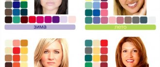
Why do you need to determine the color of objects?
Determining the shades of some objects is a mandatory attribute when developing room design and renovation. Even the slightest deviation in one direction or another can ruin the original idea of the owners or designer, and all the work will have to be done again. Obtaining information about colors is necessary because:
- some interior details should fit perfectly into the shade of the walls, floor, ceiling, furniture, etc.;
- every tenth man, due to natural features, is not able to distinguish colors, so using mobile applications will simplify the task;
- if the name of the shade is not known for certain, and a person went to buy wallpaper or other items, to whom all the details were explained superficially, there is a high probability of buying an item of the wrong color;
- when choosing a paint, it is important not only to know the name of its color, but also other parameters that play a key role;
- Only people of certain specific professions can remember the names of the entire palette.
Shades in the interior
When choosing paint for an apartment during renovation, people mainly focus on their preferences and tastes. For example, some color pleases the eye, while another, on the contrary, is annoying and visually not pleasing at all.
Below are the nuances of choosing and using different shades:
- White color is one of the most universal and background shades. Any other colors will suit it. But doing everything completely in white is not a very good choice. Still, it’s better to put color accents on it.
- With the help of a pink color it is good to divide the room into zones (kitchen and dining room); a beige shade goes well with it.
- Orange is the color of strength and energy. With its help, you can, on the contrary, recreate various individual parts of the space into one complete room. It goes well with white, green, yellow and beige shades.
- Blue color has an excellent relaxing and calming effect. It’s good to add blue or gray color to it.
- Red color awakens activity and feelings.
- Yellow gives tone and calms the nervous system.
- Green is well suited for establishing strong relationships and promotes calm and deliberate actions.
- Violet color is an activator of thoughts and inspiration.
You should not stay in a room with bright colors for a long time, as it is very tiring. A lot of red color is irritating and stressful, and a lot of white will lead to fatigue and even depression.
So, what do professionals recommend regarding choosing wall paint colors?
There is a lot of advice on the Internet that white expands space, and that it is better to use calm tones in the bedroom. Let’s not repeat them; we’d rather listen to the opinions of those who paint walls and ceilings every day for many years.
Professional painters and builders prefer to choose paint color based on the following recommendations:
The fewer options you have to choose a paint color, the easier it is.
Have you decided to paint your living room light green? Then ask the seller to show you only the main colors, some short catalog of colors, and it will be easier to choose. Why do you need 67 variations of light green to make things more confusing? If you buy paint online, choose brands that offer quick color charts. For example, on the Belinka website you can find this short table of the most frequently ordered colors. Very comfortably.
Request a catalog of paint colors
A common mistake is choosing a paint color based on an advertising brochure or seeing your favorite shade on an online store website. It must be remembered that no monitor, much less a magazine or brochure, can perfectly convey the shade of paint. If possible, always ask to see also a fan with color samples, not printed, but a catalog with pieces of material painted in different shades of paint from this brand.
3. Still, don’t forget about the purpose of the room
The color of the walls in your home may just be your whim, but don't forget what you'll be doing in the room. A small bedroom with pumpkin-orange stripes on the walls is unlikely to allow you to get a good night's sleep.
4. Don’t listen to anyone, choose the color of the walls for yourself
Fashion magazines, your designer and your architect friend can advise anything, but you and your loved ones will live in the house. So what if a pink ceiling is too much for some? And it reminds you of the color of the ice cream that your mother bought you as a child.
5. Of the two options, give preference to the less saturated one
A tiny rectangle of crimson may look really cute in a color catalog, but your head will spin when you stand in front of such a huge wall. Always choose a color that is much lighter and calmer.
Is your wall smooth or textured?
Yes, it makes a huge difference. Imagine that the wall is covered with pebble plaster (it creates the effect of grain scattered on the surface). Each pebble of plaster has a light side and at the same time casts a tiny shadow - that is, the entire wall takes on a slightly darker tone. Be sure to consider texture when choosing a paint shade.
7. Why not do a test paint job!
Still can't figure out what paint color to choose? There is a simple way: order several of the smallest cans of paint of different colors, from those that you cannot decide between, and paint with them the not-so-striking wall in the room. Then just paint over these areas.
If you test color, then in real conditions
If you liked the advice described above, then keep in mind that you need to paint the wall not just somewhere, but in the very room where you are planning the renovation. Apply the paint in several layers, in accordance with what is written in the instructions, try to paint at least 1 square meter. When assessing the results, try to include the same lighting that will be used in the room. By the way, if you can’t do a test paint job, try to at least bring a color catalog into the room and evaluate the colors in the conditions of a particular room.
Don't break the painting rules
Nobody likes to follow instructions, “why read technical maps?” Is it any wonder that in this case the paint will not only soon crack, but will also have a different shade, well, if not different in different areas of the wall. Please paint correctly.