About Grays and Neutrals from the 50 Best-Selling Paint Colors Palette
The best paint colors for walls and ceilings, according to a professional. The most purchased colors for interiors and facades in the world. The best shades of gray: from almost white to almost black. How does color change under different lighting?
When you're choosing a paint color for the interior or exterior of your home, it's a good idea to familiarize yourself with the palettes of the most popular and best-selling colors. Such palettes are formed based on the choice of both professional designers and owners of apartments and houses, and help not to drown in the ocean of thousands of available shades of paint and varnish products. This can often be a great starting point when finding the color that suits you best.
Below is a palette of 50 of the most popular and best-selling paints from the famous company Sherwin-Williams. Of these, we will highlight 12 of the most versatile and reliable gray ones and analyze them in more detail. There will be descriptions and tips on using this or that color, with explanations of why this color is more appropriate in certain places and conditions. The “pros” and “cons” of the selected colors will also be taken into account.
In this material we will rely on the extensive experience of US designer Cindy Alred. We give her our word:
Repose Gray
The number one color in the world in all companies involved in the production and sale of paints. Of course, this cannot be said with 100% certainty, but I would be very surprised if I found out that this is not the case. Repose Gray is a fantastic warm light gray that I highly recommend to my clients because it is absolute perfection when it comes to painting all the walls in a home a neutral light shade.
Pros : Versatility. This gray is especially nice because it not only looks beautiful during the day in natural light, but is also one of those rare colors that looks great at night in artificial light. When changing the color temperature of the lighting, unpleasant shades do not appear.
Cons : In rooms with lots of natural light, Repose can produce a very faint bluish-gray cast.
By the way, all the colors on the fan card where Repose Gray is located (card 244) made the bestseller list, which is not surprising because this set is simply gorgeous. These are stunning and versatile colors and you'll see some of them below.
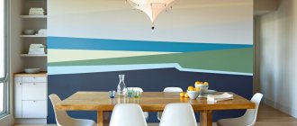
How to paint the walls in the kitchen
Modern design in the kitchen.
The first step is to prepare everything that may be required in the process:
- Work clothes that you won’t mind throwing away and protective equipment (goggles, respirator)
- Solvents and wipes for cleaning hands and tissues
- Specialized tools: brushes, rollers, masking tape, paint container
- Kitchen wall paint
To begin with, it is recommended to use a medium-sized brush to go through all the corners, hard-to-reach places and the perimeter of the baseboards, then apply the composition to the entire surface with a wide brush or roller.
Work is carried out from top to bottom from the ceiling. Using masking tape, seal the ceiling in the places where it connects to the wall. This allows you to prevent the paint composition from getting onto undesirable surfaces and create an even color.
The quality of the coloring also directly depends on the quality of the roller. Experts recommend using a mohair roller to paint the kitchen area.
Painting kitchen walls with a mohair roller.
It is best to do strokes simultaneously in different directions: from right to left and from top to bottom. Shading will help distribute the paint on the surface as evenly as possible, preventing the appearance of streaks and streaks.
Water-based paints are applied using a W-shaped motion. Then soft vertical and horizontal strokes alternate from the ceiling to the floor. If you plan to apply the substance in two layers, then the sequence should be the first layer vertical, the second horizontal. If in three, then vertical-horizontal-vertical. At the same time, water-dispersed compositions do not require complete drying to apply subsequent layers.
Painting walls with a roller yourself is a very labor-intensive process. The composition must be evenly distributed over the entire surface, carefully rolling it out. Air bubbles and debris falling onto the painted layer must be removed mechanically.
Sea Salt
This color is almost as popular as the previous one. The vast majority in the survey named it their favorite Sherwin-Williams color. Feel free to go for it if you are looking for a calming and serene spa color.
Pros : Calmness and serenity. In the right light, Sea Salt is one of the most beautiful shades of blue-green-gray.
Cons : Has a chameleon effect and can be finicky in certain lighting (usually in areas with a lot of natural light). It is very important to do test colors first. This color looks best in rooms with little or no natural light (bathrooms, bedrooms, etc.).
Worldly Gray
This is another trustworthy warm light gray color that is quite close to Repose Gray but is a little warmer and darker. I often recommend it to clients over Repose Gray as an overall color for the entire interior if there is a lot of natural light in the room, as the former can look too white in such conditions.
Pros : In rooms with lots of natural light, Worldly Gray is ideal and versatile.
Cons : This color will appear darker in areas with little natural light, and may look a little heavier than a traditional warm light gray.
What paint to paint the walls in the kitchen
Choosing paint for painting walls.
Deciding which composition is ideal and how to apply it, choosing color and texture - these are the most important questions that every housewife asks when starting a kitchen renovation.
Choosing the texture and color of paint for the kitchen.
All surfaces in the kitchen, such as walls, tiles, furniture and floors, should be easy to clean from dirt, resistant to wet cleaning and temperature changes, resistant to fungus and mold, and at the same time look attractive. A good mood for the whole day is guaranteed if you have breakfast in an ideal kitchen.
Crushed Ice
I met Crushed Ice for the first time recently when I was redecorating my living room. I chose this as a replacement for Repose Gray (our number one), which looked a little lighter than I would have liked in this space. And in the end, I just fell in love with it, so I can confidently recommend that you try this color too. It's a little lighter, a little cooler, and has a little more pigment than Repose Gray.
Pros : Crushed Ice is a stunning warm light gray that falls between light (with subtle color) and mid tone. A rare gem in the range of intermediate neutral colors.
Cons : Crushed Ice looks better in areas with moderate natural light. Not the best choice for rooms without windows.
Dorian Gray
This is another fantastic neutral warm gray from the mid-tone range. I used it on my client's kitchen hood hood and it looks beautiful. Dorian Gray also works great as a neutral color for furniture.
Pros : Found on the same card (244) of the color fan as Repose Gray, but only two shades darker. A very versatile color for walls and cabinets.
Cons : Too much natural light can cause Dorian Gray to become cooler and no longer look like a warm gray.
Dovetail
If you want something darker than a neutral mid-tone warm gray, Dovetail is a great choice. It is well suited for interior doors and cabinets. It is unlikely to be suitable for painting all the walls in the room, but an accent wall of this color will look beautiful.
Pros : Dovetail is a win-win option when you want to add contrast to a room, but don't want to use very dark tones so as not to lose the overall lightness.
Cons : Dovetail may take on a warmer tone in rooms with artificial lighting. Although this does not harm him too much, he remains beautiful.
Drift of Mist
If you want a neutral shade with just a hint of color, I suggest using Drift of Mist. It's a very subtle color that I think is almost the perfect neutral.
Pros : Drift of Mist is one of those rare colors that solves the problem when neither white nor more saturated colors will do.
Cons : There is a very slight hint of muted yellow (very faint). This is what distinguishes it from white, softening it to neutral. And, although I don’t like the presence of yellow, I could use this color in my home.
Types of compositions
Classic kitchen in yellow.
Manufacturers suggest using the following when painting walls:
- Water-based paints , which are a type of water-dispersion composition. They are characterized by the absence of odor, environmental friendliness, the ability to dry quickly and “breathe”. Stains that get on a kitchen wall painted with this composition can be easily removed with a regular rag.
- Alkyd - they smell bad, do not “breathe”, dry very quickly, do not crack and have a high degree of elasticity. They are highly flammable.
- Acrylate is one of the most expensive paint options. It is a mixture of acrylic and latex compounds, characterized by wear resistance and durability. It does not fade in the sun and is not deformed.
- Silicone - relatively recently appeared on the market, are quite expensive and are used for painting plastered textured walls. This is a new generation composition that meets all the requirements for interior paints.
- Latex - do not allow moisture to pass through, dry quickly, forming a protective crystalline film on the surface. They belong to the class of washable interior paints, which are not afraid of chemical detergents.
- Acrylic paints for the kitchen have a wide range of colors, are odorless and dry quickly. When applied, a special film is formed on the surface, which protects the painted wall from abrasion. The color is bright, with a pleasant matte and silky texture.
Painted walls in the kitchen with water-based paint.
Painting the walls in the kitchen with acrylic paint. Some brands offer a variety of decorative compositions that differ in texture, metallic tint or ability to glow in the dark. Some types of dyes imitate the texture of brick or wood. Such paints are environmentally friendly, easy to clean, do not absorb dust and have a high level of wear resistance.
Textured painting of walls in the kitchen using paint.
The assortment of almost any hardware store includes glossy, matte and semi-gloss coatings. Painting kitchen walls with glossy compounds should be done on a perfectly flat surface without rough edges or dents. Any defect will be noticeable. It is worth remembering that a reflective surface visually enlarges the room and hides small spots of dirt. But on a matte finish, on the contrary, any stain will be clearly visible.
Glossy paint for painting walls in the kitchen.
Painting the walls in the kitchen should be done with a composition that is highly moisture-resistant and wear-resistant . The kitchen is a real military training ground for dyes: temperature changes, condensation, grease flying during cooking, and dirt stains. If a painted wall cannot be cleaned of debris and dust, then such a surface will quickly become unusable. The composition must contain elements that prevent the appearance of fungus and mold.
Kitchen design in ethnic style.
The paint should be easy to work with. A parameter such as hiding power is responsible for this. The composition and distinctive characteristics are always indicated on the packaging.
Peppercorn
It's no surprise that Peppercorn from Sherwin-Williams made the bestseller list because this color is unheard of good! This cloudy taupe has tremendous depth and is perfect for an accent wall, closets, and some very small spaces.
Pros : Peppercorn is one of the most trustworthy taupes. It always looks good on walls, cabinets and accent pieces.
Cons : I can't think of a single problem with this color. He always looks great.
Silicate paint
One of the most advanced paints currently available is silicate paint for walls and ceilings. Long-lasting, easy to apply and durable, it is also the most expensive of the presented series.
Easy to apply
Let's see why they love her so much:
- First of all, it is necessary to note vapor permeability. This means that hot, humid steam will pass through the coating, leaving only condensation on the wall. This property significantly improves the microclimate of the room.
- Dirt and dust stick less to surfaces painted with silicate paint - due to their properties, they simply repel them, which greatly facilitates the cleaning process.
- The paint does not fade from heat or exposure to direct sunlight, maintaining clean and rich tones.
- Mold and fungi do not grow on silicate mixtures; they are unattractive to various parasites.
- The composition of silicate paint is completely environmentally friendly and does not contain elements harmful to health.
- They can be used for application to plaster, brick, concrete, wallpaper, plaster.
The disadvantages are the following:
- High price;
- Difficulty in applying to textured surfaces;
- A fairly complex dyeing technology that requires certain skills.
In general, silicate paints are the best choice for the kitchen due to their strength, reliability and durability. A varied color palette allows you to choose the right option for any kitchen.
Deep and rich shades
Iron Ore
The next example is a beautiful very dark gray with a brown undertone that has become a popular choice for finishing interior doors, cabinets and façade features. Really amazing color!
Pros : Iron Ore is a stunning deep and heavy color. It adds instant contrast to a space when used sparingly.
Cons : When using this color to decorate exterior elements, be careful: make sure that it harmonizes with the overall color of the facade, even if it is almost white. This is less true indoors, but bright sunlight outside really brings out the Iron Ore tones.
What should you consider when choosing a color for your kitchen?
Any color has certain properties that can affect our mood, internal feelings and even how much food we are willing to eat. Psychologists have come to a unanimous opinion that an erroneously chosen color scheme can disrupt the balance and harmony within a person, affect his well-being and even cause mental disorders.
Cheerful colorful kitchen
The kitchen is the active core of the apartment, where many different activities take place. Therefore, it is necessary to choose the right color for this room. The finished design depends not only on the chosen shade, but also on its intensity. The same kitchen will be perceived differently depending on the color saturation.
How to choose a color for a small kitchen?
When choosing a color scheme for the kitchen interior, take into account its features, dimensions, strengths and weaknesses. This is very important if you are decorating a small room. Different colors can visually adjust space in different ways. We do not recommend choosing too dark shades for a tiny kitchen. They visually distort the space and can even cause discomfort to people in such a room. This also applies to overly flashy or neon colors, from which there will be nowhere to hide in a small kitchen.
Elegant gray and white kitchen
In order to visually enlarge the space and make it more open, use light shades. Pastel unobtrusive colors are the best choice for a small kitchen. Conversely, a dark color scheme will allow you to adjust a large room, and rich colors will create the right atmosphere.
Situational color correction
Using a certain color you can solve many problems. For example, “insulate” or “cool” the interior. If the kitchen is in direct sunlight most of the time, colors from the cool spectrum will add an airy and cool feeling. Warm shades have the opposite effect - they can create the coziness and homely atmosphere that rooms on the north side lack.
Laconic beige kitchen design
It has been scientifically proven that color can regulate processes occurring in the human body. For example, shades of orange or red can awaken the appetite. This type of cuisine is an excellent choice for those who find it difficult to persuade to eat. But those who want to lose weight should pay attention to blue or gray colors, as well as shades of pink. Psychologists believe that they allow a person to restrain himself and not break into an unplanned snack.
Delicate combination of mint shade and white color
Using several contrasting colors in the kitchen interior improves vitality and adds energy. However, remember that you need to experiment with combinations very carefully. If you doubt your abilities, you should seek help from professionals to get a harmonious design. In order not to deny yourself the pleasure of using your favorite colors in the kitchen, it is not necessary to use them in their pure form. Muted shades look softer than their base, but are no less capable of pleasing you with their presence in the interior.
A bold combination of blue and purple in the kitchen interior
Additional criteria: how to choose the right color for the kitchen
There are many additional criteria that allow you to make your choice. For example, stylistic interior design. Each direction is built around a specific color scheme:
- Scandinavian style is known for the predominance of white;
- in minimalism, both white and combinations of black and white are used equally;
- High-tech is characterized by an abundance of gray, white and metallic;
- classic style is realized in pastel colors and shades of natural wood;
- romantic trends such as shabby chic, country and Provence gravitate toward muted pastel colors;
- Interiors in the style of pop art and kitsch are dominated by a variety of bright and neon colors.
Such criteria as family composition will also help you decide on the choice of color. If there are children in the house who are capricious during every meal, shades of yellow or orange will come in handy in your kitchen, as they stimulate the appetite.
Harmonious kitchen interior in muted blue color
For families with elderly people, the best option would be an interior in light colors. They have a neutral effect on a person and do not depress the psyche. If the kitchen serves as a dining room, give preference to calm colors. They will not irritate you while eating and will allow you to relax and dream over a cup of evening tea.
Recommended color combinations for the kitchen
If you are decorating your kitchen with one color, use shades of it. This will allow you to achieve volume and versatility. When planning to use color combinations in the kitchen, remember that you should not combine more than two contrasting colors in one interior, otherwise you risk overloading it. Always follow the rule: there should be more dominant shade than auxiliary shade.
Gray and yellow are companion colors
If you plan to purchase a kitchen set in different colors, choose matching shades. Bright furniture looks best against white walls. At the same time, a set of neutral colors requires a contrasting surrounding design. It is believed that you should not choose too dark types of wood for small kitchens, as they “weight down” the interior.
Contrasting combination of black and white in the kitchen interior
If you don’t know how to combine colors correctly, you can use ready-made combinations of several colors for decoration:
- white and black are monochrome colors, so they can be combined with any other color;
- gray most often acts as a base color. It is harmoniously complemented by shades of green and blue, pink, yellow and orange, ivory, blue and red;
- blue color goes best with beige, orange, blue, yellow;
- for shades of green, all shades of brown and yellow can become companion colors;
- red color looks good in combination with blue, yellow, orange, gold;
- purple is appropriate to use in combination with beige, blue, yellow and its derivatives.
Black Fox
Another fantastic dark color from the best seller list, very similar to the previous one is Black Fox. But while Iron Ore tends to lean towards dark grey, Black Fox is more of a very dark brown.
Pros : Very rich dark, ideal accent color for walls, interior elements and facade decoration. Very versatile.
Cons : In windowless rooms under artificial light, Black Fox can have a rather warm tone but still be beautiful.
Tricorn Black
Of the black colors, I most often prefer Tricorn black in my projects. First of all, because it really looks like black. And small brown-gray undertones relieve it of excessive roughness and harshness.
Pros : This is a very versatile and reliable color for both interior and exterior use. If you are in search of the best black color, you can go for this one as it is really beautiful.
Cons : I've never had a problem with this color. He won't let you down. The taupe shade complements almost any color when used as an exterior trim or accent color.
How to prepare walls for painting
Preparing walls, leveling, in the kitchen for painting.
Painting kitchen walls must be done on a perfectly smooth and even surface. First, you need to remove all stains, traces of dirt and grease, soot, old wallpaper, tiles and other materials. Any crumbling plaster must also be removed.
Fungus and mold, if present, are removed mechanically. The surface in this place is treated with special antibacterial compounds. Potholes are covered with cement or gypsum-based plaster.
Applying paint to decorative putty for kitchen decoration.
The walls are leveled using plaster or moisture-resistant acrylic putty, applied in two or three layers. To increase adhesive properties, primer is applied after each layer.
A deep penetration primer is preferable. It is not expensive and can be diluted with water 1:1
It is recommended to choose moisture-resistant putty from the same company as the paint, because their compatibility will determine how long the paint will dry, the appearance and strength of the coating, resistance to various damages and resistance to wet cleaning.
Creating a design in the kitchen with your own hands, painting the walls.
To obtain an ideal surface, the dried final layer must be sanded.
Mindful
I have been using Mindful Gray for many years, both on client projects and for myself. I think Mindful Gray is one of the nicest and safest warm gray colors out there and is great specifically for furniture.
Pros : An extremely versatile warm gray that looks best on cabinets and other furniture, as well as fronts. It's a little heavy to get a warm gray on your walls, but it's fine if you're looking for a warmer, mid-tone gray.
Cons : In rooms with plenty of natural light, Mindful Gray can look cold without losing its brilliance. However, if you want a warm gray that stays warm in these lighting conditions, then Mindful Gray is not the best color here.
Most of the Sherwin Williams colors featured on the most popular list are simply gorgeous. I haven't worked with many yellow/beige tones so I haven't given them any rating in this review.
And further. Before using any of the colors that I have given excellent ratings, be sure to test them in the room and lighting where they are intended. Lighting can change color dramatically and I really want you not to be disappointed!
You can learn about how light changes color in the article Warm and cool lighting in the interior. Color temperature of light.
To learn how to choose a light bulb with good color rendering, read the material Quality of lighting in the interior. Choosing the best lamps.
You can order paints in the colors you like right now on this website.
Articles about paints, color and design (opens in a new tab)
View products
Acrylic paint
One of the most popular types is acrylic paint mixtures. They can be used for all types of surfaces, but reviews note that this paint works best on wood and concrete.
Variety of colors and high quality
Due to its structure, the paint does not require a perfect rough finish - it is able to mask small cracks and irregularities. The material is quite elastic, so it can be applied without much difficulty. The smell is practically absent, disappearing within half an hour after application.
The smell from the renovation is not noticeable after half an hour
You can wash walls and ceilings painted in this way either with a damp cloth or with non-abrasive detergents. If you properly care for the surface, the paint layer will remain in its original form for 15-20 years.
Acrylic paint goes on very smoothly
The list of advantages of acrylic paints is quite wide:
- The color of the paint in the can fully matches the result after application: the color retains its intensity, so you can always predict the final design of the walls and ceiling.
- It tolerates temperature fluctuations well, which are essential in the kitchen.
- It dries in a maximum of half an hour - much faster than other types.
- After application, no cracks or wrinkles form, the paint goes on very smoothly.
- Over time, the color does not change, the paint does not fade from direct sunlight.
The result is worth the money.
The only disadvantages include the relatively high price. However, we believe that taking into account all the characteristics, the cost of this paint is quite justified.