When deciding what color to paint the walls in different rooms of a house or apartment, you need to take into account many nuances and rules. Following the existing recommendations will allow you to get an attractive and harmonious room that will not cause discomfort. When choosing a shade, you should pay attention not only to classic, traditional solutions, but also evaluate the options offered by the teachings of Feng Shui.
Classic interpretation of colors
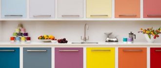
All colors are conditionally divided into three categories:
- Cold. This group includes violet, green, blue, blue gamma. Suitable for brightly lit rooms located on the south side.
- Warm. Includes a yellow, red, orange palette. They are an excellent solution for the north side with insufficient natural light.
- Neutral. Traditional grey, white and black shades.
Each option has a specific impact on a person’s emotional and mental state. Some tones can cause aggression and anxiety, while others, on the contrary, relax, put you in a calm mood, or promote creative and business growth.
Secrets of successful choice
When choosing a color scheme, individual preferences are of primary importance. But to make such an important decision, you can use recommendations that allow you to more accurately assess all the nuances.
General rules:
- Purpose of the premises. Each room in an apartment or house most often has certain functions, which influences the interior design and the color of paint for the walls. An example would be a bedroom, which should set you up for a good rest. The presence of black, variegated or brightly alternating shades in such a room will not give harmony. Even in a one-room apartment, the space is divided into zones.
- Surface texture. During finishing work, the general design of the interior is determined in advance, so it is immediately clear what kind of relief is on the walls. If the coating is traditionally smooth, then there will be no special problems. But with the texture achieved by using special putty or paint, the actual visual perception will be different. The fact is that even small irregularities cast shadows under different light sources.
- The wider the choice, the more difficult the decision. The modern palette of colors is very diverse, so initially you should focus on several basic colors, but no more than 8–12 (a larger number of shades will complicate the task). You need to choose based on samples that were actually painted, and not from catalogs or booklets. Naturally, this will not create a complete picture of saturation, but it will protect you from errors that arise due to incorrect color rendition of the drawings printed in the printing house.
- The secret of designers is the rule of three. All colors are usually divided into two groups: chromatic and achromatic. The first option includes bright shades: blue, green, red and others, the second option includes calm shades: black, gray, white. According to the rule, it is recommended to combine no more than three chromatic colors in one room. This does not apply to achromatic ones.
But even following all the rules and a good imagination will not give a real idea of what the wall will look like in the end. To do this, a test painting of an area of at least 1 m2 is done, completely repeating the technology. Naturally, such an event is not always possible.
Important! Strict adherence to the manufacturer's instructions on the label or in a separate brochure is a must.
Why do many people choose paint for decorating walls outside and inside?
The use of paints and varnishes seems to be a rational way to decorate premises. In some style concepts, this solution may even become the only possible finishing method.
Pros of painting walls:
- There are many types of compositions of various shades and textures on the market.
- Painted walls are easy to clean.
- High-quality paint lasts for many years without losing its aesthetics. It is durable and resistant to mechanical and climatic influences.
- You can paint walls in rooms for various purposes.
- The paint is applied to different substrates: concrete, plaster, plasterboard, wood, etc.
The right material is a great way to decorate your interior.
Before applying paint, it is necessary to perform preliminary preparation of the base, which is quite labor-intensive. However, the surface of the walls to be painted must be in perfect condition. Painting over old paint without removing this coating can be done if there is a need to change the color scheme, but the base itself has no defects.
Perception of color palette
Any professional designer knows that every color on an unconscious level affects emotional perception. A person may feel constantly tired or irritated and blame it on everyday circumstances, although the reason is the wrong color of paint.
It is advisable to take into account the following features of different shades:
- Red. Has a stimulating effect. In small quantities it can stimulate positive processes, but in excess it causes aggression and irritability. Constant contact with this shade leads to fatigue and psychological devastation.
- White. A universal color that can make a space more spacious and relieve a sense of tension, but in large quantities it will have the opposite effect. In addition, it evokes associations with medical institutions.
- Yellow. A small amount of this color gives confidence and creates a cozy atmosphere, but too much creates an anxious mood and creates mistrust. Orange has a similar effect.
- Blue. Promotes peace. The predominance of this shade does not have such a detrimental effect, but it can interfere with getting into a working mood.
- Green. Creates associations with trees and vegetation. Gives strength, invigorates and helps you focus on the task at hand.
- Black. The color of rigor and tact is responsible for maintaining solidity, but excess leads to depression.
To avoid making a mistake in your choice, you should follow simple rules:
- Everything is good in moderation. This postulate is valid for any palette of colors.
- Natural shades are the most correct. You can mix colors as much as you like and get amazing combinations, but everything you need already exists in nature.
- There are a great many professional craftsmen and designers, but everyone has their own idea, so their advice should only be of an auxiliary nature.
When combining different paints, a preliminary compatibility assessment is carried out. To do this, you can be guided by individual perception or use special color tables.
Fashionable colors for 2021 and the first half of 2019
To choose the right range of shades, you can use the trend of 2021, which remains in trend in the first half of 2019.
- Rose Quartz. Otherwise – rose quartz. This color emphasizes nobility and allows you to tune in to a calm mood. Being universal for all rooms, it is diluted with purple or pearlescent shades.
- Greenery. Light green color, which is quite a popular solution. It can become a real decoration of any interior; it can be combined with many tones, but it gravitates more towards natural ones.
- Iced Coffee. Iced coffee is perfect for modern (high-tech) and classic interior styles. Gives a feeling of comfort and style. Diluted with peach dye.
- Hazelnut. A universal color that will fit perfectly into any space and become an indispensable companion for all shades. To enhance the effect, you can use orange or pink accents in the interior.
- Serenity. Blue-lilac color is back in trend. Blue is the main color and gives depth to the room, while lilac gives expressiveness. Combine with rose quartz or peach shade.
- Flame. Orange-red color, reminiscent of flames, is an option for strong and confident people who are constantly on the move. Suitable for placing accents, combined with moderate shades.
- Peach Echo. The soft peach color remains an elegant solution for a sophisticated interior, the furniture of which has been selected with special taste. This wall painting is complemented by dark accents and paintings. It is most successfully used in living rooms, bedrooms and children's rooms.
The mood of the color scheme
There are trends including blue and white kitchens or green bedrooms. They don't change for a long time, but other good ideas appear.
Calm style
For a calm mood, you can use 1 color. For example, blue, which calms the psyche and looks good in a bedroom or bathroom where a person wants to relax. Accessories, furniture and other items can have any shade. A romantic atmosphere is created with soft lemon and lavender flowers.
The blue color of the walls has a calming effect on the human psyche.
For a calm atmosphere, use pastel shades of milky. To make the interior attractive, it is recommended to use different textures of bedding and accessories. You can add a cozy feel to your kitchen with buttery and sage gold tones. A feeling of peace can be created by choosing a delicate blue color.
Elegant style
The mood is created with neutral shades, including beige and milky. The room will become elegant if you add almond finishing details. Bright pillows will dilute the neutral atmosphere. You can add structure to accessories. Walls painted with neutral colors will make the room visually wider.
Bright style
The atmosphere of fun is created with rich colors, which are complemented by purple, orange and gold tones. Black and red colors are suitable for oriental style. The combinations must complement each other, so choose 2 opposite colors on the circle.
Painting walls in different rooms
Individual preference is paramount when choosing the right color for the walls in a room, but to achieve optimal results, there are some guidelines to consider.
Hallway
This room in most apartments and houses is very modest in size, so the optimal color for such a room would be light (beige, ivory, orange) with possible brighter accents. Due to this, the hallway will seem much larger.
Corridor
If the corridor is narrow, then several shades are used to paint it, which are recommended to be placed in the form of horizontal stripes. An interesting solution would be to create black central or side borders. The main color can be gray, light brown, beige.
The photo shows a corridor in beige shades; this color is considered the most used in such rooms.
Corridors usually do not have enough daylight, so the main palette of paints for walls should be light colors
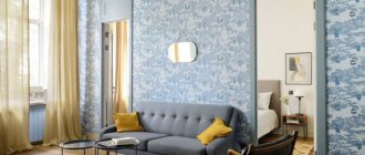
Living room and hall
Provided that all residents constantly gather in the room, blue, light blue, purple and pink shades are optimal. They are complemented by gold, red and gray colors. For a room used in other situations, a more austere interior with a predominance of cool colors is selected.
Children's
Choosing paint for a nursery is more difficult, since you need to take into account the preferences of the child or teenager. Gender also plays a significant role: boys gravitate towards bright and complex color combinations, while girls prefer calm pink and beige shades with rich splashes. Naturally, such an interpretation is often conditional, therefore, taking into account the wishes of the child, the best option is to use natural colors and their shades.
The photo shows a children's room in yellow-green color. This combination is an excellent solution for a child’s room, as it has a positive effect on the still weak visual system, gives energy and at the same time calms the nervous system.
The best solution for decorating a children's room will be natural shades of paint.
Bedroom
This room should promote relaxation and comfort, so the walls can be painted in shades of yellow, orange and green. It is better to abandon newfangled and experimental solutions that may look good on paper or in pictures on the Internet, but in reality they create an absolutely depressing impression.
Kitchen
If there are pieces of furniture in bright colors, then the walls are painted in a contrasting tone. If the kitchen modules have natural colors in the classical interpretation, similar lighter or darker shades are selected. But to create a modern interior, the walls can be painted in bright colors: red, orange or indigo.
Cabinet
Brown, gray and beige shades are suitable for this room, which can be complemented by black accents. Everything should be in a calm and business-like manner. Modern offices for creative individuals are best painted green, red and blue or combinations thereof.
Bathroom
Large bathrooms are rare, and many of them include several areas, so individual colors are chosen for each area. Blue, purple, dark blue and light green shades interspersed with red or black are well suited for such a room.
The bathroom is associated with water, so blue and its shades are most often chosen to paint it.
The main thing when choosing the color of a room is to take into account the overall style of the house or apartment.
Types of wall paints
In addition to the listed characteristics, take into account that interior paint for walls can vary in composition. The choice is made wisely, taking into account the internal conditions of the room, operating mode and the desired effect.
Interior paint for walls can vary in composition.
Water-dispersed
Water-emulsion paint for interior walls is suitable even for children's rooms, as it is the most environmentally friendly. They differ in composition by the presence of acrylic resins and components, or polyvinyl chloride. These components are in suspension. When applied, the particles merge to form a monolithic film.
She:
- Resistant to external mechanical influences;
- When completely dry, it is not susceptible to increased moisture and the effects of water, despite the water base;
- You can cover a wide variety of surfaces - wood, chipboard, fibreboard, OSB, metal-plastic, glass, plaster, putty, drywall and others.
Water-emulsion paint for interior walls is suitable even for children's rooms, as it is the most environmentally friendly.
Oily
In oil paint, vegetable filler is used as one of the components. Most often they cover metal and wooden surfaces or are used for artistic painting. Varieties of oil paint can have an organic or inorganic base.
Among the main characteristics it is worth highlighting:
- Applicability on external and internal surfaces.
- Resistant to treatment with water and detergents.
- Low consumption and high hiding power.
- Affordable price.
- Strong adhesion to the surface.
- Effective protection of the base surface.
Most often they cover metal and wooden surfaces or are used for artistic painting.
Alkyd
Alkyd enamels have become widespread in construction and repair work due to the wide variety of effects they create. They come in glossy, semi-matte and matte. The resulting film is resistant to abrasion. Such compositions are applied to wood, metal, and plastic.
Among the main characteristics it is worth highlighting:
- Fast drying process;
- Durability during operation without loss of basic properties;
- Resistance to ultraviolet radiation of the solar spectrum;
- Quick to apply and have a low price;
- The color palette is varied and the color does not change after drying;
- The layer effectively protects metal surfaces from rusting.
Alkyd enamels have become widespread in construction and repair work due to the wide variety of effects they create.
Acrylic
Acrylic paints have a lower density due to the introduced copolymers. Allow the material to allow air to pass through. For this reason, paint applied to a slightly wet surface will dry and allow the plaster or putty material to do so.
The main characteristics include:
- Quick drying;
- High hiding power;
- Low exposure to the ultraviolet part of the spectrum;
- Bright and rich colors;
- No defects form on the surface after drying.
Acrylic paints have a lower density due to the introduced copolymers.
Latex
Depending on the composition, latex paint can be polyvinyl acetate, butadiene styrene, acrylic silicone or acrylic. But they are all based on a component from rubber plants. It is the natural components in the composition that make this type of paint not the cheapest. The color performance depends on the introduced pigment. This way you can tint the paint and achieve the desired shade.
Main characteristics:
- Used inside the house as it does not produce odor;
- Economically used;
- Environmentally friendly product.
This type of paint has several subtypes:
- Dense is used for the ceiling plane. The result is a homogeneous matte surface;
- Dripless coating covers surfaces with small irregularities and cracks;
- Textured – ideal for creating a textured, embossed print.
It is the natural components in the composition that make this type of paint not the cheapest.
Silicone paint
Silicone paints are also environmentally friendly and do not emit odor during and immediately after painting. They form a surface that allows air and moisture to pass through quite intensively, as a result of which fungus and mold do not form on them. Among the main positive characteristics are:
They are not susceptible to temperature changes, which allows use on external surfaces or balconies that are not heated in winter. Preservation of color throughout the period of operation. Good stain resistance. They do not stick to walls coated with silicone paint.
Silicone paints form a surface that allows air and moisture to pass through quite intensively.
Decorative paint
Using this paint and varnish material, you can reproduce certain textural features of natural materials. This is the so-called paint with the “effect” of putty, sand, leather, natural stone, silk threads, velvet, velor, brick and other things.
When choosing decorative paint, you need to pay attention to its base. For interior spaces, it is desirable that it be water-based.
It is also important to understand that to achieve greater effectiveness, it is necessary to cover the wall in two layers, maintaining time between applied coatings. but with all this, at the initial stage, bring the base to a perfectly smooth state.
Using this paint and varnish material, you can reproduce certain textural features of natural materials.
The influence of shade on the visual size of a room
Each shade affects not only psychological perception, but also visual one. The right color for wall surfaces can expand or narrow a room.
Coloring principles:
- It is better to decorate small rooms in calm, light colors, thereby enhancing artificial lighting and visually expanding the area.
- To make high ceilings appear lower, you can paint the walls in pastel colors and the ceiling itself in darker colors. This combination will increase the overall space.
- Desaturated green and blue visually expand the room.
- Relief moldings painted in the same color will help to enlarge the wall.
- If the room area is small, you should abandon provocative solutions and a combination of many tones. This completely eliminates the feeling of space due to the inability to concentrate. Also, artistic painting, especially with large elements, would not be the best solution.
- To make large rooms smaller, orange and red shades are used, and to emphasize their status, deep gray and dark shades are used.
On a note! Since it is impossible to perceive all combinations, it is worth resorting to the use of special graphic programs. Color modeling in them is not always completely reliable, but it allows you to catch a good combination or reject a bad one.
Silicone
Before renovation, any person has a question about what paint to paint the walls in the apartment. For this purpose, a silicone composition is often chosen. It is considered an ideal choice for rooms with high humidity levels, so it is often used in the bathroom or kitchen.
The advantages of using silicone paint include:
- affordable price;
- ease of use;
- the ability to hide small defects on the walls, so cracks up to 3 mm can be easily filled with material;
- no persistent odor.
Due to the above positive characteristics, silicone paints are the most expensive on the Russian market. They are offered by different manufacturing organizations, but when choosing, it is important to consider not only the cost, but also the composition of the product.
Choosing colors from a feng shui point of view
Feng Shui is a Taoist practice responsible for organizing space. Based on this teaching, each element has its own color:
- water (north) – black;
- earth (northeast, southwest, center) – brown;
- tree (east, southeast) – green;
- fire (south) – red;
- metal (west, northwest) – white.
Bagua - map of Feng Shui zones
According to this eastern practice, common in Asian countries, each color has a specific effect on a person and is used for different rooms:
- Yellow. Symbolizes the sun, abundance and wealth. Creates a feeling of fun, comfort, strengthens hope and binds a person to home. Not suitable for dark rooms and bathrooms.
- Red. It is responsible for vital energy, therefore it is recommended for the construction of offices, but its excess leads to the opposite effect. Suitable for delimiting space and zoning. Should not be used in rest areas, hallways or bedrooms.
- Blue. A mysterious color that develops a sense of adventure and exploration. Suitable for living room, bedroom and office areas. A bad solution would be for the kitchen, hallway and corridor.
- Green. The basis of a new life, correct activity, but light shades indicate possible immaturity. Used for children's and teenage rooms, great for purposeful boys and girls.
- Orange. Can act as an additional color in the living room or short-term recreation area. You should not paint walls in offices and bedrooms with it.
- Peach. Symbolizes calm and is responsible for romantic appeal. Suitable for a room where a teenager lives, especially a girl. A slightly diluted shade is used to paint the living room and bedroom.
- White. Symbolizes purity and openness. It is used for walls in the nursery and living room and for highlighting areas in the kitchen.
- Black. Responsible for strength and solidarity, helps create intrigue. It is recommended to use shades of black that are suitable for certain areas of the walls. Not recommended for children's, teenagers', work or recreation areas.
Due to the fact that the modern interpretation of this practice has undergone changes, many meanings have been completely adapted to current conditions and have lost their original meaning.
Mistakes when choosing a color palette for walls
Mistakes when choosing paint colors that cause psychological discomfort:
- The period of illumination is not taken into account. At different times of the day, natural light can change, so the presence of artificial light sources is of great importance.
- The overall perception is influenced by all the details, and especially the furniture: a sofa, armchairs, tables, cabinets should match the main tone or contrast.
- Feng Shui takes into account the combination of colors, because the practice is based on the endless movement of space. A bad solution would be to use yellow and green, red and black, yellow and blue in the same room.
But most problems arise from the fear of making mistakes. You cannot please everyone or adapt to every opinion and recommendation; it is individuality that creates harmony. An example is the conditional ban on painting small rooms dark: if you choose a certain shade, the result can be stunning.