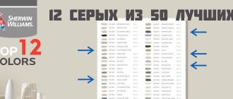
About Grays and Neutrals from the 50 Best-Selling Paint Colors Palette
The best paint colors for walls and ceilings, according to a professional. The most purchased colors for interiors and facades in the world. The best shades of gray: from almost white to almost black. How does color change under different lighting?
When you're choosing a paint color for the interior or exterior of your home, it's a good idea to familiarize yourself with the palettes of the most popular and best-selling colors. Such palettes are formed based on the choice of both professional designers and owners of apartments and houses, and help not to drown in the ocean of thousands of available shades of paint and varnish products. This can often be a great starting point when finding the color that suits you best.
Below is a palette of 50 of the most popular and best-selling paints from the famous company Sherwin-Williams. Of these, we will highlight 12 of the most versatile and reliable gray ones and analyze them in more detail. There will be descriptions and tips on using this or that color, with explanations of why this color is more appropriate in certain places and conditions. The “pros” and “cons” of the selected colors will also be taken into account.
In this material we will rely on the extensive experience of US designer Cindy Alred. We give her our word:
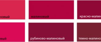
Repose Gray
The number one color in the world in all companies involved in the production and sale of paints. Of course, this cannot be said with 100% certainty, but I would be very surprised if I found out that this is not the case. Repose Gray is a fantastic warm light gray that I highly recommend to my clients because it is absolute perfection when it comes to painting all the walls in a home a neutral light shade.
Pros : Versatility. This gray is especially nice because it not only looks beautiful during the day in natural light, but is also one of those rare colors that looks great at night in artificial light. When changing the color temperature of the lighting, unpleasant shades do not appear.
Cons : In rooms with lots of natural light, Repose can produce a very faint bluish-gray cast.
By the way, all the colors on the fan card where Repose Gray is located (card 244) made the bestseller list, which is not surprising because this set is simply gorgeous. These are stunning and versatile colors and you'll see some of them below.
Programs for selecting colors in the interior
Online services will allow you to use built-in images and colors from a free palette. They can also automatically create harmonious combinations.
Tikkurila
A free online resource developed by a paint company. After completing the design, finishing materials can be purchased in the store. To paint an element, simply add a photo, select a shade and click on the wall, floor, baseboard or available parts.
Tikkurila
Pros of Tikkurila:
- A large color palette that can be filtered by collections and color type.
- You will be able to practice and look for new ideas on already designed layouts.
- You can upload a photo of your premises or select a photo from the service gallery.
- The catalog of images includes pictures of house facades and various rooms: bedroom, living room, office, kitchen, dining room and others.
- Ready-made color diagrams: complementary, accent and similar tones.
- The resulting content can be saved as JPG and PDF.
- Convenient website in Russian.
Minuses:
- Limitation in the size and format of the uploaded file: JPG or PNG document up to 15 MB.
Dulux Visualizer
Mobile application for iOS and Android that allows you to apply new paint to walls in real time. It is also possible to save a panoramic photo or video and process it at any time. To use the visualizer, you will need access to your smartphone camera.
Dulux Visualizer
Pros of Dulux Visualizer:
- Sharing and the ability to send results via email and social networks.
- Decorate walls in real time or save panoramic video.
- A large collection of shades, which is divided into categories: rooms, surfaces, coating.
- Automatic creation of color schemes.
- Function for selecting paint for exterior and interior work.
- The software can be downloaded for free.
Minuses:
- The application will only work on devices with a motion sensor. It also slows down on weak and old smartphones and tablets.
- Poor color reproduction: the tones on the screen differ from the actual color.
- To get a quality project, you need good lighting in the room.
- Uneven painting of rough surfaces.
Foundation
Free online program for selecting colors in the interior from an apartment renovation company. Use ready-made illustrations and apply shades of your choice to the elements. It is impossible to export the material, you can only take a screenshot.
Foundation
Pros Foundation:
- Customization of finishing in the living room, bedroom, kitchen and children's room is available.
- Painting of all elements: floor, ceiling, furniture, decor and more.
- A gallery of ready-made designs that can be filtered by color.
- Catalog of RAL, PANTONE and other paints.
- A table that allows you to harmoniously combine tones.
Minuses:
- Limited selection of colors (less than 22).
- Inability to import your image.
- The result cannot be exported or sent by email.
Bergge
A website from a construction company that allows you to choose colors for your living room, office, and building facades. You can only specify and customize coloring in built-in illustrations; you cannot upload your own image. Therefore, the visualizer can only be used to form a general view.
Bergge
Bergge Pros:
- Large collection of tones for interior work, facade, wood, decor.
- Possibility to customize the ceiling, wall covering and façade.
- Ready pictures for painting.
- Export the total to email.
Minuses:
- Only four pictures are available in the software: living room, office, stone and wooden facade.
- Inability to upload a photo of your home.
- The resource does not offer harmonious color combinations.
ColorSnap
Mobile application for iPhone and Android. With its help, you can install new finishing materials in real time. You will need to point the camera at the wall and floor of the room, and then select the appropriate tone from the collection.
ColorSnap
Pros of ColorSnap:
- Paint walls in real time or use a photo of the room.
- Function for calculating the required amount of paint.
- The ability to create and share your own palettes.
- Large gallery, divided by color families.
- Send the result by mail or on social networks.
Minuses:
- Complex interface in English.
- To access all functions, you must register.
- To get a high-quality result, the room must have good lighting.
- Uneven painting of rough surfaces and low-contrast areas.
Sea Salt
This color is almost as popular as the previous one. The vast majority in the survey named it their favorite Sherwin-Williams color. Feel free to go for it if you are looking for a calming and serene spa color.
Pros : Calmness and serenity. In the right light, Sea Salt is one of the most beautiful shades of blue-green-gray.
Cons : Has a chameleon effect and can be finicky in certain lighting (usually in areas with a lot of natural light). It is very important to do test colors first. This color looks best in rooms with little or no natural light (bathrooms, bedrooms, etc.).
Worldly Gray
This is another trustworthy warm light gray color that is quite close to Repose Gray but is a little warmer and darker. I often recommend it to clients over Repose Gray as an overall color for the entire interior if there is a lot of natural light in the room, as the former can look too white in such conditions.
Pros : In rooms with lots of natural light, Worldly Gray is ideal and versatile.
Cons : This color will appear darker in areas with little natural light, and may look a little heavier than a traditional warm light gray.
Crushed Ice
I met Crushed Ice for the first time recently when I was redecorating my living room. I chose this as a replacement for Repose Gray (our number one), which looked a little lighter than I would have liked in this space. And in the end, I just fell in love with it, so I can confidently recommend that you try this color too. It's a little lighter, a little cooler, and has a little more pigment than Repose Gray.
Pros : Crushed Ice is a stunning warm light gray that falls between light (with subtle color) and mid tone. A rare gem in the range of intermediate neutral colors.
Cons : Crushed Ice looks better in areas with moderate natural light. Not the best choice for rooms without windows.
Dulux paint color catalog and tinting according to it.
We produce computer tinting of paint, stains, impregnations, antiseptics, varnishes, ready-made plasters in all colors.
Prices start from 10 rubles/liter and can reach 600 rubles/liter.
The Dulux paint color catalog includes a large number of different shades. Colors from the brightest to soft pastels.
Attention! The colors on your monitor do not exactly reflect actual colors because the color rendering of all monitors varies. Therefore, using the tables, you can approximately determine the choice of color, followed by clarification at the point of sale and tinting the paint. Buy cheap Dulux paints here.
The walls are painted with Dulux Ultra Resist Living Rooms and Offices in Dulux 90BG 38/185 (blue). | Color combination 90RR 76/062 (pink) and 17GG 40/107 (dirty light green) in the bedroom interior. The walls and ceiling are painted with Malerit (Caparol). |
The walls are painted with Beckerplast 3 (Beckers) in color 10BB 83/006 (light ivory). | The walls are painted with Indeko Plus (Caparol) in color 04RB 71/092 (lilac). |
The walls are painted with Beckerplast 7 (Beckers) in color 50YR 53/011 (coffee). | The walls are painted with Tikkurila Euro Power 7 paint in color 59BB 81/022. |
The walls are painted with Dulux Vinyl Extra Matt in color 10YY 68/110 (ivory). | The walls are painted with Beckerplast 7 (Beckers) in color 30YR 21/505 (red). |
The walls are painted with CapaSilan (Caparol) in color 50YR 36/263 (pink). | The walls are painted with CapaSilan (Caparol) paint in color 80YR 76/086 (pink). |
The walls are painted with Amphibolin (Caparol) paint in color 45YY 83/125 (pastel). | The walls are painted with Malerit (Caparol) in color 30YY 78/018 (pastel). |
| The walls are painted with Indeko Plus (Caparol) in color 20YY 57/178 (pastel). | The ceiling is painted with CapaSilan (Caparol) in color 30BB 31/043 (gray). |
The walls are painted with Malerit (Caparol) in color 30BB 53/012 (light grey). | The walls are painted with Dulux Ultra Resist paint, for children's rooms in color 50GG 83/011 (pastel). |
The walls are painted with Marshall Export 7 paint in color 23YY 62/816 (yellow-orange). | The walls are painted with Amphibolin (Caparol) in color 70BG 56/061 (dirty blue). |
The walls are painted with Marshall Export 2 paint in color 50YR 83/003 (pastel). | The walls are painted with Finncolor Oasis Hall and Office paint in color 50BB 83/006 (pastel). |
The walls are painted with Beckerplast 7 (Beckers) in color 50YR 53/011 (coffee). | The ceiling is painted with Tikkurila Euro 20 Extra paint in color 10YY 72/021 (soft white). |
The ceiling was painted with Dulux Prof Bindo 3 New 2021 in color 30YR 14/365 (burgundy) | The ceiling is painted with Dulux Ultra Resist paint, for children's rooms in color 00YY 63/024 (pastel). |
The walls are painted with Finncolor Oasis Hall and Office paint in color 50BB 83/006 (pastel). | The ceiling is painted with Dulux Ultra Resist Living Rooms and Offices in color 10YY 54/034 (soft white) |
The ceiling was painted with Dulux Prof Bindo 2 New 2018 Innetak in color 13RR 06/179 (burgundy). | The walls are painted with Tikkurila Harmony paint in color 35YY 71/474 (sand). |
The walls are painted with Dulux Vinyl Extra Matt in color 69BG 77/076 (pale blue). | The walls are painted with Dulux Ultra Resist Living Rooms and Offices in color 68YY 86/042 (pastel). |
The walls are painted with Tikkurila Harmony paint in color 90YR 41/179 (coffee beige). | The walls are painted with Tikkurila Joker paint in color 60YR 54/028 (coffee). |
The ceiling is painted with Tikkurila Euro Smart 2 paint in color 10GG 33/404 (green). | The ceiling is painted with Tikkurila Euro Power 7 paint in color 10RR 83/009 (pastel beige). |
The walls are painted with Finncolor Oasis Hall and Office paint in color 30YY 78/035 (pastel). | The walls are painted with Tikkurila Euro 20 Extra paint in color 50RB 73/024 (pastel). |
The ceiling was painted with Marshall Export 2 paint in color 20YY 69/120 (pastel beige). | The ceiling was painted with Marshall Export 7 paint in color 10RR 73/016 (pastel). |
The walls are painted with Dulux Easy paint in color 30YY 64/149 (pastel). | The walls are painted with Scotte R2 (Beckers) in color 40YY 41/152 (coffee). |
The walls are painted with Tikkurila Lumi paint in color 45YY 83/062 (pastel). | The ceiling is painted with Beckerplast 3 (Beckers) in color 30YY 20/193 (coffee). |
The ceiling is painted with Tikkurila Siro Himmea paint in color 20YY 74/055 (pastel). | The walls are painted with Amphibolin (Caparol) paint in color 00NN 53/000 (gray). |
The walls are painted with Scotte R2 (Beckers) in color 40YY 41/152 (coffee). | The walls are painted with Tikkurila Euro Smart 2 paint in Dulux 90RR 64/036 (pastel coffee). |
The ceiling was painted with Elegant Vaggfarg HelMatt-4 (Beckers) in color 30GY 75/105 (light green). | The walls are painted with Tikkurila Euro Smart 2 paint in color 52YY 89/117 (pastel). |
| The walls are painted with Indeko Plus (Caparol) in color 24GY 85/110 (pastel green). | The walls are painted with Indeko Plus (Caparol) in color 70YR 27/404 (dirty pink). |
The walls are painted with Alpina Renova paint in color 50GY 52/263 (light green). | The walls are painted with CapaSilan (Caparol) in color 30BG 33/269 (turquoise). |
The walls are painted with Dulux Acryl Mat in color 80YR 57/179 (beige). | The walls are painted with Amphibolin (Caparol) in color 70BG 56/061 (dirty blue). |
The walls are painted with Dulux Prof Bindo 3 New 2021 in the color Dulux 50RB 52/107 (lilac). | The walls are painted with Dulux Prof Bindo 2 New 2018 Innetak in color 45YY 53/151 (mouse). |
The walls are painted with Dulux Prof Bindo 2 New 2018 Innetak in color 45YY 53/151 (mouse). | The walls are painted with Amphibolin (Caparol) in color 70BG 56/061 (dirty blue) |
The walls are painted with Tikkurila Harmony paint in color 50YR 07/162 (chocolate) | The walls are painted with Dulux Vinyl Extra Matt in color 45YY 61/368 (yellow-brown) |
The walls are painted with Tikkurila Euro Power 7 paint in color 70RB 54/110 (purple) | The walls are painted with CapaSilan (Caparol) in color 50YR 36/263 (pink) |
The walls are painted with Tikkurila Remontti Assa paint in color 60YR 40/297 (pink) | The walls are painted with Amphibolin (Caparol) paint in color 90YY 58/424 (light green) |
The walls are painted with Tikkurila Joker paint in color 50YR 09/244 (coffee brown) | The walls are painted with Dulux Ultra Resist Living Rooms and Offices in color 47RR 32/383 (rich pink) |
The walls are painted with Tikkurila Perfecta paint in Dulux 13RR 06/179 (burgundy). | The walls are painted with Dulux Velvet Touch paint in Dulux color 60YY 65/669 (poisonous lemon). |
The walls are painted with Dulux Ultra Resist kitchen and bathroom paint in Dulux 50BG 62/133 (blue). | The walls are painted with CapaSilan (Caparol) in Dulux 90RR 31/100 (coffee beige). |
The walls are painted with Amphibolin (Caparol) in Dulux 10RR 25/437 (purple). | The walls are painted with Beckerplast 3 (Beckers) in Dulux 10BB 07/150 (blue). |
The walls are painted with Dulux Prof Bindo 3 New 2021 in Dulux 30BG 21/301 (turquoise). | The walls are painted with Tikkurila Remontti Assa paint in Dulux 00YY 18/346 (coffee). |
Dorian Gray
This is another fantastic neutral warm gray from the mid-tone range. I used it on my client's kitchen hood hood and it looks beautiful. Dorian Gray also works great as a neutral color for furniture.
Pros : Found on the same card (244) of the color fan as Repose Gray, but only two shades darker. A very versatile color for walls and cabinets.
Cons : Too much natural light can cause Dorian Gray to become cooler and no longer look like a warm gray.
What is it and how does it work
Glow in the dark paint is a specific type of paint that has special characteristics. The thing is that it can glow on its own in absolute darkness, without having any power source. This is possible due to the fact that the paint accumulates the required amount of energy when exposed to light. As a result of this, it can emit light on its own for a long period of time.
Sometimes it happens that buyers do not know the correct name for paint that glows in the dark. Luckily for her, there are many titles, with the following being the most popular:
- phosphor;
- luminescent;
- light accumulative;
- self-luminous.
Dovetail
If you want something darker than a neutral mid-tone warm gray, Dovetail is a great choice. It is well suited for interior doors and cabinets. It is unlikely to be suitable for painting all the walls in the room, but an accent wall of this color will look beautiful.
Pros : Dovetail is a win-win option when you want to add contrast to a room, but don't want to use very dark tones so as not to lose the overall lightness.
Cons : Dovetail may take on a warmer tone in rooms with artificial lighting. Although this does not harm him too much, he remains beautiful.
Features of the computer tinting method
Finishing materials are tinted both manually and automatically. The manual method is implemented at the site of finishing work. The main disadvantage of this technique is the difficulty of obtaining a similar shade in the future, so most often for the purpose of processing the entire volume of material is tinted, which is not always convenient.
The machine method of tinting allows you to select a color for different volumes of material in a short period of time and reproduce it in the future an unlimited number of times. Computer tinting is used to quickly and accurately select recipes to obtain the desired shade.
When working, enter the color code according to the catalog and the required volume of material into the program. After the recipe is calculated, then the colors contained in the cylinders of a special device will be added to the base. Then the components are mixed, after which the paint preparation process is considered complete.
Drift of Mist
If you want a neutral shade with just a hint of color, I suggest using Drift of Mist. It's a very subtle color that I think is almost the perfect neutral.
Pros : Drift of Mist is one of those rare colors that solves the problem when neither white nor more saturated colors will do.
Cons : There is a very slight hint of muted yellow (very faint). This is what distinguishes it from white, softening it to neutral. And, although I don’t like the presence of yellow, I could use this color in my home.
How to make it yourself
After we have figured out what the name of the paint that glows in the dark is, what types there are and how to apply it correctly, we can mention that you can make it yourself. To do this, you will need varnish, a solvent, suitable containers (glass or ceramic), and the phosphor itself. The manufacturing process consists of three simple steps:
- Pour the varnish into the container.
- Pour in the powder (the more you pour in, the brighter your paint will be, but the standard ratio is 1:3).
- Add 1% solvent to evenly distribute the luminous substance and mix.
This is a recipe for making transparent enamel. If you want to give your paint a certain color, then you still need to add the dye you need to the above composition.
Peppercorn
It's no surprise that Peppercorn from Sherwin-Williams made the bestseller list because this color is unheard of good! This cloudy taupe has tremendous depth and is perfect for an accent wall, closets, and some very small spaces.
Pros : Peppercorn is one of the most trustworthy taupes. It always looks good on walls, cabinets and accent pieces.
Cons : I can't think of a single problem with this color. He always looks great.
Scope of application
Considering the fact that there are many names for paint that glows in the dark, it is not surprising that it has a very wide range of applications. Due to its unique properties, this substance can be found in the following areas of application:
- Interior Design. This paint is a very popular material for decorating clubs and restaurants, applying certain images to walls, ceilings and even floors. In residential areas, such paint is used quite rarely, since it is impossible to achieve complete darkness, which may sometimes be required for a restful and restful sleep.
- Body art. The harmless paint allows you to apply luminous makeup and manicure.
- Textile. Dye is applied to clothing and shoes either for advertising purposes or to make the products unique. It can remain on textiles even after 50 washes.
- Printing. Production of advertising products that would be visible in the dark.
- Tuning. You can use paint to customize cars, motorcycles and even bicycles.
Iron Ore
The next example is a beautiful very dark gray with a brown undertone that has become a popular choice for finishing interior doors, cabinets and façade features. Really amazing color!
Pros : Iron Ore is a stunning deep and heavy color. It adds instant contrast to a space when used sparingly.
Cons : When using this color to decorate exterior elements, be careful: make sure that it harmonizes with the overall color of the facade, even if it is almost white. This is less true indoors, but bright sunlight outside really brings out the Iron Ore tones.
Types of paints
Some of its characteristics and ease of use depend on the type of dye.
By composition
Based on their composition, 3 types of luminescent paints can be distinguished:
- Acrylic . Water-based, odorless paint. Suitable for indoor use as well as outdoor use. It dries quickly and is not afraid of moisture and temperature changes.
- Inert enamel . Made on a polyurethane base. For indoor use, different colors can be mixed. It fits perfectly on top of wood, gypsum board and plaster. It has high strength and is often used in specialized areas: finishing roads, creating work clothing.
- Ink . They are used in interior printing, when creating advertising products, in art and design. You can use fluorescent paints that are activated only by UV rays.
By release form
The products are produced mainly in three types:
- Aerosol . Sold in cylinders. The composition includes an acrylic base. Used for working on large areas.
- Powder . In dry form it is added to conventional paints.
- Liquid paint in jars . Sold in small containers for creative work.
When creating one project, you can combine different forms of luminescent paints.
How to choose composition and color
The choice depends on the scope of work and purpose.
The choice of paint type depends on what it will be used for:
- a large area will be processed - walls, furniture, car surfaces or the entire bicycle frame - select the composition in cans;
- if you need to cover a small part , then choose liquid paint in jars;
- when creating complex large patterns, you can use pigments in buckets, applying them with paint brushes and rollers;
- for paint used on skin and clothing , there is one requirement - a safe water base;
- to cover plastic , you should choose special polyurethane-based enamels;
- If you need high-quality paint , then when purchasing, you should check the certificate from the seller.
The choice of fluorescent paint colors is limited. Most manufacturers offer 8-10 base tones. However, they can be mixed to create original combinations.
If you want to combine different shades, it is important to remember that combining compositions from different manufacturers is unacceptable.
When choosing a color, there is another parameter - the intensity of the glow. Achromatic shades under the influence of ultraviolet become rich and bright, and without it they are invisible to the eye. Chromatic colors become very bright under the influence of rays.
Valera
The voice of the construction guru
Ask a Question
Opaque paints can change shade in the dark. Most manufacturers offer samples that are natural in color and develop at night or when exposed to ultraviolet light. A subtle pastel pink can glow with both lilac and magenta in the dark.
Black Fox
Another fantastic dark color from the best seller list, very similar to the previous one is Black Fox. But while Iron Ore tends to lean towards dark grey, Black Fox is more of a very dark brown.
Pros : Very rich dark, ideal accent color for walls, interior elements and facade decoration. Very versatile.
Cons : In windowless rooms under artificial light, Black Fox can have a rather warm tone but still be beautiful.
Tricorn Black
Of the black colors, I most often prefer Tricorn black in my projects. First of all, because it really looks like black. And small brown-gray undertones relieve it of excessive roughness and harshness.
Pros : This is a very versatile and reliable color for both interior and exterior use. If you are in search of the best black color, you can go for this one as it is really beautiful.
Cons : I've never had a problem with this color. He won't let you down. The taupe shade complements almost any color when used as an exterior trim or accent color.
Application Tips
In order to achieve the maximum effect from such paint, you need to know how to apply it correctly. First of all, it is worth noting that the ideal base is a flat white surface. When applying such coatings to a dark coating, you need to understand that the black color itself absorbs a significant part of the light, thereby taking away the brightness from the luminous paint. If you cannot change the color of the surface, then it is recommended to treat it with a primer before painting.
Before starting work, the paint itself must be thoroughly mixed, since luminous elements may settle to the bottom of the can over time. Regardless of color, the surface must be clean and dry. The painting itself must be carried out in two layers, and the second can be applied only after the first has completely dried.
Mindful
I have been using Mindful Gray for many years, both on client projects and for myself. I think Mindful Gray is one of the nicest and safest warm gray colors out there and is great specifically for furniture.
Pros : An extremely versatile warm gray that looks best on cabinets and other furniture, as well as fronts. It's a little heavy to get a warm gray on your walls, but it's fine if you're looking for a warmer, mid-tone gray.
Cons : In rooms with plenty of natural light, Mindful Gray can look cold without losing its brilliance. However, if you want a warm gray that stays warm in these lighting conditions, then Mindful Gray is not the best color here.
Most of the Sherwin Williams colors featured on the most popular list are simply gorgeous. I haven't worked with many yellow/beige tones so I haven't given them any rating in this review.
And further. Before using any of the colors that I have given excellent ratings, be sure to test them in the room and lighting where they are intended. Lighting can change color dramatically and I really want you not to be disappointed!
You can learn about how light changes color in the article Warm and cool lighting in the interior. Color temperature of light.
To learn how to choose a light bulb with good color rendering, read the material Quality of lighting in the interior. Choosing the best lamps.
You can order paints in the colors you like right now on this website.
Articles about paints, color and design (opens in a new tab)
View products
Range of colors for walls
The color range of paints, recommended by recognized interior designers, is suitable for premises for various purposes. It is characterized by the use of neutral shades, which allow you to change the mood of the room and make adjustments through color accents.
The considered color combination options suggest painting the ceilings white, matching or slightly lighter than the walls. The second option is relevant with a pastel color palette.
White color
The color of luxury is pure white, without cold or warm shades, life-affirming, compatible with all colors. Reveals the texture of any material, and therefore it is beneficial to introduce textured contrasts in white: glossy and embossed wall surfaces, light and heavy textured fabrics, soft leather and stone. A popular combination of painted brickwork and smooth plaster (or drywall).
It goes well with any bright accents, but in small quantities.
The peculiarity of color should be taken into account: any lighting and the presence of a color accent create reflections and color spots on the white surface, changing its character. Direct sunlight will make the room dazzlingly white and contrasting, muted daylight will make it cold and soft.
Goes well with clear glass.
Classic white combinations:
- gray-brown (sepia) becomes contrasting against a white background,
- with sand color creates a feeling of freshness,
- neutral gray in small quantities mutes whiteness, adds calm,
- dark gray and anthracite - recommended for contrasting accents, as an alternative to black.
Black is too contrasting for white, but can be present as a graphic element on the wall or in furniture.
You should not overload a white room with pastel and bright combinations of various colors in large quantities. Saturated red, blue, green are recommended only as accents.
White walls with bright accents are appropriate in a room for active areas.
The color can have cold (“white night”) and warm shades, which are present in interiors to soften contrasts and dim brightness.
Light sepia (taupe)
In itself, neutral and calm, this shade creates a feeling of balance and harmony.
Light shades play well in textural contrasts, for example, matte wall surfaces and fabric with large relief patterns. It is a color that changes depending on the shade or other chosen color with which it is combined.
Harmonizes with brown, gray and their shades. Pure white color, dark wood and chrome elements will be a refined addition. As an accent, you can use color spots in green, red and purple shades.
The combination of gray-brown with any shades of yellow is unacceptable, including colors that contain yellow to some extent.
Light shades of sepia are suitable for the bedroom; in combination with warm brown (furniture) and white, they create a feeling of some detachment.
In combination with white (protruding structures) and gray shades of flooring and furniture, it can be used for office walls.
Light taupe in combination with white ceilings and fillets, brown wood doors looks perfect in the hallway and corridor.
Light ocher (sand color)
Warm and cozy, associated with nature, yet very homely. It harmonizes well with white, brown of varying brightness and saturation, cream (see below) - a win-win option. Like all light colors, it brings out the surface texture well.
With white, depending on the intensity of the light, there may be a contrast on vertical planes, which will require some muting of the white pilasters to a “white night” tone.
A combination with blue and pink shades, including other colors, is considered unsuccessful.
Black color is allowed, but only as an accent, just a little.
If you don’t know what color to paint the walls in the bedroom, then light sand shades will be very appropriate. In combination with white and cream, they will brighten northern rooms, while brown chocolate tones will add restraint.
Accent colors – orange, bronze, mother-of-pearl.
Cream (pastel ocher with a hint of yellow, rustic butter color)
Calm and enveloping. It may not seem very expressive, but with white it becomes active and contrasting.
A harmonious combination - with brown and ocher (sand).
Accent colors can be blue and black, but in small quantities. It will look natural and fresh with greenish color tones.
Orange, red, lilac can be accents, but they weigh down the interior and require careful selection of shades.
The tone incompatible with cream is gray-brown (sepia).
Cream color is not recommended for rooms with excess sunlight, since in this case it will be too bright and “active”.