Wallpaper in the kitchen interior is not the most practical solution. This is exactly what it may seem at first glance. However, modern materials have higher parameters, are functional, and can easily withstand difficult operating conditions, unlike older wallpapers. For this reason, wallpaper has regained its popularity today. They help diversify the interior of the kitchen, make it cozy and original.
Using the right combinations of patterns on wallpaper, you can hide the shortcomings of the room and place accents in the interior of the kitchen
A very good option is combined wallpaper for the kitchen. Using various combinations of fabrics, you can achieve a unique effect - transform even the tiniest kitchen into a functional, stylish room. More details about the rules and principles of combining wallpaper in the kitchen are described in this publication.
Rules and principles for combining wallpaper in kitchen design
Extraordinary design ideas for combining different textures and colors of wallpaper are increasingly being used in home interiors. This solution is universal - it will suit classic, modern, Provence, hi-tech, modern, loft styles. When implementing such an idea, it is important to adhere to several principles.
Looking through photographs with wallpaper combinations, you will notice that different combinations are reflected in the geometry of the kitchen, making the room higher or lower, wider or narrower
The first principle is taking into account the individual characteristics of the room. If the kitchenette is tiny and low, then you will have to give up dark colors and large patterns. If the ceilings are too high, it is undesirable to use small ornaments. The second principle is to wallpaper only on a flat, well-prepared surface. Even the highest quality finishing materials will fit poorly on uneven surfaces of walls with defects.
The design of wallpaper in the kitchen should be in harmony with furniture and household appliances
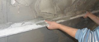
Note! When purchasing wallpaper to create a combination, you need to choose canvases of the same thickness. The difference in thickness will be very visible after gluing; very noticeable seams can spoil the overall picture.
Combining different materials for finishing is a rather painstaking task with many nuances. For an experienced designer, such work is not difficult, but not everyone has the opportunity to involve a specialist in kitchen design.
Wallpaper of the same shade and similar texture will look great together
To combine wallpaper yourself, follow some basic rules:
- If you have already purchased wallpaper, but it is not the same thickness, use moldings and borders. Such accessories will help hide the transition and disguise protruding seams.
- It is not necessary to use colors of the same saturation level. You can really benefit from the contrast of shades.
- Checking the compatibility of finishes at the purchase stage is mandatory! You can simply take rolls and apply them to each other.
- In the kitchen it is better to use washable, thick wallpaper. This rule is associated with the characteristics of the room: high humidity, soiling, the presence of unpleasant odors, etc.
- Materials must be purchased with similar characteristics and properties. This will help achieve almost the same service life and avoid the need for premature repairs.
- You can't combine incompatible things. Modern 3D photo wallpapers will not look harmonious in combination with canvases decorated with classic patterns.
Highlighting the dining area with the help of an original panel made of vinyl wallpaper and moldings
Important! If choosing a finish still causes difficulties, be sure to look at the wallpaper in the kitchen interior and their combination in real photos.
Combined wallpapers are selected based on the similarity of style, texture and shade
Vertical zoning of walls
Combining wallpaper vertically in the kitchen is an opportunity to balance out a narrow, long room, as well as a great way to visually raise the ceiling. Wallpaper with stripes is almost always used for vertical zoning. Here you can choose the following solution:
- Symmetrical: the kitchen walls are covered with wide stripes on both sides of the center. Contrasting materials are perfect here, distracting with expressive lines from the imbalances in the room;
- Asymmetrical: material with wide stripes decorates one wall, and all others are decorated with stripes of different sizes. This solution looks dynamic in the interior and helps make the kitchen wider.
You can also correctly place visual accents by combining variegated stripes with single-color stripes. In addition, this is an excellent way to avoid boredom in a monochrome design - for this, canvases of different shades alternate as 1-1 or 1-2. It turns out to be a wonderful color play. However, you need to monitor the contrast of the combinations so that the room does not end up being too aggressive. Of course, you can use bold combinations: red-blue, raspberry-green, but fans of traditional design most often choose calm contrasts: red-black or white-black; blue-gold. In the photo, each of these options looks amazing.
Combining wallpaper in the kitchen: which option to choose to highlight the dining area
The dining area, unlike the working area, is less dirty. Here it is allowed to use a much wider range of materials. Using a combination of different wallpapers in the dining area, you can solve many problems:
- Separate the dining room from the food preparation area. This can be done using a different color, a different finish texture.
- Eliminate minor planning errors. Few people can boast of an initially successful layout in their home. When combining wallpaper in the kitchen, it will be possible to hide, disguise or even eliminate small mistakes.
- Ensure the individuality of each individual functional area.
Combining wallpaper allows you to highlight the functional areas of the kitchen without resorting to redevelopment
You can highlight the dining room with a more saturated color. When choosing a shade, you should rely on the advice of psychologists. For more comfortable digestion and increased appetite, experts recommend giving preference to red, orange, turquoise, purple, and brown shades. To ensure that the selected color is in harmony with the rest of the interior, you can use it in the work area. For example, purchase textiles, accessories, and equipment in this color.
You can highlight the kitchen dining area using a combination of patterns with a monochromatic finish.
You can separate the dining area from the working area with the help of beautiful photo wallpaper. Photo wallpaper can be combined with various design styles: Provence, hi-tech, classic. For example, on the walls near the dining table you can paste wallpaper with a beautiful view of the Eiffel Tower. This is a good solution for a room decorated in Provence style. With this design, every meal will become special. You can look at photo wallpapers in the kitchen interior, photo design and ways to combine them in this section.
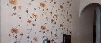
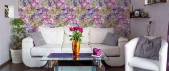
Floral print is always in fashion and is suitable for both classic interiors and rustic styles.
In a modern interior, a combination of light wall decoration with inscriptions on the wallpaper looks stylish.
In a Japanese-style kitchen, the dining room can be highlighted with an unusual large-format panel. It is better to combine them with wallpaper of the same tone. Wallpaper with a small pattern is also suitable.
A novelty in interior design is the decoration of walls with Arabic or oriental patterns, made in the form of panels and combined with furniture upholstery or other accessories.
Types of wallpaper for the kitchen
Not all wallpapers are suitable for kitchen walls, because you need to take into account humidity, temperature, grease and odors. For example, inexpensive paper collections, like expensive luxury textiles, will not last even 5 years in such conditions. But there are alternatives!
Non-woven wallpaper
Non-woven fabric is a more modern, practical and unpretentious replacement for paper. They are no less diverse, and from the point of view of textures, even more original. The fabric itself is denser and stronger due to its non-woven fibrous structure. Thanks to her, it remains environmentally friendly and allows air to pass through.
Non-woven wallpaper can be washed and repainted 10-15 times - the exact quantity for each collection is indicated by the manufacturer. Therefore, to freshen up your kitchen, you don’t even have to plan a major renovation. When laying non-woven fabric, it is enough to apply glue only to the wall - there is no need to impregnate the canvas itself. This means that it is much easier to stick it neatly and evenly, and at the same time you don’t need to worry about shrinkage when drying.
Vinyl wallpapers
Vinyl is denser, stronger and hides minor unevenness in the base well, unlike paper. This is not a separate material, but a special foam coating that is applied to a paper or non-woven base. It is this that gives strength and wear resistance, resistance to washing and repainting.
Vinyl is easy to work with – it doesn’t produce bubbles when pasting, so it’s easier to do it yourself. You can wash the walls with a regular soft sponge and soapy water and not worry about safety and color. And the specificity of the protective coating allows you to apply interesting textured patterns to vinyl wallpaper using the silk-screen printing or cold stamping method.
Wallpaper for painting
Wallpaper for painting is a separate collection of vinyl and non-woven coverings with increased density and strength. Usually they are without patterns or designs, but with relief textures - in fact, this is an alternative to decorative plaster. Compared to paper, such wallpaper has increased sound and heat insulation, although, of course, it is not capable of replacing cladding with mineral wool.
In the kitchen, paintable wallpaper is not afraid of any stains from grease, juices or wine. Even if you don’t manage to get it out without a trace, the consequences of a small accident can always be eliminated with a can of paint and a brush.
Glass wallpaper
Fiberglass is an unusual modern material of increased density and strength that came to us from Europe. This is a durable looped fabric woven from thin glass fibers. In its essence, it is closer to ordinary textiles, because it allows air to pass through and provides a comfortable microclimate.
You can even wash glass wallpaper with a hard sponge or brush, so it won’t be difficult to remove the most difficult stains. When gluing, the seams are so invisible that you can replace an entire fragment without leaving a trace. In combination with vinyl or non-woven fabric, glass wallpaper also gives an unusual play of textures.
Liquid wallpaper
Liquid wallpaper can hardly be called wallpaper in the classical sense - it is a kind of alternative to decorative plaster. Only instead of sand and other fillers, the composition contains light and environmentally friendly cellulose. If you prefer the characteristic paper texture, then for a hot and humid kitchen, pay attention to liquid wallpaper.
Given its specificity, the material combines well with others. Additives, pigments, mother-of-pearl, glitter and any other decorative impurities are introduced into it. You can experiment with textures and make an accent wall in the work or dining area against a background of more neutral vinyl or non-woven fabric.
Photo wallpaper
Wallpaper with photo printing is distinguished by the fact that absolutely any design can be applied to it, even personal photographs. The type of base varies, so they can also be used in the kitchen. But most often it is an accent element, and not a full-fledged covering for all walls.
Curtains for the kitchen (65 photos): types, beautiful ideas
Zoning a room using wallpaper of different colors, textures and patterns
The kitchen is often equipped with at least two zones: a dining room and a work area. In order to visually transform the space, you need to use one of the zoning methods. A good option is zoning with wallpaper that differs from each other in texture, color, and pattern.
A harmonious combination occurs when the color of a plain surface matches one of the shades of the pattern on the wallpaper
Note! When using finishes of different colors, textures, patterns, kitchen zoning can be: comprehensive, partial. In the first case, in the dining room, the working part of the room, different shades of the walls are used, in the second, the wallpaper differs only on one part of the wall, most often near the dining table.
Creating an accent wall is a great way to break up a monotonous kitchen interior.
The simplest method of separation is to use finishes of different shades. You can look at the combination of wallpaper of two colors in the kitchen photo right in this section of the article. This approach is used if you plan to introduce bright accents into the interior. In this case, zoning is usually partial.
Instead of trying to hide various niches and protrusions, try highlighting them with wallpaper that is a different color or texture from the background trim.
Using wallpaper with different textures is a good option for a classic kitchen interior. But here it is important to follow one rule - the structural motifs of the surfaces must be harmoniously combined. In this case, the joints can be masked with molding. Another important point is color. If the texture is different, it is better to leave the color the same (with minimal difference).
Wallpaper inserts are a very effective technique for creating an attractive interior. It is advisable to make such inserts from thick wallpaper on a non-woven basis.
Patchwork combination or patchwork of wallpaper is a very extraordinary way to decorate walls
Combining different patterns with each other is quite difficult. This zoning method is usually chosen by designers with sufficient experience. If you have no experience, it is better to combine the pattern with plain walls.
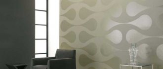
Combination of a simple light background with luxurious embossed wallpaper
Combination rules
For combination, suitable wallpapers are selected, taking into account their thickness, material, texture, pattern, type; they also produce collections with ready-made combinations. To make the design harmonious, you need to follow several rules:
Harmonious combination
- It is recommended to combine coatings of the same thickness so that joints are not noticeable. Decorative edging is used to disguise the transition
- You need to select two types of different wallpapers so that they not only harmonize with each other, but also correspond to the overall design.
Matching interior style
- If the kitchen area is less than 10 m2, you should not choose bright colors and large patterns on the wallpaper.
- Bright photo panels need to be set off with single-color wallpaper or dim elements on them. The accent wall should be 3-4 meters away; placing large furniture near it is not recommended.
Bright photo panel
- In order for the kitchen design to be harmonious, you need to select similar colors or pattern elements present on the kitchen furniture, textiles, and dishes.
The color matches the kitchen furniture
Types of wallpaper combinations
| View | Features, useful tips |
| Vertical | In this case, vertical accents are made. There are a huge number of gluing options. You can glue strips throughout the entire wall, in its individual parts, only next to specific interior items. You can experiment with the width of the vertical stripes. For example, make wide light stripes, bright stripes thinner. |
| Horizontal | This method is more suitable for kitchens in Provence, Baroque, Romanticism, and Classic styles. It involves the use of wallpaper in dark and light shades. The bottom becomes dark, the top becomes lighter. Moldings and special wallpaper tapes are used at the joint boundaries. When combining horizontally, you can glue more than two strips. |
Vertical alternation of plain stripes and stripes with a pattern can visually expand the kitchen space and “raise” the ceiling
Horizontal division of walls with wallpaper is an effective design technique for creating a luxurious interior
Basic rules for combining
When combining wallpaper, you need to proceed not only from personal preferences, but also take into account the size of the kitchen and lighting features. If you don’t adhere to certain rules when combining, the design may turn out tasteless:
- You should not place furniture against the background of wallpaper with a large pattern, because the ornament will not be visible and the space will visually become smaller.
- If wallpaper with a pattern was chosen for the combination, then the distance from the kitchen furniture should be at least 3-4 m.
- You cannot combine cheap and expensive wallpaper, otherwise the design will look tasteless. A combination of materials of different textures and colors is acceptable.
- When combining several wallpapers, you should choose them of the same thickness, then there will be no difficulties with gluing them.
- The ideal solution for the kitchen is a combination of pastel shades with bright, rich colors.
- Designers recommend combining floral patterns with wood texture;
- Geometric patterns look better with abstraction.
The kitchen should not have too many bright accents or wallpaper with patterns, otherwise it will not be possible to create a cozy homely atmosphere. Don’t forget about practicality: you need to choose materials that are easy to clean. Wall decoration should not only correspond to personal preferences, but also suit the chosen kitchen interior.
Thematic wallpaper highlights the wall in an original way
Color combination rules
To create an attractive kitchen look with combined wallpaper, you need to know the rules for combining different shades. There are colors in nature that do not go together at all. And there are shades that perfectly harmonize with each other.
A classic of the genre - a combination of white and black, works to increase space if white is the priority
When selecting wallpaper, focus on the following combinations:
- Green, gold, blue, and gray go well with red. You can’t combine red with brown or purple.
- Orange looks great with white, purple, green. But it cannot be combined with red.
- Brown looks perfect with beige. A good combination is brown with gray, gold, and blue. You definitely shouldn’t combine brown wallpaper with lilac.
- Grey, black, white colors are universal. They combine well with almost any other shade.
- Yellow suits brown and green. Looks worst with burgundy.
A combination of wallpaper with different patterns, but one background color
Same pattern, but different tones
Combined wall decoration with wallpaper and plastic panels
Highlighting the kitchen dining area using a vertical wallpaper combination
Important! The easiest way to select wallpaper of two colors is to choose shades that belong to the same color palette. For example, it could be blue and light blue.
One of the win-win combination options is creating contrasts
Horizontal combination method
This option is used in a kitchen with high ceilings and works ideally in any style of interior. Dividing walls in a horizontal plane is a favorite technique of decorators when it is necessary to transform a room that is too elongated upward.
The simplest option for horizontal combination in the interior is alternating wallpaper of different colors and textures, echoing each other and compatible with the kitchen decor.
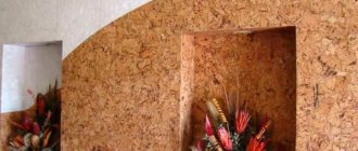
Advice! Almost all styles can use a combination of wallpaper with cork or wood panels.
When combining horizontally, the height of the wall is divided as 1 to 2, with a less wide strip located below. There are many classic combinations, each of which looks more than luxurious in the interior in the photo:
- The top is with geometric patterns, damasks, large flowers or stripes, the bottom is plain or with small patterns;
- The bottom has a prominent, massive, expressive pattern (geometric or floral), the top is monochrome;
- The bottom is striped, the top is with a small pattern or plain.
Options selected in the same color scheme will look attractive. The main thing is to choose the right border, with the appropriate color and theme of the design.
As for the height reference, it can be done to the level of the window sill. If the ceilings are very high, then the lower part should occupy 2/3 of the room.
When combining horizontally, you will also need a separator - a special molding, border, strip.
Advice! You can combine contrasting materials or wallpaper of similar shades. In any case, don’t forget about the play of textures. Thus, embossed vinyl wallpaper, imitating plaster, is amazingly combined with soft textile options.
Photo: 50 wallpaper combination ideas
Combined wallpaper design
The classic solution is a combination of plain materials and wallpaper with a pattern. With their help it is easier to make the correct placement of accents. But you can limit yourself to using only plain wallpaper to update your kitchen interior.
Plain wallpaper
The most popular material used for wall decoration. In classic and Scandinavian styles, light or white shades are usually chosen. They visually enlarge the space, making it even brighter. However, monochromatic wall decoration is unoriginal and does not emphasize individuality. But if the kitchen owner is afraid of combinations with patterns, then you can combine several plain wallpapers.
- Cool colors - gray, blue, green visually increase the space. Suitable for classical, neoclassical, Scandinavian, high-tech styles. Such shades have a calming effect. Psychologists have also noted that a cold palette reduces appetite. But restrained muted tones should not be chosen to decorate a kitchen located in the northern part of the apartment/house.
- The most popular options are yellow, beige, and golden. They do not visually reduce the space and help create a homely atmosphere. But the abundance of such a range can be tiresome to perceive. Therefore, designers advise diluting it with bright colors.
- Red color is usually chosen for typefaces and rarely for wallpaper. It is too accentuated and can be an irritant to the nervous system. Therefore, it is recommended to choose it for one wall.
- Green is also a popular color for kitchen decor. It looks most appropriate in Provence or country style.
White color is considered universal because it adds spaciousness and always looks elegant and expensive.
However, such a kitchen evokes associations with a hospital ward, so designers recommend adding bright accents.
Yellow wallpaper in the kitchen brings comfort and warmth
Wallpaper with a pattern
Wallpaper with a pattern is often chosen to decorate an accent wall that delimits the kitchen space. To visually increase the height of the ceilings, choose vertical or diagonal stripes.
Ornaments need to be combined based on the overall concept of the kitchen. Plant inserts will harmoniously combine with each other, or with animals and birds. It is appropriate to combine a geometric motif with abstract designs.
To decorate small kitchens, designers do not recommend using wallpaper with a pattern, because it will visually reduce their space.
You should choose wallpaper based on the features of the interior so that they look harmonious. When gluing materials with a pattern, you need to look at how they combine with the overall color scheme of the kitchen.
The accent wall is successfully highlighted with photo wallpaper
The right combination of wallpaper in two colors for the kitchen space
When choosing the design of the walls in the kitchen, you should pay attention to some points regarding the compatibility of different panels.
What you need to make your kitchen unique:
- Wallpaper should be the same texture. Different types may not be combined, since paper wallpaper is thin, while non-woven or vinyl wallpaper is much thicker and the transition from one to the other will be very noticeable and the effect of the integrity of the room may be lost.
- Wallpaper of two types must be in the same price category.
- The style and pattern of the wall covering must be combined with the kitchen set and appliances. Expensive wallpaper and well-worn furniture cannot be combined with old appliances and will give the room an awkward look.
- Highlighting one wall with a bright color should be offset by soft tones on the remaining walls.
- Floral patterns go well with wallpaper that repeats the pattern of a wooden surface, geometric shapes with abstraction.
Whatever the wallpaper for the kitchen walls, it must be hung correctly and carefully so that the holistic perception of the room is not disturbed.
Decor features
It is no secret that the layout and design of the kitchen play a significant role, because this room is considered one of the most important in the house. The key point to consider when choosing facing materials for the kitchen is to create a cozy and pleasant-looking environment, as well as ease of care of the surfaces.
How to do it? overly bright shades in the kitchen interior , and complement gloomy and dull tones with more cheerful ones.
In addition to aesthetic properties, materials for kitchen walls should be quite practical . It is advisable to choose materials that are not susceptible to the negative effects of steam and moisture, prevent surface contamination and do not absorb odors.
In addition, vinyl, non-woven, textile, paper and other types of wallpaper coverings differ in strength and service life. This means that after a certain period of use you will have to change part of the composition, and choosing a harmonious pattern will not be so easy.
The modern market for wall materials offers a wide range of suitable wallpapers, but not all of them are suitable for kitchen decoration. If you do not have the ability to harmoniously combine shades, contact design professionals or consult with specialists who will choose the most optimal colors for your kitchen .
Tip: paper wallpaper with moisture-resistant properties, as well as vinyl and fiberglass coverings, are best suited for the kitchen.
When choosing the colors of wallpaper that will be combined in the kitchen interior, you need to pay attention to the following features:
- room size : tight spaces are decorated in light colors, large rooms in richer shades. You can visually expand a limited space using patterned wallpaper or coverings with a textured pattern;
- room style : wallpaper should match not only the kitchen set, but also the overall color scheme of the room. Ancient style trends involve the use of wallpaper with classic and strict geometric patterns, as well as with elements of floristry and natural themes. For more modern interiors, wallpaper with abstraction, realistic compositions or plain coverings with or without relief are suitable;
- Light level : poorly lit kitchens are decorated in warm and natural colors. In rooms with good lighting levels, you can use wallpaper in calmer and more neutral shades.
Despite the variety of features that need to be taken into account when choosing a wallpaper style for the kitchen, experts recommend choosing bright and warm shades, diluted with neutral, pastel colors .
A contrasting combination will reflect the dynamics of the style and will allow you to adapt to any influencing conditions. For example, red and orange shades can be combined with white and beige, bright blue with blue or gray, and green with soft yellow and light turquoise shades.
Other Unusual Techniques
Another popular and relatively old idea, which is constantly being updated with new techniques, is the use of a combination with photo wallpaper. The modern market offers a wide range of photo wallpapers of a wide variety of subjects and of varying quality. Thus, choosing the appropriate wallpaper for the kitchen is not particularly difficult. Combination of 3D wallpaper with plain wallpaper in the kitchen interior:
The best place to place them in the room is the dining area. The photo placed on top of the existing finish looks quite original. The process consists of selecting suitable style elements and placing them in a frame. The shape of the inserts can be of various shapes; the main rule in this matter is compliance with the style direction.
How to choose and combine wallpaper for the kitchen is shown in the video:
Recommended Posts
Paper wallpaper in the interior for a nursery, kitchen
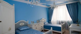
Turquoise wallpaper in the interior design of a living room, bedroom, children’s room…
The combination of wallpaper and curtains in the interior
Wallpaper in the nursery: with stars, clouds, cars, planes
Combining wallpaper for the hallway
Striped wallpaper in the hallway
Additional ideas
In addition to the proposed ideas, there are a couple more options for implementation in the interior. You can use a combination of wallpapers in the style:
- Art object . Make inserts of thick non-woven patterns on top of the main neutral background. The inserts can be decorated with beautiful moldings - in the end you will get original and stylish panels.
A piece of wallpaper can easily be turned into a full-fledged painting
- Patchwork . The most extraordinary and, perhaps, the most difficult option to implement. You need to carefully combine many small pieces into a coherent whole, while avoiding the feeling of kitsch.
Patchwork looks impressive, but is difficult to implement
Don’t forget about the now popular photo wallpapers. They can highlight a wall (most often in the dining area) and decorate the interior with a luxurious landscape, a view of the old city or a still life.
Combination rules and techniques
With the right combination, you can adjust and visually enlarge the room and emphasize its advantages. The right color and material will help you create a cozy and functional kitchen even from a small space.
The basic principles of combination are as follows:
- space correction . With the help of decoration, they not only decorate, but also improve the room. A spectacular pattern imperceptibly masks the shortcomings of the room and distracts attention from uneven walls;
- "black bottom, white up" . Paste the kitchen so that the upper part is in calm shades and the lower part is dark. In this case, the top should be 2 times larger than the bottom. This combination can be combined with mirror surfaces, other wallpapers and facades. The technique looks especially advantageous in kitchens with low ceilings;
- the ceiling as a continuation of the accent wall. The differences in color and texture clearly define the dining area in the kitchen. Bright textures look win-win;
- patchwork _ The term refers to a method of decoration using mosaics. If you have 3-4 different rolls at your disposal, then why not combine them with each other and create an original panel. The collage combines glossy and matte, smooth and textured surfaces.
How to properly design the transition of wallpaper from the kitchen to the hallway
In an apartment with a large square footage, wide corridors and huge studio kitchens, you can easily install additional doors. But there are also old Khrushchev buildings, as well as houses from the Brezhnev period, when the entrance to a small kitchen appears from a narrow dark corridor. Such a small corridor needs to be decorated, as well as the kitchen walls adjacent to it. Glue a smooth continuation of the kitchen panels, thereby increasing the area of the kitchen space. In this case, it will be necessary to remove the doorway from the corridor, as it will limit the space.
In the absence of interior doors, the boundary between the kitchen and the corridor can be highlighted using wallpaper
If there is no desire to extend the dining space at the expense of the corridor, then the former location of the door can be decorated in the form of an irregularly shaped arch with light, almost white wallpaper. But arches are currently going out of fashion.
In large apartments, the transition from the corridor or hallway to the kitchen is decorated with wallpaper similar in color to the color of the walls of the smallest room or made in contrast to the main color.
In any apartment, correct zoning and design of smooth transitions will create the integrity of the room and indicate the good taste of the owners.
Possibilities of combined finishing
Using different wallpapers in kitchen design allows you to solve different problems:
- visually expand the room;
- correct the shortcomings of the room - both small size and not very convenient shape;
- zone functional areas, which is especially convenient when combining a kitchen with a living room or dining room;
- place accents, drawing attention to certain architectural solutions;
- implement the chosen style even in a small apartment through minimal decoration and the use of the most organic wallpaper options.
Combine and choose the right wallpaper in the kitchen, ideas
Choosing wallpaper for the interior is not so easy. Here the following must be taken into account: wallpaper should be chosen not only by color, but also by texture, taking into account both the intensity of cooking and the frequency of attendance of this room:
- if you constantly cook in the kitchen, the whole family gathers there every day, and on holidays even friends, and wash a large amount of dishes, then in this case the wallpaper should be moisture-resistant and washable;
- if semi-finished products are only being heated in the kitchen, and there are rarely more than two people gathered, then any wallpaper will do, including ordinary paper and textile ones.
You need to combine wallpaper correctly, usually according to the color palette.
Advantages and disadvantages (highlight correctly)
It is in the kitchen that it is best to combine wallpaper for several reasons:
- to hide wall defects and room layout flaws;
- If necessary and desired, divide the kitchen into functional zones, which is good even for a small kitchen;
- give the interior dynamics and eliminate monotony;
- place accents when decorating the kitchen in a certain style;
- focus on the highlights of the layout: niches, bay windows, ledges, columns;
- draw attention to individual furniture groups, or vice versa, distract from something, for example, from an overly bulky refrigerator or stove.
The obvious disadvantages include the following:
- most modern wallpapers, such as textile ones, absorb odors and retain all odors for a long time;
- not all stains can be removed even from washable wallpaper;
- this is the least durable finishing method;
- the walls under most wallpapers do not breathe;
- Almost no type of wallpaper meets all the requirements.
Coverage Requirements
Wallpaper needs to be combined not only in color, but also in style.
- they should not fade in the sun, otherwise the kitchen will quickly become unpresentable;
- kitchen wallpaper should be vapor-permeable and dry quickly;
- they must be moisture resistant;
- they can be easily washed.
Wallpaper in the kitchen should be dense, because in this case it does not have a large number of pores where dirt can accumulate and microbes can multiply.
Combination with other types of finishes
A combination of wallpaper and other finishing materials looks much more interesting: tiles, bricks, concrete, painting, wood panels, cork, decorative plaster, mosaics.
There are hundreds of options, but there are a few general rules.
- 1 Same thickness. The thickness of the coatings should be approximately the same, which will eliminate problems with joining.
- 2 Do not use expensive and budget analogues at the same time. Give preference to materials from the same price category that differ in texture and color.
- 3 Same shine. For example, matte tiles look bad against the backdrop of shiny, glossy wallpaper. It is desirable that the degree of gloss be as identical as possible.
- 4 In combination with any wallpaper, even the most expensive, another finishing material still becomes accentuated. Therefore, it is better to rely on neutral colors for wallpaper.
- 5 Adhere to zoning principles. Chaotic inserts of other finishing materials around the perimeter of the entire kitchen will bring disharmony. Complement large prints with wallpapers with small patterns or plain colors, and rich colors with pastels.
You will find more original ideas for using combined wallpaper for the kitchen in the interior in the photos provided.
Everyone can find individual solutions for themselves, striking in sophistication and exclusivity.