Despite the abundance of available wall finishing materials, painting still remains relevant. Still, accessibility and simplicity of design are not an empty phrase for most owners. However, one should not think that this is where all the benefits of paint end. In fact, it is one of the most effective and expressive ways to give your interior a memorable personality. At your disposal are all the colors of the rainbow and countless shades that can create the necessary mood and atmosphere in your apartment or house. Meanwhile, very often the walls in an apartment are painted in two colors. And today you will find out why this is not a desire to complicate the color scheme of the room, but a deliberate move to create a catchy and remarkable design. Photos with popular ideas will come in handy.
- Benefits of use;
- What you need to consider when choosing paint;
- Features of using contrasting pairs;
- 6 options for using two colors in painting;
- The most popular combinations and their impact on the interior;
- A selection of photos with the best ideas for your apartment;
- Conclusion.
Benefits of use
First, let’s try to figure out what is hidden behind this undeniably noticeable trend: the indirect influence of dualism, practicality, or convenient integration into any design concept. Let's take a look at the obvious advantages of two-tone painting of walls in an apartment:
- zoning the room
- using this painting method, you can organically divide the room into functional zones, and do this with a minimum of material and time costs; - correction of visual perception
- a skillfully selected combination in a pair can help you visually make the room taller or wider, depending on the specific goal; - the principle of contrast
- without light there is no darkness, and in painting one of the shades serves as a natural complement to the other to create an impressive harmonious design of the walls; - color balance
- some shades seem boring and urgently require addition, so the use of a gradient tone can enliven the interior and emphasize some notable features in the design; - strong expressiveness
- skillful management of color pairs helps to correctly place accents in the design of an apartment using painting, muffle an undesirable effect and, conversely, bring the desired motives to the fore.
Psychology
Green is the result of mixing yellow and blue. This fact is reflected in his psychology. She is multifaceted.
Green is a reflection of the duality of the world. This is exactly what most psychologists think. Its purpose is to help in comprehending universal wisdom.
Green is the choice of calm and self-confident people. No wonder it is used as a hospital ward.
walls painted accordingly normalize blood pressure and improve the functioning of the cardiovascular system, and also have a beneficial effect on the functioning of the entire body as a whole.
Different tones and halftones of green have different interpretations. So, coniferous symbolizes stability and confidence.
In general, this information is quite interesting and even useful. Especially if one of your loved ones or colleagues has such a color preference.
For example, if a person chooses a color with a predominant shade of sage or moss, it means that he is subconsciously looking for a way to relax and calm down.
And those people who stop at shades of emerald and malachite actually want to become rich.
What to consider when choosing paint
It seems that choosing a couple of shades you like and fitting them into the interior is a trifling matter that deserves absolutely no attention. However, in reality it turns out that you need to take into account not only your taste preferences in color and the wishes of your loved ones, but also the features of the room. Let's consider the issue of choosing colors when painting walls in more detail.
- the specifics of the layout
directly affect the final result, because what is good for one apartment may seem like a creepy stylistic experiment with an unsuccessful conclusion for another; - features of lighting
- lighting has long stepped beyond the purely practical functional level, declaring its rights to full participation in interior design, and it would be very reckless not to take this fact into account; - purpose of the room
- we mean its basic functionality, which determines the nature of daily use (modern options for wall decoration in the kitchen).
Take a look at the photo where interesting wall painting led to the creation of a beautiful and original design. And if such interiors do not seem lively enough to you, then we advise you to read the article: “Drawings on the walls in the apartment.”
Choosing colors from a feng shui point of view
Feng Shui is a Taoist practice responsible for organizing space. Based on this teaching, each element has its own color:
- water (north) – black;
- earth (northeast, southwest, center) – brown;
- tree (east, southeast) – green;
- fire (south) – red;
- metal (west, northwest) – white.
Bagua - map of Feng Shui zones
According to this eastern practice, common in Asian countries, each color has a specific effect on a person and is used for different rooms:
- Yellow. Symbolizes the sun, abundance and wealth. Creates a feeling of fun, comfort, strengthens hope and binds a person to home. Not suitable for dark rooms and bathrooms.
- Red. It is responsible for vital energy, therefore it is recommended for the construction of offices, but its excess leads to the opposite effect. Suitable for delimiting space and zoning. Should not be used in rest areas, hallways or bedrooms.
- Blue. A mysterious color that develops a sense of adventure and exploration. Suitable for living room, bedroom and office areas. A bad solution would be for the kitchen, hallway and corridor.
- Green. The basis of a new life, correct activity, but light shades indicate possible immaturity. Used for children's and teenage rooms, great for purposeful boys and girls.
- Orange. Can act as an additional color in the living room or short-term recreation area. You should not paint walls in offices and bedrooms with it.
- Peach. Symbolizes calm and is responsible for romantic appeal. Suitable for a room where a teenager lives, especially a girl. A slightly diluted shade is used to paint the living room and bedroom.
- White. Symbolizes purity and openness. It is used for walls in the nursery and living room and for highlighting areas in the kitchen.
- Black. Responsible for strength and solidarity, helps create intrigue. It is recommended to use shades of black that are suitable for certain areas of the walls. Not recommended for children's, teenagers', work or recreation areas.
Due to the fact that the modern interpretation of this practice has undergone changes, many meanings have been completely adapted to current conditions and have lost their original meaning.
Features of using contrasting pairs
You may not know anything about the nature of the interaction of contrasting pairs of colors in the interior of one room, but you definitely won’t be able to ignore the effect they create. Especially if this effect does not at all correspond to the desired result. Let's highlight four active contrasting pairs of colors:
- black White;
- Red Green;
- orange – blue;
- yellow – violet.
Most often, the first combination of colors is used in the interior, which involuntarily evokes a fairly logical association in people - day and night. It is quite calm due to its spectral characteristics and is widely used in any room.
But the use of all other pairs of colors is limited only by the desire to highlight one of the walls. This emphasis is most often characteristic of modern design styles that boldly break traditions.
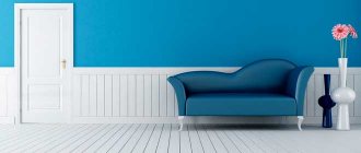
If you do not want to focus attention on any one wall, then it is best not to use such pairs of colors. Except, of course, in those cases where the use is purely contextual. Here is a small selection of photos where the contrasting method of painting walls in an apartment turned out to be successful in the context of the entire design of the room.
Before you start changing the color of the walls in the room
Without proper preparation of the walls for renovation, even the most beautiful colors of the rooms will look sloppy, and most importantly, they will not be durable. So before you decide how to paint your room, prepare the walls and the rest of the room for this complex process.
You need a lot of free space for painting. Additionally, paint dripping from a brush can damage furniture or other items in the room. Therefore, at the very beginning, make sure that all things in the room are removed from the room . If for some reason you can't do everything, take care of the rest. All objects, including the floor, should be covered with a special painting film to protect the room from possible paint splashes.
Preparing the wall for painting
A very important element is proper preparation of the wall for painting. Without this, even the most beautiful wall colors in the room will not be aesthetically pleasing or durable. To make sure the base is suitable for painting, touch the walls you want to paint. If you hear the characteristic "empty wall" sound, this means you need to apply new plaster to ensure that the colors chosen for the room stay on the walls for as long as possible.
If the walls of your room are covered with wallpaper, be sure to get rid of it before you start painting. Otherwise, applying paint to the wallpaper will cause it to get wet. As a result, the wallpaper will begin to peel off from the wall, bend and roll off. Even the most fashionable colors of the walls in the room will not save you from this situation .
How to paint a room whose walls were previously covered with opaque paint? It won't be easy to get rid of it, but it is possible. However, such a process will require a lot of effort and patience. In this case, it is better not to scrape off the paint with force, as this may damage the plaster. To make your work easier, you can use special preparations available on the market.
The most popular combinations and their impact on the interior
We bring to your attention a compact table that not only reflects the most popular combinations of two colors for rooms of any type, but also describes in detail the impact they have on the interior.
| Combination | Influence on the interior | Design style |
| Red - gold | creates a bright festive atmosphere | Classic, modern |
| Green - olive | tends towards a calm effect, brings peace and relaxation to the perception | Classic, eco-style |
| Red White | emphasizes the contrasts in the room, participates in the creation of an extraordinary and colorful interior | Loft, minimalism, modern, contemporary |
| Gray - purple | enlivens the visual appearance of the room, emphasizes the active outlook on the life of its owners | Loft, modern, hi-tech |
| Brown - olive | creates a cozy homely mood, makes the room warmer | Classic, modern |
| Beige - brown | an effective and versatile tool for emphasizing calm accents and overall harmonization of living space | Provence, shabby chic, classic |
| Red Black | Characteristic stimulating effect, recommended only for large rooms | Modern, avant-garde, loft |
| Blue - beige | The ideal balance between cheerfulness and tranquility, the necessary accents can be highlighted by lighting and furniture arrangement | Modern, classic, contemporary |
| Green - red | When properly designed, it emphasizes volume and creates a balanced mood at any time of the day. | Classic, avant-garde, contemporary, high-tech |
Some interior styles in green
Modern
The most common style of the 21st century, loved by all creators of modern design. The main palette of this trend is all classic shades. This is why green fits so well into any project.
Green in Art Nouveau style
Country
This non-standard style is characterized by a white and brown color scheme that carries woody notes of warmth. It is impossible to imagine it without a log house, stone and other natural components that simply ask for a breath of fresh air in the form of plant tones.
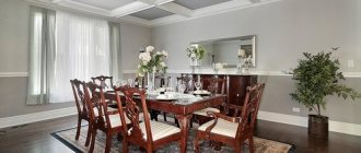
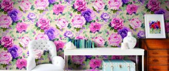
A selection of photos with the best ideas for your apartment
If you are decorating your own space, then this selection of photo designs for painting the walls in your apartment in several colors can greatly help you decide if you still haven’t come to a specific decision about the chosen couple of shades. Of course, the interior context itself influences the perception of examples. However, blindly copying its features is an approach doomed to failure. Your job is to creatively process the information you see, which will lead to the creation of the ideal design for you.
Properties of yellow color
The main features that are inherent in yellow are:
Its ability to brighten an interior that has insufficient lighting levels.
Warm yellow shades, which have a rich hue and are formed by mixing orange, visually reduce the space. This must be taken into account if you want to make bright, warm yellow walls.
As opposed to a warm shade, yellow walls in the interior will increase the space, but only if they have a cool shade.
Ideal color combinations
To make the interior harmonious and cozy, you need to follow proportions and skillfully combine colors and shades with each other. In the case of yellow, there is one basic rule that should be followed - you cannot paint large surfaces with this color, for example, the ceiling, floor or all four walls at once. You risk repeating the environment of an institution for people with psychological illnesses, which will negatively affect both you and your family members. Only thoughtful and measured use will bring an atmosphere of joy and comfort. Let's look at the colors with which shades of yellow look most harmonious:
- Yellow + white or beige- this is the most common combination. In this case, the main color will be white, and yellow is used as an additional color or for adding bright accents. It will enhance the effect of freshness and bring some joyful notes. This is an excellent option for small rooms that will visually seem more spacious and lighter. For example, for offices, small bedrooms or bathrooms. Good with white any shades can be combined yellow. If you want to keep the room feeling cool, then use cool shades, and if you want a warmer atmosphere and want “warm up” a cold room, then warm colors will come to the rescue. While with beige it is better to combine only warm tones, such as pear, saffron, golden, brownish yellow. This way the composition will be more balanced and harmonious. Many designers advise choose beige as the main color for decorating walls or floors and most pieces of furniture, and yellow to paint only individual parts or a small piece of furniture, for example, an armchair or bedside table. The neutrality of the main background will slightly muffle and calm the hot colors. This option is suitable for finishing of large rooms.
- Yellow + black + white. It is believed that this is the most extravagant combination Not many people will be able to decide on it. This is true, but this does not make such an interior any less attractive and popular. If you're not afraid bold experiments, then pay attention to this union. It is enough to dilute a classic, and even a strict black and white interior with just one yellow item, and it will never look so restrained. It could be single piece of furniture, curtains or a small rug, or large decorative elements in moderation. You will notice how literally before your eyes the room will become warmer and more comfortable. It's like a small piece of a puzzle that was so missing to complete the picture. This technique works in any premises any size.
- Yellow + green. A beautiful flowering meadow bathed in sunlight is a combination symbolizes herself nature in its best manifestations. This design will suit for the cheerful and positive personalities, who have no idea what it means to be sad. This is not surprising, because in such a room there will always be an upbeat mood. So that the room does not look too colorful designers advise using muted shades of one of these colors. Which one - decide depending on personal preferences. You will be able to maintain the desired contrast, but it will be much easier and more pleasant for your eyes to perceive the environment. Recently, such an interior has become very popular for decoration. children's rooms.
- Yellow + blue or blue - another combination borrowed from nature, which symbolizes the sun in the firmament. It is very important here to make sure that blue Not eclipsed yellow, and he did not get lost against its background. To do this, use its muted tones. These two colors are opposite in temperature. Blue is the coolest of colors, while yellow is one of the warmest. Balance such imbalance A neutral white background will help, which will make the transition less obvious. A room in these colors will be a little cool and filled with autumn mood.
- Yellow + brown - one of the most good decisions for decorating spacious and bright rooms. Noble soft chocolate shades, complemented by warm saffron tones, will create a truly refined ambience, which will be very warm and cozy. These colors are similar in tone, so you can reach full harmony. For bright yellow, choose darker shades of brown, close to black, and for muted tones, mustard is good. In the first case, it is necessary to provide good lighting. With these colors you can create a real African interior.
- Yellow + red – the most warm combination, which will be a real salvation for northern premises. These two colors are stimulants of the nervous system, so if you feel daily need to cheer up then this is exactly what will help you. To prevent the room from being too hot and colorful, it is better to give preference to muted shades that will not hurt the eyes. You can use these two colors as accents on neutral background, or you can choose one calm and soft shade, against which objects painted in the bright colors of the second will be located. For example, crimson furniture will look good against the background of pale yellow walls. Such a room will be filled with sunlight from the inside, which will always cheer up the owner.
- Yellow + violet - Very an extraordinary combination. It is not often used to decorate modern homes, which seems to us a real omission. Shades of purple so chic and varied, which can complement almost every interior, especially in Provence style or oriental style. It is recommended to use one of these colors (optional) as an accent, and the second as an additional color, giving preference to soft tones. This composition is a must balance neutral light tones. Ethnic ornaments in Mexican or Spanish style and furniture made of dark wood will fit perfectly into a room decorated in this way.
The best and winning color combinations
When decorating, it is important to consider the compatibility of different colors for walls and other surfaces. For example, all shades of beige can be diluted with red, orange, and purple tones. Gray color can be combined with blue, green, burgundy. Blue tones are in harmony with silver and bronze. There are many more color combinations, the use of which for the interior will help to decorate it in the best possible way.
It is not necessary to use two colors; you can choose three. It is important not to overdo it so that the room is easy to perceive and does not have a negative impact.
We develop the design
Imagination cannot always give the correct answer to the question of whether it is worth painting the walls in one color or another. Therefore, it is better to acquire a palette of samples of paint, wallpaper or plaster. By applying them to the wall, you can more clearly imagine how a particular shade will look on the wall. The same technique can be used when choosing a color for the floor. There is no need to be afraid to combine the shades of the walls and floor, and also to make the walls themselves contrasting and varied.
Dividing rooms into separate zones, highlighting the wall on which the window is located, or a more distant wall. All these techniques help eliminate deficiencies in the layout of the room using the most accessible methods.
How to combine walls and floors
Modern flooring materials, as a rule, have shades that can be ideally combined with literally any walls. Don’t be afraid to make the floor more contrasting, for example, combine a dark floor with light tones, and vice versa. Beige tiles will look great with a dark brown floor, and a deep blue shade will look great with sand.
The floor shade does not have to be from the same palette as the walls. Contrast is not only fashionable, but also an advantageous technique that can be used for both floors and walls. The main thing is not to be afraid to experiment.