Combination of shades
What wallpaper goes with orange wallpaper? It is not difficult to answer this question, since shades of orange can be combined with tones of different saturations .
In combination with a cold palette, the orange color will be muted; when combined with light shades, it will become the main accent. The combination of orange and other bright colors will emphasize the emotionality and energy of the interior, so you should be careful with this design.
Tip: an interior with orange wallpaper for the walls will be harmonious if you use light shades in at least some areas of the room. They will balance the color scheme and make your room more delicate and soft.
A room with orange wallpaper will look stylish and original in combination with many colors:
- orange-green wallpaper will highlight the summer atmosphere and make the interior cheerful. Such combinations are best used in rooms intended for active pastime (children's or living room). In the kitchen, such wallpaper will whet your appetite, and in the bathroom – it will charge you with vigor and energy;
- White and orange wallpaper is more suitable for modern design trends. White color can become the background color: then it will brighten the room and make the space wider. Orange patterns will add brightness and expressiveness to the wallpaper;
- You can dilute the overly bright orange palette by using beige-orange wallpaper. The tandem of these shades is suitable for any interior in your home, because it looks both bright and calm at the same time;
- a similar effect will be obtained when using gray-orange wallpaper. Cool gray tones will balance the brightness of orange, but will not outshine this shade, so the accents in your interior will remain the same. The combination of bright shades with gray is especially popular in high-tech interiors;
- a combination of orange and blue shades will create a lively and natural interior. Such combinations will look most harmonious when using pale blue shades that do not create bright accents;
- combinations of orange and blue will appeal to lovers of creative designs. A harmonious combination of these shades is possible only when using warm and calm blue tones. Bright blue, on the contrary, will create excessive contrast in the room and cause discomfort;
- You can get closer to nature with the help of yellow-orange wallpaper. If you like monochrome styles and want to decorate the room in one color scheme, choose yellow, sand, cream and other similar tones. Such wallpaper looks impressive next to wooden furniture;
- Orange and black looks interesting : as a rule, it includes thematic patterns and is used on one of the walls to create an accent. The combination of such powerful shades requires the use of at least one light tone that will dilute the gloomy atmosphere. Most often, wallpaper with elements of black and orange colors is found in modern interiors.
Many more interesting color solutions will make your room more energetic, bold and cheerful, or, conversely, calm and emphasize a light and relaxed atmosphere.
How the color of wallpaper affects the psyche
Many people have known since school days that green wallpaper and shade in general have a calming effect. How do other colors affect the psyche?
- Orange color creates a tonic effect. Suitable for a room that is not intended for rest and relaxation, such as the kitchen
- Gray wallpaper is well suited for creative people. They don’t distract and get you ready to work
- You need to be careful with black color, because it can make you depressed. It is better to choose wallpaper of two colors with a black shade, diluting the dark shade with something light or bright
- Yellow wallpaper also gives energy and activity.
- The pink shade adds romance and sentimentality to the room. Therefore, pink wallpaper is preferred by vulnerable people. By the way, this color will fit well in the bedroom
- Blue color helps you concentrate on business and be attentive. Great solution for a work office
Color combination for the bathroom
The compatible colors in the bathroom interior are a combination of blue and blue shades with a white background.
These colors give a feeling of freshness and cleanliness, which is so necessary for the interior of the shower and bath area.
Wallpaper color and purpose of the room
An important factor when deciding which wallpaper color to choose is the room in which the pasting will take place.
For example, a calm wallpaper color is more suitable for a bedroom. It would not be very appropriate to put red in places where a person needs to rest and relax. But in the living room, a red tint will come in handy.
The shade of wallpaper can have both a positive and negative perception of the room. Therefore, already at the purchasing stage, you need to carefully plan how you want the room to look.
Note!
Glass wallpaper - what is it? Pros and cons, types, features, characteristics, photos of design and combinations in the interior
Plain wallpaper - 150 photos of modern design. Rules for choosing and combining wallpaper in the interior: kitchen, bedroom, living room, hallway
Wallpaper framed on the wall in the interior: photos of original design and beautiful decor
Red color and its shades
Saturated red color causes irritation and even aggression. In its pure form it is practically not used.
Red color is used only to create contrast, to highlight or emphasize any detail in the interior. Pairs well with neutral shades (blue, gray, beige).
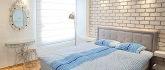
Wallpaper color for the bedroom
The bedroom is a place to relax, so the shade of the walls should promote relaxation and restful sleep. Wallpaper in white or any other pastel shade is suitable for this room.
Blue is known to have a cooling effect, so this color would look appropriate in a bedroom. It will have a calming effect on the nervous system, helping to keep it in good shape.
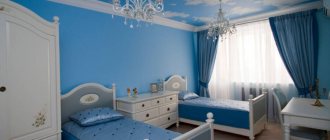
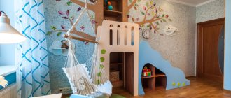
Wallpaper color for a children's room
In a children's room, as a rule, there are several zones - for relaxation, play or study. You can delimit each wallpaper with the color of a specific section. So, the sleeping place can be covered with wallpaper in pastel colors, and the area for games or study can be covered with bright colors.
Young children can choose wallpaper with drawings, for example, characters from fairy tales or favorite cartoons; school-age children are more suitable for wallpaper in calm shades, which will set them up for serious and attentive study.
The best color compositions
When designing an interior, when the walls of the room are in an orange palette, it is important to follow the principle of the correct combination of colors. To create a harmonious interior, you should not use several shades of this bright color option in one room.
Designers name several shades that look harmonious with orange. All of them are divided into the following categories:
- neutral;
- achromatic;
- warm;
- cold.
The neutral category consists of natural beige shades. Moreover, they can be either warm or cold. Designers recommend giving preference to the first option of the beige palette. If you decide to decorate the walls of your living space in bright orange, use products made from MDF or milky plastic as furniture. Fans of discreet classics should take a closer look at furniture made from light wenge, ash, muted shades of maple, beech, alder and elm.
Achromatic colors are white and black, different shades of gray. “Orange” of any shade will look harmonious with these colors. The orange color against a dark background becomes brighter and more saturated, but at the same time it does not cause discomfort or aggression.
The neutral group consists of green shades. When designing your interior, you can choose green-orange wallpaper with various patterns. Green abstract or floral motifs on an orange background look interesting. When arranging your kitchen, you can choose a light green, pear, or mint kitchen set. If you have set yourself the task of making the interior more fresh so that it is associated with a spring mood, combine “orange” with lime, avocado, and forest greens. You shouldn’t give up on dark shades of green – emerald, malachite, olive, khaki, fern. They will bring a feeling of calm and stability to the environment. Such color combinations would be especially appropriate in a children's room and bedroom.
Cool shades are blue and blue, which are available in many different options. In the interior of an apartment or house, wallpaper in orange tones is best combined with items made in a purple palette. What cool shades does orange go with? You can choose amethyst, wisteria, indigo, sky blue, cornflower blue, sea wave, denim.
If you want to turn your home into a sunny, warm and cozy corner, feel free to choose orange shades for wall design. To achieve harmony in the interior, adhering to the basic rules and recommendations of experts.
Wallpaper color for the kitchen and hallway
The kitchen is a place where constant dirt appears, so the choice of wallpaper needs to be approached not only from an aesthetic, but also from a practical point of view.
Wallpaper in the kitchen should be washable. Bright and cheerful colors - orange or yellow - will fit well. Also, such a beautiful wallpaper color will whet the appetite of household members and guests.
Corridor rooms are usually covered with dark wallpaper. You can combine dark shades with light ones. But there should not be a big contrast between the walls in the corridor and the rest of the surfaces in the apartment.
Color wheel and its variants
For the convenience of designers and artists, a so-called color wheel was created, containing three levels and allowing for optimal combination of color components.
Another option used in practice is a color table. With the help of the presented tools, any apartment owner can successfully select colors for interior design: contrasting and neutral motifs.
And educational tips from leading designers teach you how to correctly combine colors in the interior.
How to choose wallpaper for furniture
When choosing the color of wallpaper for furniture, there are also some nuances:
- If the furniture is old, then it is better to make the walls in bright colors so that all attention is focused on them
- New furniture can easily be combined with light shades on the walls. Then all attention will be drawn to the furniture, and you can dilute the interior with a bright spot in the form of decor or the same furniture
Sometimes one of the walls is made the main one, choosing an accent for it in the form of a different color of wallpaper. In this case, the furniture can be selected specifically for this shade.
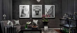
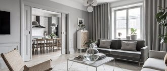
Color combinations for the living room
The living room is usually one of the largest rooms. The abundance of light and rich colors will be an advantage.
When choosing colors for upholstery materials and interior decoration, preference is given to the following tones:
- Dark blue colors combined with blue notes or sharp contrast in the form of gray and yellow.
- True gray is used in some design styles, such as modern.
- Beige and chocolate shades go well with white tones.
Designing a color composition is a rather complex process. To optimally combine colors in the interior of an apartment, you will need training in the form of a small creative experiment.
Combination of furniture and wallpaper tones
- 1) White furniture is always universal; it can be matched with both light and dark wallpaper. One nuance needs to be taken into account: with similar shades, the furniture and the wall can merge. In this case, a bright accessory on it, for example, a painting or panel, will help to highlight the wall.
- 2) Brown furniture can symbolize both natural shades and carry a classic style. In the first case, wallpaper in natural shades will go well with the furniture. In the classics, it is good to combine beige or burgundy colors
- 3) On the contrary, light walls should contrast with dark furniture. Ornament may be present, but it should not be too flashy
- 4) Furniture of different colors, for example, a kitchen set, goes well with pastel colors. A drawing may be present. To avoid scattering of colors, the pattern on the wallpaper should be the same color as the furniture
Furniture and walls should not only be combined with each other, but also emphasize the advantages of the room and hide its shortcomings.
If you have doubts about color compatibility, then a color harmony table can always come to the rescue.
Choice for the bedroom
For the bedroom, you need to focus on the fact that the day will begin with this room. And a person’s mood depends on what color of wallpaper is used. It should be noted right away that aggressive colors are prohibited. There will be no quality sleep, and annoying ones will lead to frustration and quarrels. Too minor will also not lead to anything good, since the room should not turn a person into a lazy creature.
You should immediately consider a selection of popular shades:
Blue relaxes and calms
- Blues are often chosen because they are calming, despite their coldness. You can only use light blue, not blue. Blue is allowed only for compact rooms - it can visually expand them.
- The mood of green is perfect for the bedroom. Color gives relaxing emotions, relieves stress, and allows you to relax.
- It’s not for nothing that universal ones have such a title - they can be used everywhere. You can combine anything with white. The room will be light and open, but if there are other shades along with white. Having only white will make the room look impersonal. This is a good option for small bedrooms. It goes with most popular colors. These can be used in bedrooms with poor lighting.
- The use of yellow compensates for this deficiency. Like white, brown can be classified as a universal shade. It will never go away in reality. It has the most positive impact. In such a room you can relax.
Brown is a universal shade
Are there any conflicting colors for the bedroom?
There are several colors that can be used in the bedroom under certain circumstances. But we must immediately make a reservation – the colors are contradictory. For example, this is red wallpaper. It is the color of aggression, leadership and dominance. Leaders and easy-going people like him. The color is most often used in the living room, but it can be used in the bedroom as well. But then the red wallpaper will need to be diluted with a light finish.
Blue is cool. It definitely needs to be diluted. Otherwise, blue wallpaper will cause melancholy and depression. For small bedrooms this is prohibited.
Blue only for large rooms
Black can overwhelm its richness, so splashes of beige or white are a must. A completely black interior for a bedroom is unacceptable.
Cardinal directions for the bedroom
As for the living room, the cardinal directions play a big role in the bedroom . Especially if the apartment owner is interested in Feng Shui. If the windows face south, then there will be no problem with light. After lunch there will be too much light, so you need to absorb it:
- blue;
- purple;
- terracotta.
All of the above rules are relevant only for spacious bedrooms. There is no need to use dark ones for compact bedrooms. When the window faces north, there will be a lack of light. Then even opening the curtains will not greatly improve the situation. You will need to use wallpaper in a beige, gold or yellow shade.
Bohemian style
Color combination of wallpaper and furniture
It is customary to plan the overall range in advance, so that in practice you do not end up with a frankly unsuccessful combination of finishing materials and furniture.
- For light furniture, you need to choose materials to match. Such wallpaper can be golden, white and beige wallpaper. In rooms with large walls you can play with contrast. That is, you can use black furniture and white wallpaper and vice versa. Warm and cold shades cannot be mixed under any circumstances.
- As for dark furniture, it refers to warm furniture. Accordingly, cool shades cannot be used in wallpaper. Suitable colors are white, sand, ocher, brown. Furniture should act as a secondary material, while wallpaper will be the main element.
There are also some bold solutions to add some light color to a dull interior. You can try combining different types of wallpaper. The point is that you need to use the same pattern structure. Colors can be any. You can make a vertical or horizontal position, as well as inserts and niches.
Horizontal stripes are good for zoning a room
Horizontal stripes are used to zone the room. At the bottom of the room, dark wallpaper with a dynamic pattern is used. At the top of the room there will be calm tones. Vertical stripes can be made monochromatic. The width of the stripes can be selected to be the same as the dimensions of the bed. The material can either reach the ceiling or go beyond it. Inserts are required to highlight space. The area above the bed is often highlighted.
Advice If there is a niche in the room, then it is worth making it the same as the other walls.
Wallpaper and interior
When choosing the color of wallpaper, many people forget about the ceiling in the room. If the ceiling is painted in a non-standard white color, then it must be taken into account. For example, brown wallpaper will not look good with a blue ceiling.
You should remember the rule that it is better to choose cold shades for cold shades, and warm ones are combined ideally with warm shades. A white ceiling will match any wallpaper color.
Based on the color of the doors, they are also chosen according to the principle of being one or two shades lighter. Curtains can be made a bright accent, which will differ from the color of the walls by several shades.
A non-standard approach to choosing wallpaper colors
If you plan to do renovations in the room frequently, and the furniture is selected to be universal, for example, white, then you can buy wallpaper for painting. This will make it easier to change the interior; the wallpaper will not need to be re-pasted every time. Simply repaint them and the room will sparkle with new colors.
Now there are chameleon wallpapers that change their color under the influence of certain factors, such as temperature.
Someone continues to follow the traditions of Feng Shui, arranging the interior according to its canons. In this case, the bedroom is pasted in red, the nursery in yellow, the living room in beige, and the kitchen in white. According to Feng Shui, these colors have a beneficial effect on the energy in certain rooms.