Interior design features
Pink color has a calming effect. However, an overabundance of this shade in the interior can be a serious mistake. There are no uniform canons for decorating rooms in pink tones, but some features of using this color should be taken into account:
- light tones of pink can visually expand the room;
- Furniture in solid dark tones looks good against the background of pink wallpaper;
- to avoid the dollhouse effect, you should use at least three non-conflicting colors in the interior, but lack of moderation can ruin the charm of the design idea;
- in the rich palette of pink shades there are both warm and cold tones;
- by choosing wallpaper in soft pink shades, you can safely play with bright accents in your choice of furniture;
- if the room has low ceilings, zoning with companion wallpaper will add height to the space, and one main wall, decorated with wallpaper in pink tones, will add light and grace to the room.
Rich or soft pink background in rooms for different purposes
Warm pink tone improves appetite. However, you should not overload your kitchen space with rich marshmallow shades, as this can lead to an addiction to sweets and lead to excess weight gain. The best solution would be a muted soft pink shade of wallpaper, which will awaken the creative potential of the young housewife and push her to new culinary exploits. The pink background of the walls can be complemented with stenciled contrasting inserts in white, blue, orange or green.
Wallpaper with pink shades will make the bathroom interior fresh and cool.
In a pink kitchen, light kitchen sets in white, blue and light brown look best. Textile and decorative elements in fruit and berry colors will complement the overall mood: apricot, apple and strawberry. Photos of pink kitchens clearly demonstrate different approaches to interior design.
When choosing pink wallpaper for the bedroom, it is better to give preference to muted shades that will soothe and promote relaxation. The neutral color scheme should also be reflected in the ceiling and floor designs. Bright accents can be created with the help of rich, eye-catching textiles and decorative accessories. The pink tone should be barely visible in the interior. This solution will avoid the feeling of being in a dollhouse.
Pink wallpaper is perfect for decorating a girl’s children’s room. A good effect will be created by materials with cute patterns in the form of bows, flowers, and stars. This solution helps create a fabulous atmosphere in which the baby will grow up cheerful and calm.
A pleasant and cozy interior in the living room can be created using muted shades of pink. Against this background, white or gray furniture looks most advantageous, which will give the room a special flavor. Brown and black decorative elements will also help to play up the velvety and softness of the pink hue. An accent wall trimmed with pink wallpaper looks elegant and modern, and stands out against the overall light pastel background.
Pink tones can fill the bedroom interior with warmth and comfort.
For the corridor you should use calm, muted tones. This finish will go best with wooden furniture and dark brown doors.
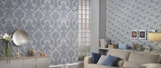
If pink wallpaper is correctly combined with products of a different color, they will not look boring and childishly primitive. Depending on the chosen shade, you can create a light or strict, sophisticated or romantic, calm or cheerful interior that will help you relax, set yourself up to achieve new heights, and also give joy and carefreeness to the inhabitants of the house.
Types of wallpaper
When choosing wallpaper for wall decoration, many focus solely on appearance, color and texture, bypassing such an important selection criterion as material. There are many varieties of this popular coating. Some of them are suitable for a budget option, others will be appropriate in a rich interior.
Liquid
Eco-friendly and safe, liquid wallpaper is an adhesive cellulose mixture. You can add various decorative components to them, which opens up unlimited possibilities for bright creative solutions.
Photo wallpaper
Thanks to high color resolution and long-lasting colors, photo wallpapers will bring the gentle charm of spring, the colors of a mountain landscape into your home, or help accentuate the selected area with bold abstraction. Pink photo wallpaper is a great opportunity to use rich floral prints.
Non-woven
Breathable, with a reinforced structure, non-woven wallpaper can be easily repainted. They have a wide variety of textures.
Vinyl
A type of non-woven wallpaper with increased strength. Convenient for use in rooms with high humidity - for example, in the kitchen. Well-proven silk-screen printing is performed on the basis of vinylized paper. The PVC coating is washable.
Paper
Still one of the most popular varieties due to its affordable price.
Textile
Due to their respectable appearance, such wallpapers are used mainly in classic interiors. Thus, glamorous pink wallpaper with gold ornaments is an irreplaceable detail of an Empire style interior.
Some rules for combining
Even those who have not yet figured out in practice how to combine two types of wallpaper may not worry about the final result of their design, since knowledge of the basic rules of combination will help you highlight the positive aspects of the interior.
Tip: the selection of wallpaper in two colors must be carried out with one important condition: the materials you choose must have common features. It is not at all necessary that it be the same composition of materials or the size of the canvas. It is much more important to maintain consistency in shades, textures or themes of the drawing.
Quite often, an interior with two wallpapers looks contradictory due to the inconsistency in the style of such materials. For example, wallpaper with classic patterns will not look harmonious next to modern 3-D photo wallpaper. The unity of styles should be manifested both in the materials themselves and in the harmony of the combination of colors of wallpaper and furniture for your room, therefore the decoration and design of two-color wallpaper is carried out after the purchase of furniture and accessories.
A design of wallpaper of two colors does not have to include only plain coverings
That is why it is important to maintain the harmony of the patterns on the canvases that you paste next to each other. For example, combining wallpaper with flowers and wallpaper with large geometric shapes will create an aesthetic imbalance
Advice: to prepare for the process of creating such combinations, discuss your idea with specialists or look at photos of combining wallpaper of two colors with ornaments and thematic designs.
Correctly combined wallpaper is the key to creating a spectacular and stylish design, as well as the ability to correct the shortcomings of your interior. Let's see what effects are possible when wallpapering two colors in the interior of one room.
Stylish design ideas and drawings
The end result should not rely entirely on fashionable design ideas - first of all, it should please the owners of the house. However, the main trends in stylish ideas are worth studying in order to avoid common mistakes in home decoration.
Do not consider plain wallpaper boring: against its background you can get the most advantageous solution in the interior. For small rooms, pink wallpaper in pastel colors is the only right option. Any other tones or pattern will visually reduce the already small space.
Wall coverings with geometric patterns are an indicator of the impeccable taste of the owners. Modern trends allow the use of wallpaper with geometric abstraction in any room. The Burberry cage is more suitable for a hall or a cozy living room, and pink wallpaper with thin stripes is an excellent solution for a small hallway.
Floral wall coverings are a constant companion to the rustic Provence and country styles. The main trend of the last season is creating a garden effect indoors. Photo wallpapers are ideal for this purpose.
- Prints with tulips are the best option for the bedroom.
- It is appropriate to decorate a hall or living room with coverings with orchids or roses.
- Lush pink peonies with emerald-colored leaves or delicate Japanese sakura are an interesting solution for the kitchen and dining room.
Pink polka dots
This wallpaper is suitable for a charming girl’s children’s room.
With hearts
Romantic natures and creative personalities will feel comfortable in an interior with hearts. Delicate wallpaper with small prints is perfect for a married bedroom, and multi-colored asymmetrical hearts will fit perfectly into the interior of a teenage girl’s room.
Under the tree
Wood is an expensive, voluminous and labor-intensive material to install. But some interior styles cannot do without wooden textures in wall decoration. In addition, such motives have a pacifying effect and look very respectable.
Marbled
Vintage and retroclassics involve the use of natural finishing stone, which is not entirely convenient in a modern apartment. An excellent alternative is to zone a room with a monolithic marble slab at the price of regular wallpaper.
Nature
Pink sunset is perfect for a bedroom headboard. Imitating clouds directly on the ceiling in the nursery promotes the development of imaginative thinking in children. And bright butterflies and funny animals on the walls will enliven a boring room.
Birds
A style accent in strict minimalism, rich shades of tropical parrots in a nursery or cute floral and animalistic designs in retro style - wallpaper with birds will bring joy and optimism to any interior.
Shiny
Gold wallpaper with sparkles will harmoniously fit into modern interiors, and silver ones feel great in the company of chrome parts and glass.
With inscriptions
Letterism is a characteristic wall covering for rustic, shabby chic, Provence, and country styles. Vintage and modern can also include elements of inscriptions. It is important to choose the style and color. And large inscriptions will soften and decorate brutal interiors.
Under the brick
It is traditional to use such decor in the kitchen, but the ultra-fashionable loft style expands the possibilities of using such wallpaper up to the bedroom and living room.
How to use gray wallpaper in the living room?
The combination of gray wallpaper with purple and lilac accents looks pretty good. Such accents add liveliness, emotion and, oddly enough, warmth to the design, although this shade is generally considered cool. When giving preference to this tandem, you need to remember two rules. Firstly, there should not be too much lilac, as it is a very strong color, and even in small quantities it has a noticeable effect on the overall emotional mood in the room. Secondly, the brighter the lilac color is used, the darker the walls should be. Gray wallpaper in the living room combined with purple pillows and a rug will be a pretty good and harmonious choice from an emotional point of view.
Photos in various styles
Provence
The sweet charm of the French countryside is reflected in pastel, sun-bleached tones, floral motifs in textiles and wallpaper, and dusty pink shades.
Shabby chic
Noble antique wallpaper with imitation wear is most often decorated with roses, which are indispensable for this style. If the interior is already overloaded with flowers and frills, shabby chic wallpaper can be plain, but invariably light. Dusty rose or pink peach are the characteristic shades of this style.
Classic
A style that will never go out of style. Time-tested proportions and color combinations are suitable for spacious rooms with high ceilings.
Fast and safe - pink furniture and accessories
The solution, of course, is simpler and less demanding is to use furniture and accessories in pink. A beautiful Scandinavian style nook or sofa will allow you to bring not only color but also elegance. A bright piece of furniture with wooden legs feels light, which is very useful if you don't want a pink living room interior.
Of course, once one piece of furniture is installed, no arrangement is complete, so be sure to invest in pink trinkets and decorations. You can change the color of the flower pots, hang a painting or design above the sofa in a similar tone, or place a rug that resembles a pink cloud on the floor.
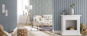
Shades of pink in the interior
Among the rich palette of pink shades, everyone - from a young girl to a brutal man - will be able to find a suitable tone.
Light pink
Ideal for incorrigible dreamers and romantics. An exceptionally girlish color, at first glance, in combination with strict gray will look advantageous in the hall and dining room.
Light pink
An excellent choice for a child's room. Having a positive effect on the emotional state of the child, light pink can be used both in a newborn’s room and in the apartment of a teenage girl.
Powdery
A muted, soft powdery shade of pink is perfect for the bedroom. Can be used in any style, including harsh Nordic ones. This color brings freshness and warmth.
Crimson
Juicy, sensual raspberry is perfect for bright accents in the interior.
Pale pink
A palette of pastel pale pink tones will give the interior of the room softness and ease, make it romantic and fill it with light.
Dirty pink
The color of a faded rose will suit aristocratic natures, especially in combination with gilding and glass.
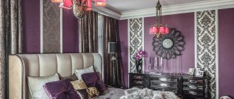
Dark pink
The shade of purple wine cannot be an independent color in the interior, but its measured use will elevate and decorate any room.
Ash pink
Warm natural shade. Feels good in the company of such aristocratic colors as white, gold, and wood.
Pink dreams
A bedroom in which the main color is pink is very bold and unusual, but in order for a man to live in one, several conditions must be met:
- Use pink-peach, any ash-pastel shades.
- Pair with dark chocolate. It is even possible to use pink wallpaper: furniture and decoration will give the room stability and some brutality.
- Maintain moderation in decorative elements.
With the help of pink it is possible to make the bedroom ideal, the way you personally see it. If you want an active morning, use white color with its tonic effect as a companion. Acceptable for pastoral and modern styles. The combination of powdery shades with delicate greenery and olive will add naturalness, freshness, and comfort. Adding blue and white shades at the same time will make the room look more spacious. This is relevant if the bedroom, in addition to a relaxation area, provides additional functionality, such as a work area. Light and space will be brought by accent colors of pillows, bedspreads, curtains:
- turquoise;
- light green;
- light emerald.
If the bedroom is constantly flooded with light (windows to the southeast), the “cooling” function will be taken over by purple-pink and other cool shades of purple-pink design. The opposite desire - to give more warmth, is possible with the addition of a golden color. Option: bedroom interior with pink wallpaper and golden textiles - pillows, ottoman upholstery, headboards.
Combination with other colors
By combining the pink palette with other shades, you can get spectacular solutions that are suitable for the planned style of the interior.
With blue
Morning dawn - a fresh and cool combination of pink and blue is perfect for a bathroom or bedroom.
With gold
Vintage chic and grace - this is the effect pink and gold give.
With purple
Pink in a duet with purple feel great together. This tandem can be complemented with shades of white and chocolate.
With yellow
It is believed that these two colors do not mix well due to their similar temperatures. But it’s not for nothing that in the East, homes were decorated in these very colors. A sunny mood in such an interior is guaranteed in any weather.
With beige
A good combination for a bedroom or nursery. A gentle duet will help you find peace of mind.
With gray
A fashionable but very delicate combination that looks harmonious in a classic and modern room.
With mint
A combination of pink and mint tones is suitable for a modern interior.
With white
Pink and white is a delicious classic, reminiscent of lush pastry desserts and vanilla dreams. Suitable for decorating kitchens with rural motifs and delicate children's rooms.
With turquoise
Fashionable, fresh pair. The contrast of warm and cold tones combine perfectly, bringing harmony to the interior.
With brown
Cinnamon, chocolate, tea tree adequately set off the weightless, marshmallow shades. In a kitchen in these colors, any dish will seem tastier.
With blue
In bold interiors, this pair looks especially bright if you add gold and coral tones to it.
Recommendations from professionals - methods for combining shades
Only a room design thought out to the smallest detail looks harmonious and life-affirming, so it’s worth listening to the advice of experts.
Monochromatic range
Curtains of monochromatic gray tones fit organically into a room made in green, lilac, lilac or burgundy tones. The layout and size of the room are not particularly important.
In order not to spoil the interior when decorating with plain curtains, there are several professional tricks and nuances:
- Gray goes best with walls in milky or neutral pastel shades;
- the silver tint will add visual shine and gloss to any surface that is nearby;
- dark colors can be used only if there are enough sources of artificial lighting in the room, as well as a lot of chrome or glass products;
- Rich graphite is not recommended for use in the interior of a living room, but in the decor of eccentric bedrooms with the addition of bright attributes it is quite justified.
Professional designers are able to harmoniously combine up to 5 strong colors in an interior, but it is better not to try such experiments on your own.
Too much decor begins to have an oppressive effect, causing attacks of aggression and irritation. Sometimes fabric or interesting drapery in itself is a sufficient decoration.
Using shades of different colors
A popular trend today is eclecticism. This mixture of styles and trends gives very interesting results. Combined curtains are functional and practical. As an option, long canvases of gray, gray-turquoise and turquoise on each side of the window.
Or another option - two types of tulle - the main one in the form of curtains with a pattern and the background one. Roman blinds combined with tulle are a very popular and practical combination. They decorate rooms with a balcony, a bay window, and small windows where it is simply impossible to attach a regular cornice.
Yellow-gray compositions look relevant and fashionable. They can be present on the same canvas or on different types of curtains, and for harmony you can add several pillows of the same color to the sofa.
Gray curtains and contrast
Modern trends do not prohibit the use of bright, acidic, variegated shades in the interior. Bedspreads, pillows or ottomans in lemon, orange, pink against the backdrop of calm curtains will add a touch of joy and bring a feeling of harmony and comfort.
It is important not to forget about some rules:
- There should be no more than two bright shades (ideally one).
- Two or three decorative items with aggressive colors are enough.
- If bright spots are suddenly removed, you can become depressed. In this case, another option should be considered.
Each interior in this color is unique and unique. Gray is a harmonious middle ground between white and black, between light and darkness, it is a symbolic balance and restrained expression. And the curtains in the apartment only confirm this inner harmony.
Photo examples in the interior of rooms
Among the variety of shades of pink wallpaper, there is sure to be one suitable for the most sophisticated interior. Ready-made ideas for decorating rooms will help you imagine the final version.
In the kitchen
Pink wall decor in the kitchen is a delicious solution. You should be careful - pink color improves mood and increases appetite.
In the bedroom
Peace and tranquility are the prerogative of pastel shades of pink. In such a room love will invariably reign.
In the hallway and corridor
The ability of pink to expand space is indispensable in a cramped hallway.
In the children's room
The classic design option for a nursery is soft pink tones.
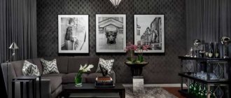
In the living room
Dusty pink combined with noble gray looks chic. Other pink color combinations for the living room depend only on the preferences of the owners.
Pink wallpaper on the wall: pros and cons
Pink looks good not only in the nursery.
Some people like it for its airiness and lightness, while others think that it is too cloying. This shade is suitable for decorating a living room. This color is gentle, warm, and is used to add romance and sensuality to the interior, giving a feeling of warmth and comfort. It promotes relaxation and puts you in a creative mood.
The rooms are also decorated in a monochrome style, while the walls should be covered with coral, pearl, apricot materials, and the installed set should be darker, for example, a flamingo shade.
If the set has a pearl color scheme, then the walls can be made darker - lilac, purple. A very light cream carpet will look good in such a room; it will tone down the overly dark walls.
Most men do not like this color. Therefore, you should not use such coverings in the matrimonial bedroom.
It must be remembered that other colors can be added to pink materials: white, beige, yellow, brown.
Features of color selection for interior elements
Successful color combinations can transform any room, pushing the boundaries of imagination.
Curtains
Depending on the purpose of the room and the desired effect, pink wallpaper can be safely combined with café-au-lait curtains, snow-white heavy curtains or olive curtains with geometric patterns.
Furniture
Pale pink is a good background for Cremona oak furniture. Light-colored furniture goes well with deep pink shades.
A white sofa against a background of salmon wallpaper with patterns will appeal to people who value comfort and luxury.
Floor
Pink works well when paired with contrasting colors. The choice of color depends on the overall style of the interior, but a universal option for flooring paired with shades of pink is gray laminate or carpet.
Is it possible to use patterns on curtains in a room with pink walls?
Faced with a variety of ornaments and patterns, most people get lost, not understanding what options can be combined with pink wallpaper, and opt for plain curtains. This is actually a big omission. If you choose the right pattern, you can literally breathe new life into a familiar or too simple interior.
There are a number of rules to keep in mind.
- The oriental ornament will require support from other furnishings. At the same time, the pattern should not immediately catch the eye and come to the fore. This can be avoided by using additional plain curtains or a massive lambrequin.
- Stripes will be a win-win option. Using the color of the wallpaper will give the room a finished look. Simple canvases with alternating gray, pink and white vertical lines look very fresh.
- Floral motifs do not give up their positions. You can choose curtains in the shabby chic style with a pattern that imitates blurry watercolors, or bright, playful curtains with clear floral motifs.
Pink color does not accept chaos and uncertainty, so it is better to abandon abstractions and geometric confusion.
What to combine with
Pink-orange interior
Warm pinks and pastel oranges go well together. A room covered with such wallpaper turns out to be cozy and sunny:
The popular “pink nude” wallpaper is neutral in itself, and to “live up” the interior, you can use orange accents, but more juicy ones:
A bright, cool color can be offset with another warm tone, and orange accessories are perfect for this:
Pink-red interior
Bright colors of wallpaper - fuchsia, magenta, cyclamen and others, look good in an interior with rich red or burgundy:
Pale pink and red, burgundy colors also create an interesting, contrasting combination:
Pink and red wallpaper in the same interior can give a fantastic effect:
To create such an interior, you need to use deep, rich red wallpaper.
Adviсe
- If the apartment has light furniture, then the wallpaper should be darker, for example, coral.
- If the bathroom is large in area, then it is worth covering 2 walls with pinkish wallpaper.
- In the kitchen, a combination of coral with orange, green, snow-white, and blue will look best.
- Curtains in color and style should match either the furniture or the color of the wallpaper. If the room has a coral or pearl shade and there is dark furniture in it, then it is better to hang light curtains: snow-white, cream, light beige, pale blue made of organza or tulle.
- If the wallpaper is coral and the furniture is lighter, then curtains that have the same color as the furniture look best. If the apartment and furniture are in pearl tones, then it is better to hang curtains in bright or dark colors.
When decorating the walls in pink, you should furnish the room with furniture: snow-white, beige, yellow, brown. Pearl tones make the apartment visually larger and have a calming effect. And magenta and lilac will contribute to the appearance of energy.
Expert advice
There is no clear opinion on the use of pink wallpaper in interior design; some people like this color for its lightness and airiness or for other reasons, and there are those who consider pink shades too cloying and “girly”.
Men and women also perceive pink wallpaper for wall decoration in completely different ways.
Most men reject pink color when decorating walls, perceiving it as doll-like and too cloying. For this reason, you shouldn't consider decorating the matrimonial bedrooms with pink wallpaper, but using more muted tones of this color for the walls of the kitchen or living room can be an excellent compromise option.
Fuchsia, fresco and strawberry: 70+ trendy wallpaper colors in pink tones
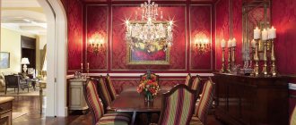
Dark fuchsia in the dining area
Using shades of pink, you will be able to create a truly gentle and harmonious interior. Such walls are at the same time moderately bright and at the same time calm, they are non-standard and fresh. Don't think that this color is only suitable for girls' rooms - its potential is truly enormous, as is the palette of options, ranging from discreet coral to bright fuchsia... See for yourself!
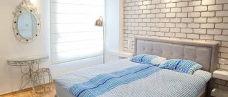
Pastel colors will have a beneficial effect on your quality of sleep
Coral ornaments perfectly refresh the bedroom
Modern and balanced nursery design for girls
Bright, contrasting dining room interior