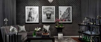
Finishing materials
Wallpaper
Wallpaper is the most affordable wall decoration material; it hides uneven surfaces and light cracks. Wallpaper can be plain, with a floral or other pattern in a contrasting color, liquid with gold threads and the addition of shiny chips. Depending on the density, there are paper, vinyl and non-woven materials. If the walls are not level enough, you can use glass wallpaper for painting and create your own design.
The photo shows a living room interior with non-woven wallpaper with decor that matches curtains and textiles.
Photo wallpaper
Photo wallpaper in the interior on an accent wall in gray color is suitable with the image of a pencil sketch, photograph, city, monochrome drawing.
Brick
A brick wall is suitable for a loft style and kitchen backsplash. Can be painted or natural grey. It is better to limit yourself to finishing one wall with brick and combine it with colored or white wallpaper.
Painting
Painting is suitable for smooth walls of the kitchen, living room, bathroom and corridor. Latex, silicone, acrylic and modern eco-paints are suitable for the apartment.
The photo shows a monochromatic interior with painted walls, white paintings and trim, corner decorative lighting adds brightness.
Tile
It is used to decorate walls and floors in the bathroom and kitchen, it comes with a classic decor, frieze, puzzle-type pattern, mosaic.
Laminate
For additional sound insulation and unusual wall decor, laminate is used, which is an independent finish and is attached to liquid nails, clamps or lathing.
Plaster
To add texture to the walls, plaster is used, which does not absorb odors, is a durable material and effectively hides surface roughness. Suitable for art deco, minimalism, hi-tech interiors.
Decorative rock
It is used for the interior of the kitchen and corridor, decoration in the living room or to create panels. Lighter than natural stone and easily mounted on the wall.
The photo shows the living room interior with an accent dark wall made of decorative slate and light plain wallpaper. Stone and fireplace combine harmoniously in a modern style.
Wall panels
Chipboard, MDF are resistant to moisture (in the presence of a wax coating), withstand the load of shelves, gray PVC panels have a high service life and fire resistance.
Photos in the interior of the rooms
Kitchen
Gray walls are the background for any headset. A white kitchen with a black dining table or countertop has a classic appeal. The interior can be diluted with any colors, decorate the wall with paintings, hanging plates and photo wallpapers.
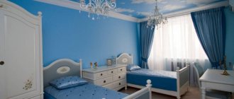
Bedroom
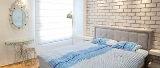
It will look good with light gray walls, pink or pale blue textiles, and a white door. Furniture should be selected lighter or darker than the walls so that it does not merge into one gray tone.
The photo shows a bedroom interior with plain walls and a floral wallpaper border, which is separated by molding. Dark shades are complemented by milky colors of textiles and furniture.
Living room
A living room in any style with gray walls will look successful. Dark gray walls should be combined with a white ceiling and light floor. Combines with green, scarlet, beige, and white companion colors for decorative items and textiles. The main role is played by curtains, which should be lighter or brighter than the walls.
Bathroom
A bathroom with gray walls should be well lit and combined with a white installation, shower, and lighter flooring.
The photo shows a bathroom interior in a modern style with gray rectangular tiles.
Children's
The nursery combines gray walls well with yellow, red, pale pink, orange or light green decor. Striped paper wallpaper goes well with white furniture and a colored rug.
Hallway
An entrance hall in gray is a practical option; MDF or PVC panels, stone trim, vinyl wallpaper, and plaster are suitable. Doors can be light or dark brown.
The photo on the right shows the interior of the hallway with striped wallpaper on the walls and a white and gray floor with decorative tiles. The white ceiling and mirror make the hallway brighter.
Gray furniture and accessories in room design
Elements of gray tones are optimal in cases where the overall color scheme is quite complex and it is difficult to choose the color of furniture and decor. Patterned fabric upholstery is an excellent option for a bright interior. Ornate decor will complement a classic-style setting, while abstract prints are appropriate in a modern design.
Dark and light gray furniture goes well together
It is easy to install gray furniture in the kitchen, living room, bedroom, nursery or hallway, but often the interior also contains accessories and textiles of this shade. Curtains with a contrasting combination of gray and brighter colors will make your window decoration more impressive. A carpet in a dark or light shade of this palette will be a worthy addition to any setting and will provide comfort.
Two-color curtains are appropriate in any interior
Style selection
Loft
Loft as a casual and practical style combines brick, wooden floors and a plastered gray wall, which can be plain or with a large ornament. Gray walls are combined with an equally large sofa or bed and a gray table. Combines in a loft style with white, red, turquoise and yellow.
Scandinavian style
The style emphasizes practicality, careful handling of objects and a penchant for natural finishing materials (wallpaper, laminate, plaster). A light gray shade that goes well with pastel colors is suitable. Furniture is selected as practical as possible in white, gray, beige colors.
Modern style
The modern style is most often executed in gray walls, which are complemented by paintings, a mirror, and framed photographs. Monochrome, striped decor, and clear lines are welcome. Curtains are selected Roman or long from a practical mixed fabric.
Classic
Classic in a gray interior does not look boring, the walls are complemented by modeling, these can be tapestries, silk-screen printing, gold monograms, white flowers and patterns. The walls will become the backdrop for wooden furniture, a light sofa, emerald curtains, and a golden lambrequin. The decor includes portraits, landscapes, and wall candelabra.
Gray in the design of different rooms
The right shade, optimal combinations, determining the shape of objects and decor are the key to a harmonious and comfortable environment.
- The noble gray color palette is often used for living room design. This is due to the fact that the room requires some neutrality in the interior, which is conducive to pleasant communication, receiving guests and relaxing for the owners of the house. A light shade is often used to decorate walls, a dark shade is often used to highlight an area with a TV or an area with a sofa. This color may be present in small quantities, for example, only in the form of a carpet or sofa cushions. This option is appropriate for a design in a classic style. Modern design often uses dark and light gray objects, glossy surfaces, and chrome parts.
Patterns on the walls - a spectacular decor option - The bedroom is a special area that requires maximum comfort and coziness. Universal for this room are light gray shades, which can be present on the walls, in textiles or furniture. With the help of dark tones it is easy to create an effective contrast by highlighting the desired area. You should not use a large number of gray details, which will make the situation quite sad. For a bedroom, a combination of warm and gray tones is optimal. Bright and cold options emphasize the solidity of the interior.
Bright details will make the interior stylish - For the kitchen, gray is a practical solution. The most appropriate elements of this shade are ceramic floor tiles and work area countertops. In the area of the sink and stove, you can install an “apron” of gray wall tiles. Ceramics, stone and wooden furniture are easily combined with each other. For a more modern design, glossy surfaces and laconic furniture are suitable.
Dark gray details in the kitchen are practical - When decorating a room for a child of any age, it is best to use the lightest shades of gray. In combination with pastel colors, they will easily create a stylish, comfortable and beautiful environment. For a girl's room, combinations of gray with peach, pink, lilac are often used, and for a boy - with blue, black and white, brown, green, yellow. It is best to make the ceiling white. Finishing materials must be of high quality, which is necessary for environmental friendliness and safety.
Gray flooring - a universal solution
Video: gray color in the bedroom interior
Floor color
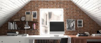
Light floor
A light floor with gray walls looks organic; the floor is diluted by a dark undertone of gray. Painted boards, light laminates, and light wood parquet boards are suitable. If the walls are dark in color, then the floor can be golden in color.
The photo shows the interior of an office with light parquet and gray walls, which looks bright due to the wide window and practical Roman blinds.
Dark floor
It can be the color of stained oak or wenge, painted in dark blue; porcelain tiles are suitable for the kitchen and bathroom; laminate is suitable for the bedroom and living room.
Bright floor
A bright floor made of tiles or sectionally painted boards or a plain laminate will suit a gray interior. A carpet or runner will also add brightness.
To match the walls
The floor to match the walls will create a transition effect without borders and merge into one color scheme.
Ceiling color
Light ceiling
It is used more often than others, decorated with moldings, modeling, white plaster, paint, and suspended ceilings are used for finishing.
The photo shows a modern interior with a white, flat ceiling that echoes the white wood panels, which makes the dining room bright despite the dark floor and black table.
Dark color
Suitable for a spacious room and high ceilings, as dark will make it visually lower.
Bright
It can be created in a monochromatic or gray-white interior using wallpaper, panels, paint, or a stretch ceiling.
To match the walls
The ceiling will be a continuation of the walls and can be decorated with stucco.
Combination of gray walls and doors
It is recommended not to match the doors to the color of the walls; there should be contrast in the interior; the trim can act as a color frame for the door or be combined with it.
- Light gray and white doors will go well with dark gray walls.
- Black and white doors will go well with light gray walls.
In the photo, white glass doors in a classic apartment interior match wooden floors, tile floors and gray wallpaper with geometric patterns.
Subtleties of choosing gray color for wall decoration
True gray color, obtained by mixing equal proportions of white and brown, is used extremely rarely in the interior. Preference is given to numerous shades obtained through admixtures of brown, beige, and blue.
Each tone is unique and good in its own way, but the ideal gray wall color is selected taking into account the characteristics of the room.
The degree of illumination of the room plays a primary role. This does not apply to an artificial, but to a natural light source. Absolutely the same gray wall paint can look completely different.
In rooms with windows oriented to the north, such decorative finishing will take on a cold bluish tone, and to the south - a much warmer one.
Designers recommend not to be afraid to experiment and show courage by refusing to use illusory optical illusions. By choosing not light, but dark gray wallpaper for the walls in a small room, you can create a truly cozy and effective interior, which is not always possible to achieve when trying to visually expand the space.
Furniture color
The color of the furniture can be of different saturation; all bright shades of red, green, orange and turquoise are suitable.
Cool blue and blue are best used as the color of poufs and small chairs. A gray sofa and bed will fit into a gray interior, complemented by bright pillows.
In the photo there is a gray sofa in a modern living room interior with dark gray curtains and walls, the gloss of the painting and daylight fill the room with freshness.
It is better to choose the same shade of chest of drawers, wardrobe and shelves. White, mint, light gray, black, wenge will suit the interior.
Rules for combining gray shades in the living room
The maximum manifestation of your own color is guaranteed if it is applied according to the established rules:
- In a small room it should be given a dominant role, but only in light colors;
- The monotony of such an interior must be diluted with the presence of pastel colors in the form of “beige”, “peach”, cream color;
- A living room with small dimensions should have a very light ceiling. Walls that protrude noticeably should be finished in a dark tone, as well as niches. Visually this will help increase the space;
- In rooms where the volumes are significant, it is worth making full use of the monochromatic option. This is how amazingly beautiful unions with pearl and graphite palettes, anthracite are born;
- An elongated room, slightly narrowed, will require the presence of warm tones. It can be a gray-greenish palette, or with natural ebony. Cool tones of ice, silver and steel are considered ideal for the tangible spaciousness of the living room;
- The purchased furniture, in contrast to the decoration of the walls, should be of a different tone so as not to get lost in the room. By choosing a lighter tone for the sofa and wardrobe, armchairs and shelves, you can’t go wrong. They will be noticeable and fit perfectly into the design of the decor. The exception is miniature rooms. It is for them that a similar shade of furniture items is needed. In this case, the bulkiness of each product will not be so visible;
- It is preferable to use bright details for decoration, such as original figurines, original picture frames, indoor plants along with posters, images of landscapes in photographs, and for the loft style - posters.
Selecting curtains
When choosing curtains, it is important to take into account the natural composition (linen, cotton), synthetic additives and the tendency of the material to fade. In length they can be short classic, Roman, Austrian, rolled, long.
The color is selected based on the shade of the walls and the pattern. Cool shades, pale pink, lemon, lilac are suitable for a light tone. White translucent fabrics, bright tones of red and yellow will suit the dark tone. A neutral option would be beige curtains with a gray pattern.
Gray wall decor
For decoration, stone inserts, fabric panels, photos, 3D wallpaper, mirrors, bright flags and pom-poms in the nursery, sconces, portraits in the living room, paintings and reproductions in the bedroom are used.
The photo shows the interior of a living room with wall decor: colored abstraction, shelves with souvenirs that make the walls brighter and remove monotony.
If the walls are plain, you can use 2 types of decor; if it is wallpaper with decor, then it is better to refuse additional accessories.
Combination with other colors
Gray-white
It is combined more often than others in modern interiors; white adds space and is suitable as a color for stripes.
The photo shows a gray and white interior of a modern bedroom with colored accents and white translucent curtains.
Gray beige
Suitable for bedroom and living room, can be combined in patterns.
Gray-blue
Cools the room, suitable for a bedroom, classic hall, boy's bedroom.
Taupe
It looks strict and stylish, the shades complement each other.
Yellow-gray
Gives a combination of energy and tranquility, suitable for children's rooms and kitchens.
The photo shows the interior of the kitchen-dining room in gray tones with yellow accents on the wall in the form of stripes and yellow chairs.
Gray-green
Calms and relaxes at the same time.
Gray pink
Often used in modern style, decorates children's rooms and bedrooms.
Gray blue
Suitable for Scandinavian and maritime styles, used in hot rooms along with white or blue curtains.
The photo shows a living room interior in a modern style with gray, white and blue patterned wallpaper.
Red-gray
Fills the interior with energy, red is an accent.
Grey-violet
Gives a magical combination balanced by tranquility.
Gray-lilac
Suitable for a nursery and bedroom, lilac reveals itself against a gray background.
Gray-turquoise
Used in Provence style or marine style.
Harmonious color combinations
Gray color has a unique property - it can be amazingly combined with almost all colors. It is able to smooth out and neutralize sharp transitions, calm overly aggressive shades, balance the color scheme and make the interior more voluminous. Bright shades look more saturated against its background. It is because of its versatility that many famous designers work with its shades with such adoration.
It is a mistake to think that this is a boring, “mousy” color that evokes melancholy, and that’s all. The color of wet asphalt, graphite, steel, ash, lead, gray-blue and many other shades can transform any room and make it more comfortable and calm. Despite all its advantages, you should not use its shades everywhere. If you choose different tones of gray for the walls, floors and upholstery, you will end up with a single gray mass. This color must be used in doses, or better in combination with the shades most suitable for it .
For example:
- Grey + black + white. This timeless classic, which is still actively used to decorate the interiors of living rooms or dining rooms. A strict black and white design, complemented by shades of gray, instantly takes on a completely different look. The room becomes more comfortable volumetric and harmonious. If the area of the room allows, you can paint all the walls in your favorite shade of gray, choose furniture with black upholstery, and use white in textile elements and decorative items. If the room is small, but you really liked this option, use gray for finishing the floors and complement the picture with gray curtains and small plain and patterned pillows. Necessary contrast Such elements will be added against the background of white furniture upholstery. Walls It’s better to decorate them with light shades, and make one of them distinctive – gray. In this case, black should be used as an accent color. For example, the shades of floor lamps, photo frames, a small coffee table or a small rug can be black. Such an interior will be very calm and stylish. Main – provide good lighting, if dark colors predominate.
- Grey + blue or blue – cool combination which is great for decoration of any room. Whether it's a bathroom, a nursery or a bedroom. If all the listed premises have small sizes, it is better to give preference to light, muted shades. IN as a basic You can use both gray and blue shades, depending on your preferences. Lighten things up White color will help, which can be used both for wall decoration and for decorative elements. For example, in bedroom or in children's, Gray can be a bit depressing, so don't use it on all your walls. For this purpose, choose one, the narrowest wall, and place it against its background. white bed with a gray bedspread and blue pillows. Curtains can be either blue with a gray pattern, or vice versa. For a bedroom that has plenty of natural light and is large in size, you can use dark shades gray combined with turquoise. Such an interior will be more rich and unusual.
- Grey + pink or violet - this is one of the most popular combinations for decorating a bedroom or children's room for girls. Such the interior will be Very gentle, cute and romantic. Small decorative elements will help create such an atmosphere. For example, all kinds of bows, ruffles, frills and floral patterns that look very advantageous on a light gray background. Bed linen can be not just plain, but have an interesting pattern. For bedroom decoration For a girl, it is permissible to use not only floral patterns, but also a geometric print, which will have a gradient color from dark crimson to pale pink. Such wallpaper will look very impressive, especially since you can make it yourself using a stencil and paints. Pink curtains Recommended for use only in children's rooms. IN tandem With purple, gray gives calm combination which sets you up for complete relaxation and rest. This combination is perfect for decoration bedrooms or living room. For a more “lively” environment, use bright and rich shades of purple. And for relaxing And peaceful – muted light colors. Dominant color could be any of them, depending on your taste. For small rooms, it is better to give preference to light colors for wall decoration, and more saturated colors for textile elements.
- Grey + yellow - Very controversial combination which requires strict adherence to proportions. Yellow recommended for use in as an accent, then on gray it will shine like a real sun, because gray enhances and saturates bright shades. To decorate the walls and ceiling, you can use several similar shades of gray. Furniture can be white, dark gray or dark wood. With a little yellow, a room will immediately come alive and feel warmer and cozier. This union is suitable for decoration of any premises, except the kitchen. The exception is the high-tech dining room. The fact is that in this room gray will be perceived as a cold metal surface.
- Gray + green is a very interesting combination, which is unfairly rarely used in the interior. This combination is very beneficial for decorating small rooms. Light gray walls and ceiling will visually “stretch” the room and make it more spacious, and green will highlight this feature. This will not create a sharp transition that will catch your eye. The atmosphere will be very calm, cozy and soft. Gray will not attract attention to itself, but will only advantageously and unobtrusively emphasize any of the shades of green.
- Grey + red - lately this couple gaining great popularity and many designers. In this case, it is necessary to use gray as the main color, and red should perform role bright accent. To add clarity and contrast, you can use small elements black color. Secret lies in using these bright flashes to attracting attention to the necessary objects, while gray will smooth out the aggression of red and the tragedy of black. Instead of black, you can add white, which will dilute such a dynamic combination and make it less harsh. This option is perfect for the dining room.