The color of coffee with milk, or a wonderful latte in the interior: palette, combination and secrets
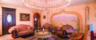
Interior of a room with a sofa in the color of coffee with milk
Coffee with milk or latte is a color that is included in the palette of beige shades. It is equally successfully used in the beauty industry and design; it is very much loved for its neutrality and the ability to “play” with decorative elements without much risk. With its help, you will create a harmonious, unobtrusive interior and avoid chaos.
Kitchen in Latte color
The main thing is not to overdo it with decorations and find out in advance what the color of coffee with milk goes best with, and in what proportions it is best to use it. There are many options, and we will be happy to tell you about them. Let's talk about paint for walls, wallpaper, furniture, and about decorating different rooms in latte colors.
Who would suit this color scheme?
Since beige and coffee tones are classic, restrained, they are usually chosen by people with an established view of the world. These are older people who do not like or no longer want change, enjoy watching retro programs, and are interested in art in the usual sense of the word. Modern installations, performances, abstract concepts are not for them, but world masterpieces of painting, sculpture, beautiful vases, framed photos are. By the way, objects of art look great against the backdrop of coffee with milk.
This seemingly inexpressive color allows you to concentrate on work or study and will not distract from important tasks. It stabilizes the nervous system and eliminates irritability.
If a warm tone is used, it warms in the cold season, brings comfort and a pleasant feeling of relaxation. Coffee, chocolate, cream are unique antidepressants that distract from unpleasant thoughts and give a good mood.
Living room in soothing colors for relaxation
Latte in the interior has an equally positive effect on the owners of the room and the guests. If relatives and even strangers gather, a relaxed, calm atmosphere is created. When residents are left alone, they can easily tune in to a creative mood or mental work. By adding several antique items, an expensive carpet and curtains, leather upholstered furniture, you will emphasize your high status and add solidity to the space.
What psychologists advise
Most professional psychologists insist that coffee color can stabilize the nervous system. A cozy home helps to “talk” and discuss all possible problems. Since the milky color scheme does not imply the presence of cold colors, the winter period will be characterized by a warm environment. The absence of pressure on the psyche allows you to fully relax. In addition, the coffee palette in the interior is often called chocolate. And this product is a generally recognized antidepressant.
Let's look at some aspects of using this range:
- The room, which is decorated in coffee color, allows you to forget for a while from your worries. The interior does not have a burdensome effect on guests, and sets the hosts up for creative and intellectual work. Therefore, popular colors can often be found in offices;
- Brown wallpaper will be useful for those people who lead an active life. Because they just need a home corner where they can relax;
- Coffee color in the interior was previously used in the palaces of the aristocratic nobility. Thus recognizing him as chosen and elite. The color scheme of the room in chocolate wallpaper significantly adds solidity to the decor. This effect can be enhanced with the help of expensive furniture made from valuable wood species, as well as elements made from genuine leather. A luxurious Persian carpet on the floor can add a rich accent to a calm atmosphere.
What other advantages of latte color in the interior?
Furniture, walls, and textiles in coffee tones look strict, elegant and cozy at the same time. They help to visually enlarge the room and hide its shortcomings. You can choose the optimal shade of their beige palette, experiment with chocolate and white shades. Think about coffee: it can sparkle with new colors if you add more or less milk, cream, cinnamon, cardamom, etc. to it.
Colors and shades of coffee
On such a surface it is more difficult to see specks and stains. Beige and brown finishing materials create a comfortable environment, calming and relaxing. And most importantly, if desired, the color of coffee with milk can be “revitalized” by simply using suitable contrasting combinations. Of the proven options - red, orange, purple.
If the room is small and located on the dark side, decorate it with light latte shades. In well-lit, spacious rooms, you can also use darker tones, close to chocolate.
Basic shades
A common practice is to use light colors for cladding surfaces, and dark ones for finishing furniture sets. This is due to the correct approach to interior design. When the main emphasis is on an aristocratic setting, which looks better on a light background. The use of light or dark colors alone is strictly not recommended, as the space will lose its shine and grandeur. It will cause boredom and cause gloomy thoughts.
Among the fashionable variations of coffee with milk are combinations of cream and brown shades, which are diluted with splashes of seasonal flowers. These can be turquoise or amethyst elements, orange or terracotta. If the room lacks freshness and exoticism, then you can use olive-colored inserts. It is also important to pay attention to quality lighting. Proper placement of light allows you to favorably highlight exclusive accessories and items of expensive furniture.
Very important! Experienced psychologists are convinced that decorating a child's room in a dark coffee color negatively affects the development of the child. The brown scale suppresses the desire to understand the world. Therefore, it is better to dilute the rich color with milk.
Coffee with milk color: combination with popular shades
Beige walls can evoke completely different emotions and impressions. It all depends on what exactly they are combined with, and what tone was initially chosen. Classic combinations include latte and light peach, apricot, white, yellow, and dark chocolate. They are always relevant and create a cozy and calm atmosphere.
If you want to bring something new and interesting into the interior, experiment, stop at:
- pink powder;
- pistachio;
- blue;
- salmon;
- gray;
- lavender;
- olive
Such combinations will add dynamism and uniqueness to the space. Bright shades are best used as decoration and textiles, and the background should be dominated by coffee and milk. And now we propose to consider the possible combinations in more detail. So, what can you combine the color of coffee with milk with?
Earth tones
Brown, dark green and ocher perfectly complement the pastel palette. It’s easy to find wooden furniture sets, ceramics, and linen products on sale. All these things look natural in living rooms. Lovers of exotics and owners of large country houses will certainly find furniture made from bamboo or rosewood useful.
Marine motifs
The golden tone of latte is often used to decorate rooms in a marine style. It perfectly sets off the white and blue of natural, untreated wood. Milk coffee and pale blue also go well together.
Marine motifs in a combination of coffee shades
It’s like plus and minus – cold and heat, which when meeting each other are balanced and form a harmonious picture. The interior will contain both warm notes and freshness.
Monochrome combination
A combination with shades from the brown-beige spectrum is not universal. This is static, regularity, which is acceptable in the kitchen and appropriate in the bedroom. In other rooms, such an “alliance” will quickly get boring, you will want to add variety - and there is a high probability of going too far with bright elements. To prevent this from happening, order in advance for the bedroom and kitchen, dining room curtains and tablecloths, covers, pillowcases with an interesting texture and contrasting colors.
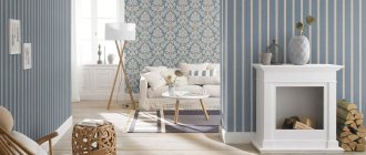
Combination with gray
The best solution is cool gray and coffee-milk. It is suitable for any layout and room parameters, because sometimes it allows you to eliminate all flaws without additional techniques. Thanks to light brown, volume is added, and cool tones visually expand the boundaries. It is this feature that is happily used in modern kitchens in small apartments.
Plus white
Coffee with milk and white - again, classics. It's fresh, unobtrusive, calming. Emphasis is placed on additional elements and various textures. As a rule, one cannot do without glossy surfaces, furniture with leather upholstery and bronze.
Along with orange
Light coffee and orange are a bright combination that is especially suitable for rooms designed in ethnic, modern and high-tech styles.
Kitchen in orange colors
You have two options: apply these tones in equal proportions or make the latte predominant.
Combination with green
Natural green shades bring with them coolness, they can also be compared to a sip of water or a breath of breeze. Of course, this combination is more associated with eco-style, but with the right emphasis it will be useful in others. Mint - the trend of this season - and the color of coffee with milk are especially good for decorating a nursery. It's both fun and balanced. For teenagers, it is better to take more coffee and less green.
Paired with blue
Designers are very fond of this alliance for its ability to adjust space - to skillfully mask imperfections. Cool shades are good in overly lit rooms, they seem to scatter the sun's rays and relieve the heat. Coffee or chocolate with turquoise will eliminate size problems.
Whatever combination you decide to try, remember: do not overload initially small rooms with details. In spacious apartments and houses, it is undesirable to use many different colors at the same time. Why? This is a big load on perception; you will get tired of the abundance of “information”, emotions and associations that each color evokes individually and their combinations.
Photos of interesting design ideas for different rooms
Coffee with milk is a light, warm, cozy shade that provides many possibilities. It has several shades, characterized by different properties:
- a more beige warm tone is suitable for classic, traditional interiors,
- the light, almost white tone will be an excellent addition to modern minimalist apartments.
This calm, gentle tone is an excellent choice for fans of a cozy, relaxing environment. It is often chosen to decorate the bedroom, living room, and bathroom.
A delicate coffee-milk shade helps create an atmosphere of silence and peace; it has not gone out of fashion for many years, and works great in various styles. It is used in modern decors, emphasizing their simplicity, and in antique-style ones, in which it does not compete with the decorative forms of furniture and details.
Coffee beige has an important advantage - it easily blends with other colors:
- green,
- bronze,
- gray,
- purple,
- red.
This color combination is pleasing to the eye and is perfectly perceived.
This shade is beautifully presented in monochrome arrangements consisting of many of its shades - from light milky to rich coffee. From creamy whites to medium and dark shades of brown, these color combinations create a relaxing mood, perfect for unwinding after a hard day.
One coffee-milky shade without expressive decorations seems uninteresting, but it is not. Its attractiveness is determined by the use of many shades of beige, replacing bright patterns with expressive textures, which are better visible in a calm environment. An expressive texture will be ensured by:
- decorative plaster,
- moldings,
- 3D panels.
Below is an example of an interior decorated on a monochrome basis in several shades of beige. Accents of strong red will help liven up the decor, bringing energy to a calm atmosphere. Orange and yellow additives work similarly. Despite the living room being decorated in soothing beige tones, the room looks dynamic. This is due to the strong tonal contrast. The light background is combined with dark brown and black accents.
Latte color in the living room
Beige succeeds in decorating a living room intended for the whole family and will bring peace and harmony. Colorful additions and interesting furniture shapes look nice against the background of beige shades.
The colors of the walls and accessories can be light, beige, in tones closer to white or brown. Depending on the shade of coffee, latte is used to decorate a room with a warm or cool atmosphere.
Interesting effects are achieved by combining beige in different shades. For example, as a wall color it will add depth to the interior and highlight selected elements.
You need to pay attention to the lighting of the room:
- when decorating a room, dark shades should be used in the sunny part, around the window;
- For the dark part, it is better to choose light shades of latte coffee.
Caffe latte goes well with most colors. When decorating the living room, you can use calm tones:
- green,
- brown,
- yellow,
- orange.
The discreet combination of light coffee and white is interesting. A classic example is white furniture in the living room and beige shades on the walls.
You need to be careful not to make the interior monotonous or boring. It is worth adding accessories, additives of a warm shade.
Beige in the design of the living room will make a pleasant combination with strong colors:
- red,
- black,
- fashionable blue.
Cappuccino colored kitchen
A beige kitchen is light, spacious, and does not look as sterile as pure white. Coffee tones add a cozy touch to the atmosphere. Therefore, many choose latte shades for kitchen furniture facades. To emphasize them, you can use a slightly darker background. A countertop in a darker shade - dark brown, gray - can visually separate the line of upper wall cabinets from the floor cabinets.
Cappuccino color in the kitchen interior - photo
Warm dark beige fronts of the upper wall cabinets of kitchen furniture are combined with white lower cabinets. The wooden tabletop adds elegance.
The beige walls in the kitchen-dining room make an excellent background for white furniture, perfectly warming the interior.
Coffee latte goes well with elements from:
- wood,
- bricks,
- stone
The coffee-milky color is not always constant; depending on the presence of daylight or artificial lighting, it changes, becoming darker or lighter. To prevent your kitchen interior from looking boring, you should think about bright, interesting color accents.
Photo. To liven up the beige kitchen decor, turquoise and purple accents appeared in several places. Interesting design allowed us to combine modernity with classics. The steel on the appliances, baseboards, and cabinet handles meets the beige glass splashback above the countertop.
Photo. Beige kitchen furniture pairs beautifully with black items, giving the kitchen a glamorous style.
Bedroom in coffee tones
Don't be afraid to mix light coffee shades with bright colors. These do not have to be permanent interior elements; it is better to choose bright colors for textiles and other accessories. Bright fabrics can be easily changed when the interior becomes boring. For example, in the bedroom shown in the photo below, the accent on purple linen helped to enliven the atmosphere of the interior.
Paired with turquoise, a cool blue, creates a refreshing, attractive color combination.
Light coffee color in the bathroom
When choosing bathroom furniture, the interior is not doomed to a traditional white color scheme. Light coffee-colored furniture looks elegant and timeless. Bathroom furniture with milky coffee fronts is a popular choice. Earth colors, including shades of beige and brown, are very popular. By choosing this color for your bathroom furniture, you can be sure that your bathroom will look fashionable.
Coffee tones are timeless, if the current fashion passes, this furniture still looks elegant. Warm colors will add coziness even to modern times. Below are examples of modern bathroom furniture in light coffee color. The soft, streamlined shapes of the vanity cabinet in a delicious cocoa shade create a cozy atmosphere. The combination of cabinets, open shelves in wooden decor with facades in a light cocoa shade does not clutter the interior and creates a feeling of lightness.
Light, warm colors will add coziness to a trendy industrial-style bathroom.
Such a “faceless” latte color in the interior
As we said at the beginning, milk coffee is most often used in classic styles. It makes the interior elegant, noble and expensive. Portraits in luxurious frames and paintings by famous artists will look especially advantageous against a neutral background. Coffee walls are perfectly complemented by a large rug and solid black wood furniture.
Coffee walls and black furniture
It’s hard to imagine rustic styles, especially Provence, without a coffee palette. Neutral walls, aged white furniture, beige tablecloths and curtains, bright hand-made crafts - all this reminds of the charm of a French house, grandma's freshly prepared pies and a warming, invigorating drink. Lattes are enjoyed in living rooms, kitchens and bedrooms.
In Scandinavian interiors, latte also copes with its tasks “excellently” - making the premises as functional, simple and comfortable as possible. It does not “press” and hides scratches and dirt.
By the way, coffee with milk will also be suitable for modernism: it will be an ideal background for experiments with different shapes, shades and textures. It will also help out owners of minimalist interiors - it will partially replace black, gray or white.
Furniture
The kitchen set does not have to be entirely coffee. The upper and lower tiers can be either plain or contrasting. As a rule, wall cabinets are made lighter than cabinets. As an example, the color is coffee at the bottom, creamy or vanilla at the top. The coffee color scheme in combination with gloss looks impressive. A shiny surface not only makes the interior lighter and more spacious, it looks stylish and modern. The design of the kitchen, furnished with cappuccino-colored furniture, can be seen in the photo below.
“Background” color of coffee with milk: wall paint and wallpaper
Latte is ideal for painting walls. It covers the surface evenly, masks blemishes and does not require multiple layers. Experts advise choosing a matte texture and combining coffee and milk with a brighter shade. For example, with white or blue, chocolate, lemon, terracotta, reed. Other good options are orange, apple, lavender and cream.
Secrets of coffee and milk wallpaper
This is a popular shade, so it won’t be difficult to find it in old and new collections. Almost every manufacturer has it, and various textures, bases and prints are used in the design. When choosing, first of all you need to focus on the purpose of the room.
"Coffee" wallpaper
For a small home office, look for trellises with a vertical pattern and horizontal stripes. The former will visually “raise” the space, the latter will expand it. In the kitchen, wallpaper should be washable; you can find an interesting thematic pattern or a neutral ornament. In the bedroom, darker colors are sometimes used to separate different functional areas from each other.
In the corridors and hallways, the walls are decorated with lighter shades of coffee; they are perfectly set off by brown objects. For example, a chest of drawers, a bench, an ottoman, a cabinet. If the room does not have enough volume, mirror surfaces are added.
What to do in the kitchen in cappuccino color
It is not necessary to decorate the entire kitchen in cappuccino shades; it is enough to limit yourself to one or several large items.
This will fill the interior with the warmth and softness of “delicious” coffee tones, but at the same time help avoid monotony in the design of the room.
Kitchen set
Kitchen sets are often placed in one or two rows. There is no need to try to choose one-color furniture. The kitchen set will look more interesting if it combines light and darker coffee or brownish shades.
It is also acceptable to combine shades of cappuccino with other, brighter and more saturated colors, for example, greenish or purple.
Coffee tones look best in gloss: they visually expand the space and make the kitchen interior more stylish and interesting.
IMPORTANT! A cappuccino-colored kitchen set can be made in any style, but it should be noted that modern plastic furniture will look better in gloss.
If the kitchen is decorated in a classic style, then a matte wood set is best suited, which in some cases will be appropriate to “age” a little due to artificial abrasions.
There are several ways to place sectional furniture in cappuccino color:
In one line. All sections are displayed along one wall, while the upper cabinets can be replaced with hanging shelves, which will look especially good in a room decorated in Scandinavian or country styles.
Angle. The L-shaped layout allows you to use the kitchen space quite efficiently. Often, a continuation of such a module is a bar counter, which is placed along the window.
Island layout. Only suitable for kitchens larger than 20 square meters. In such a spacious room, some of the work surfaces and household appliances can be placed in a separate block, which can be used as a partition if it is necessary to separate the kitchen from the adjacent dining room.
U-shaped. This layout allows for the most efficient use of space. Typically, a U-shaped set is located along three walls in a room. There is also a corner layout option, complemented by a bar counter on the side.
Parallel layout. Furniture is placed in two rows along opposite walls. This arrangement of modules allows for a rational distribution of kitchen appliances, but a parallel layout is only suitable for spacious rooms.
Curtains
You need to select cappuccino-colored curtains so that their tone is close to the shade of the kitchen set and walls. The fabric can be either natural or artificial; when choosing it, you need to proceed from the style of the room.
Patterned curtains go better with plain walls. If patterned wallpaper was used when decorating the kitchen, then single-color curtains will be an ideal complement to them.
IMPORTANT! It is recommended to select the design on the textiles in accordance with the overall style of the kitchen, but the less noticeable it is, the more elegant the interior will look.
Modern trends allow the use of materials with large abstract patterns, but cappuccino-colored curtains with small patterns look more advantageous.
Wallpaper
When choosing wallpaper for the kitchen, you should give preference to washable ones, preferably glass or non-woven. The fashionable “liquid wallpaper” in the cappuccino shade should be abandoned: they absorb moisture too much, swell and quickly become unusable.
The surface of the walls can be either smooth and one-color, or textured or patterned. However, you need to take into account that wallpaper with a large pattern is not suitable for a kitchen in a coffee color scheme; according to designers, compositions placed in squares, as well as bright flowers, are especially unsuccessful.
IMPORTANT! Recently, it has become fashionable to combine coffee-with-milk wallpaper with artificial or natural stone inserts, as well as wooden panels, which are placed in the room as large accents.
Apron
A cappuccino-colored kitchen apron can be made from a variety of materials: ceramic tiles, tiles, glass, mosaics, natural or artificial stone.
Glass aprons with themed photo printing fit well into modern and many classic styles. Most often, they depict freshly brewed coffee with various spices or sweets served with it.
Aprons with landscapes or reproductions of paintings also look good, especially if they are complemented by a frame of relief inserts that create an imitation of stone or brickwork.
The most popular coffee aprons are made of ceramic or tiles.
They are beautiful, durable and quite practical; in addition, such an apron fits into almost any interior design style.
Kitchen aprons made of natural or artificial stone in a cappuccino shade are also beautiful and durable, however, due to the textured surface, they are somewhat more difficult to care for than smooth ceramic tiles.
Latte colored kitchen
Shades of coffee and milk have always been associated with home cooking or a nice coffee shop, where it is warm, cozy, smells nice and there is something to enjoy. With the help of latte color, you can safely decorate a room in a rustic, ultra-modern or classic style, give it romanticism, tranquility or “environmentally friendly”, gourmet notes. Choose combinations depending on your goals:
- adding red and brown details increases appetite;
- Furniture made from dark brown wood and frosted glass make the interior elegant;
- brown chairs and milk hanging racks bring even more light into the space;
- The combination of milk chocolate and pink colored elements will especially appeal to girls and will add femininity and a certain charm.
To create a unique, special atmosphere, use cute accessories. Hang a bright poster, a vintage-style clock, or a painting that matches the theme and color scheme on the coffee and milk walls. If the kitchen set has open shelves, place decorative plates, pots with indoor plants, and metal or wood figurines on them. Sets made of porcelain, crystal, tourist souvenirs, family photos, and slates are also indispensable as decoration.
Psychology of color
The shade of cappuccino is lighter than brown, but darker than beige. It occupies an intermediate position in the color gradation between these tones. Unfortunately, on a subconscious level, brown is perceived negatively by a person. This is the color of street dirt and fallen leaves. In nature, it is associated with withering and death. The same cannot be said about its light shades, which are compared with natural landscapes, the fur color of many animals, clouds of fog in the rays of the morning sun and, of course, the coffee and milk whirlpool in the cup caused by the movements of the spoon. Associations with drinks and food (cakes, sweets, cakes) play an important role in the interior of the kitchen. They are used not to remind of the purpose of the room, but to create an atmosphere on which the comfort of staying in it depends. The shade of cappuccino is considered a warm color that unobtrusively “warms” the kitchenette. They create coziness, and in good lighting they begin to “emit” light themselves. Its options vary: from light yellow to gray tint. Room design in cappuccino color is chosen by people of open minds. Their psychological age does not exceed 30-35 years, since subconsciously the soul is already reaching for a state of peace, but to achieve it, fashionable solutions characteristic of the younger generation are used.
Coffee and milk walls
Finishing in soft and calm colors will be an excellent backdrop for creating a bright and eclectic design.
Light brown walls
Among the assortment of wallpapers, it is not always possible to choose the right tone. But among the paints on sale there is much more choice. You can mix several solutions of different shades and get your own, unique one.
How to arrange a living room?
A beige palette can unite all family members: from old generations to the current one. The milk and chocolate hall will put you in a peaceful mood and allow you to focus on pleasant conversations, original decor and unusual furniture.
Living room in milky coffee tones
You can use exclusively beige shades for decoration; this solution will appeal to collectors, avid travelers and creative people - those who have something to show.
When decorating a living room, special attention should be paid to lighting. Dark colors are allowed only near the window and in the sunny part; in darkened areas, light latte shades are used. Brown, orange, green and yellow, red, blue are suitable for variety and creating beautiful accents.
Combination with other shades
The latte color is universal, but will nevertheless be perceived differently in each room, based on the color combination. Lovers of classic motifs in the interior prefer muted tones:
- white;
- pastel yellow;
- light peach;
- dark chocolate.
Such solutions will provide a pleasant, calm and cozy composition that will never go out of style.
Supporters of extraordinary ideas give priority to unusual shades:
- olive;
- pistachio;
- blue;
- gray;
- pink;
- salmon
Such combinations seem more modern, dynamic and give the interior an unrivaled character. Below are design options with a combination of similar shades.
Earthen
Warm latte perfectly harmonizes with earthly colors:
- brown;
- dark green;
- ocher.
Coffee walls are luxuriously complemented by dark wood furniture, also from exotic woods (bamboo, rosewood), and ceramic products, which is relevant in the interior of the living room and bathroom, which are shown in the photographs below.
Marine
In a marine theme, designers often use warm coffee color. It allows you to smooth out cold blue and light blue colors, giving the room coziness and freshness.
Bright
Modern designs should be filled with bright, dynamic shades. The combination of latte with:
- orange;
- turquoise;
- red;
- black.
Designers insist on using bold, contrasting combinations to create stylish, unusual interiors, as shown in the photo.
Relaxing bath of a “modern Aphrodite”
In the bathroom, light coffee furniture is most often installed, and the floor, walls or ceiling are made of brown, beige, caramel, etc. This solution is timeless. You can be sure that the fashion for such a design will not pass. Streamlined shapes, open shelves, and wooden facades are welcome.
Bath in coffee shades
To decorate the bathtub, and not only, products made of light ceramics, graphics, boxes and wicker boxes of chocolate color are suitable. LED bulbs placed around the entire perimeter will add a special highlight to the room. A coffee and dairy living room or bedroom cannot be complete without a laconic floor lamp and a beautiful table lamp. Do you love a comfortable homely atmosphere? Be sure to order small fluffy rugs.
Accessories and interior decorations
Latte can be used in interior design not only as a base, but also as an additional decor. For example, natural beige fabric materials made from cotton, wool, and linen warm up any interior quite eccentrically.
Latte accessories will help add warmth and light to the room. Figurines, pots, sculptures and many other porcelain and ceramic products of a certain color range can be used as decorations.
Latte color is valued by designers for its sophistication, delicacy and harmony. The shade is universal and popular, so there are many interior options for rooms for different purposes with a predominance of coffee color in all sorts of style variations.
Rooms in a coffee interior
The coffee theme is quite relevant and is actively used in modern interiors. Subconsciously, this gives cheerfulness and energy to the people who are in the coffee premises. Coffee color includes numerous palettes: from milky to dark brown.
Wallpaper with a coffee theme is best used in the following rooms:
| Photo | Description |
| Kitchen |
For the kitchen it is better to use light shades. Designers recommend taking a closer look not only at solid colors.
Choose wallpapers with images of coffee or coffee beans.
It is important for the kitchen to choose washable and thick wallpaper. For example, it could be vinyl or non-woven wallpaper.
For the living room, it is most beneficial to use contrasting options.
Contrasts give the living room elegance and solemnity. In addition to wall coverings, coffee shades are good to use in accessories:
- carpet,
- decorative pillows,
- floor vases,
- flower pots.
You can use photo wallpapers depicting coffee beans, drinks and others.
To create a competent office interior, you need to be able to combine two or three coffee shades.
Feel free to use light and dark coffee, as well as the color of the burnt beans.
Wallpaper coffee with milk in the interior of a bedroom is the most harmonious option.
Neutral coffee colors have the best effect on your psychological state. Allows you to fully relax and unwind.
It is better not to stick coffee colors on the wall of a children's room. They are distinguished by a certain heaviness that absorbs the emotional component.
If your child is characterized by excessive activity, then in the play area you can paste vinyl wallpaper in light coffee tones.
Dark shades of coffee will look ugly in small spaces. For hallways, it is better to choose the lightest shades possible.
For example, it could be the color of cappuccino or coffee with milk.
As an additional shade, choose a dark color scheme.
Companions: 6 shades
With your own hands you can create beautiful, rich and original projects. It is important to learn how to correctly combine different coffee palettes:
| Living room |
| Study |
| Bedroom |
| Children's |
| Corridor |
| Photo | Description |
| White |
Such a room will be filled with freshness. It is important that the companion color does not become the leading one.
White shade can be used as an auxiliary shade:
- furniture fittings,
- cornices,
- small carpets,
- some pieces of furniture.
It will bring an additional feeling of coziness and comfort to the coffee interior.
The color that combines most favorably with beige is cappuccino.
This color goes well with coffee color.
It is advisable to use a brown palette in certain pieces of furniture, curtains and decorative accessories.
It should be used in coffee interiors with extreme caution and in minimal quantities.
Gives rooms an epic touch. With this companion color you can get a luxurious and presentable effect.
A bold and incredibly original combination. More often used in minimalist styles.
You can use up to 3–4 colors at the same time in one room
The basic design rule is that light coffee colors are leading, and all other dark shades can be used as an additional shade. Dark coffee looks most beneficial in textile materials: curtains, sofas, carpets, decorative pillows and blankets.
Brown color is complex. You should absolutely not use black shades as a companion. Such combinations will make the interior heavy.
Curtains, flooring and even small pieces of furniture will create a single interior line
For gluing the walls of premises, you can choose various PVC coatings:
- Textured.
- Washable.
- Embossed.
- Multi-colored.
- Plain
- Photo wallpaper.
- Paintable wallpaper.
- With imitation stone or wood.
Coffee interior in 4 styles
The following styles are best suited for coffee walls:
| Pastel colors or beige |
| Brown |
| Black |
| Gold |
| Pistachio |
| Photo | Description |
| Minimalism |
Here it is important to use the most realistic photo wallpapers and three-dimensional images, stencils on the walls.
Choose furniture for minimalism from glass or plastic.
Choose wallpaper with coffee beans and steaming cups. It is appropriate to use coffee inscriptions.
Decorative accessories can be used as an additional element:
- ancient Turks,
- vases with grains,
- clay cups,
- rare coffee grinders.
The cost of creating this style is slightly higher than others.
Choose unusual pieces of furniture made from planed boards. Natural dark wood floors would look appropriate in the interior.
Coffee bags and coffee boxes can be installed in the interior as decorative accessories. Curtains can be made from burlap.
The main colors of the colonial style are orange, yellow and beige.
The main color is coffee: from light to dark. You can complement the interior with paintings depicting coffee. It is advisable to purchase plain furniture.
Shelves and cabinets in brown shades would be appropriate in the interior.