Color can directly affect a person. Research in this area has proven the possibility of environmental paints affecting the central nervous and endocrine systems. Colors can calm or excite, speed up or slow down metabolic processes. The colors in the environment have an impact on the development of children's character and can change the mood of any person. In psychology, there are diagnostic tests of color perception to recognize deviations and obtain a picture of personality. In addition, psychology actively uses and develops the method of color therapy and art therapy in the treatment of certain diseases. Therefore, what colors to surround yourself with in the house where you sleep, eat, relax and communicate with your family is extremely important.
When choosing a color palette, you need to rely on your own preferences, the characteristics of the colors, and the intended purpose of the room. For example, a palette of shades for a bedroom should promote relaxation and good rest; for the kitchen, colors that accelerate metabolic processes are well suited.
Determining warm and cool colors
In nature there are three colors called primary or pure colors of the spectrum (yellow, blue, red). When mixed, they produce many chromatic shades.
Characteristic properties of chromatic colors:
- temperature (warm, cold);
- activity (muted, bright);
- intensity (dilute or saturated).
If we talk about color temperatures, yellow and red are the colors of fire and sun, warm. The tone of the oceans and seas is blue and cold. One color can have a different temperature, depending on which temperature range the base color (midtone or subtone) in the shade belongs to. If the red or yellow undertone predominates, the color is warm; if the blue undertone predominates, the color is cold. The picture shows a color wheel that clearly shows the temperature of different shades.
The ability of color to change the perception of space
Yellow is unobtrusive if it is not too intense like sharp lemon. It is able to encourage active activity, increases efficiency, and the desire for creative flights. Sunny color has a beneficial effect on the human psyche and charges with positive energy. An interior in yellow tones with bright splashes of persimmon, orange or carrot will always be associated with summer and fire.
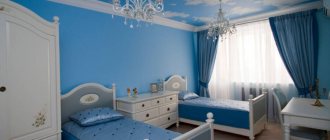
The yellow wall decoration in the hallway is well balanced with white. Source wp-tid.zillowstatic.com
Lightened shades of yellow and brown, sometimes with a pinkish tint, are peach, cream, vanilla, sand, milky, creamy beige, light brown, light yellow. With their help, the space can be made more spacious. They are visually perceived as light, neutral, and comfortable. But designers recommend not using such shades without inclusions of bright spots. This is due to the monotony that gradients bring. So, an entirely beige room can quickly become boring.
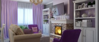
The living room is harmonious in warm and cold pastel shades Source arlind.ru
Red color can be aggressive, calm, neutral, with a tint of pink, orange, and gold. It has a “warming” effect, making the microclimate in the room warm and conducive to friendliness. Designed to stimulate activity and movement. This is an energetic color, so it is often used when decorating rooms for romantic evenings or kitchens.
Wall decoration and curtains in brick tone are diluted with brown and gray Source dizainvfoto.ru
Warm Color Chart
Warm colors bring home comfort, warmth to the interior, and create an uplifting mood. Warm shades will add light and warmth to rooms with northern or eastern orientation and “warm” the room.
| Colors and shades | Predominant semitones |
| Orange (pumpkin, tangerine, fiery orange, copper) – always warm | Yellow Red |
| Reds (scarlet, pomegranate, carrot, marsala, burgundy) | Red |
| Yellow (golden, bright yellow, honey) | Yellow |
| Greens (olive, yellow-green, grass, bright green) | Yellow |
| Violet (lilac, eggplant) | Red |
| Brown (ochre, chocolate, coffee, vanilla, caramel) | Red Yellow |
| Gray (quartz, protective) | Warm brown, green |
| Blue (sky) | Warm green |
| Blue (dark azure, sapphire) | Warm purple |
Features of the main shades
Cool color spectrum:
- grey;
- silver;
- blue;
- blue;
- violet.
Silver is a stylish replacement for gray. It makes you remember the snowy winter, adds sophistication to the interior and gives a piece of mystery. The silver color is complemented by a blue, lilac or light blue tone. Yellow and green shades will be good for a warm accent.
Gray color is a cold analogue of beige. It will be the ideal basis for any interior style. It is better to choose light gray variations, combining them with blue, lilac or turquoise tones. This set of shades exudes coziness and tranquility and is well suited for a large room or bedroom.
Blue is always elegant. Associated with the element of water. The blue tint fills residents with energy, vitality and vigor. Suitable for bathroom, living room and kitchen. The color itself is saturated, so it is combined with a white shade.
Shades of blue radiate energy and coolness. The color suits Mediterranean and Scandinavian styles well. If the interior is made in a northern style, the color is combined with white, blue or silver. If the interior is Mediterranean, green, turquoise or white paint is suitable.
Purple is a complex color. This is the color of power and wisdom; it is very demanding in the selection of companion shades. If you are not confident in your knowledge of the color palette, it is better to avoid purple and use it only for color accents.
If you combine this shade with a green background and the color of asphalt, you will get a room in spring colors. If the main goal is to create a cool atmosphere, then you should take a lilac tone and complement it with blue, blue or white colors.
Complete turnkey apartment renovation
- Everything is included The cost of repairs includes everything: work, materials, documents.
- Without your participation After agreeing on the project, we only bother the owners when the repairs are completed.
- The price is known in advance. The cost of repairs is fixed in the contract.
- Fixed repair period Turnkey apartment renovation in 3.5 months. The term is fixed in the contract.
Read more about Done
Cool Color Chart
The use of cool shades is especially appropriate in bedrooms, since such tones are serene, not energetically active, and help prepare for bed, tune into a calm mood, and relax. The tonal solution of rooms in cold colors will help to muffle too bright sunlight in rooms whose windows face south and west.
| Colors and shades | Predominant semitones |
| Turquoise (bright turquoise, cyan) – always cool | Light blue, blue |
| Blue (cobalt, dark blue, azure blue) | Blue |
| Gray (anthracite, marengo) | Blue |
| Blue (sea green, azure) | Blue |
| Violet (dark purple, indigo) | Blue |
| Greens (emerald, jade, dark green, mint) | Blue |
| Yellow (lemon) | Cool green |
| Reds (raspberry, carmine red) | Cool purple |
| Browns (bistre, sepia, terracotta) | Cool purple |
Is it possible to correct room imperfections with color?
Not everyone was born designers and architects, and not everyone has the opportunity to hire professionals for work. Sometimes finished housing seems uncomfortable due to design flaws, inappropriate lighting levels, or simply small space. You can correct the perception of a room using a color palette.
Cool tones can help expand the space, visually of course, but the feeling in such a room will be fundamentally different.
Gradients can help with ceiling height if darker colors are placed below
It is better to decorate small rooms in cool shades, this will make them a little freer at the level of sensations.
If you make the wall opposite the window darker, then in a small room the effect of visually expanding the space will work.
In long corridors, on the contrary, it is better to choose warm colors
Southern rooms are hotter; shades of blue paint will “cool” such a place a little. The northern room is “warmed” in the same way.
At first glance, all these intricacies with color are not easy to master. But you just have to listen to your feelings, and they themselves will intuitively tell you the right choice of color for your interior. Using the tips from HomeMyHome.ru, you can find “your” correct color for each room, and whether it will be pure or diluted with halftones, it’s up to you.
Color and temperature
The tables well illustrate the conventions of the concept of color temperature. A mixture of undertones and the perception characteristics of an individual give a different visual perception of colors (colder/warmer).
You can determine the color temperature by decomposing it into its components. To change the temperature, add unambiguously warm or cold undertones.
Recognition of shades by the human eye depends on the wavelength of the spectrum, as follows:
- long waves increase the heartbeat, blood rushes to the extremities, warmth is felt - the color is regarded as warm;
- A short wave makes you feel relaxed, processes in the body slow down, a feeling of coolness appears - the color is perceived as cold.
The relativity in temperature differences between shades is associated with the lack of experience of observing absolutely pure spectral colors by most people (in nature, pure color is rare).
Neighboring colors mutually influence temperature. So, burgundy in tandem with sepia will give a feeling of warm, with caramel - a cool color. Understanding this phenomenon should be applied in interior solutions, this will allow you to bring harmony to any space.
Choosing a color: basic recommendations on what color to paint the walls in an apartment
Warm shades visually bring the surface closer, while cold shades move away. However, the choice of palette is not always determined by such parameters. Numerous techniques for emphasizing and creating balance in rooms of different layouts are based on the influence of color on space.
Bathroom
Painting bathroom walls was originally used as a cost-saving measure as a replacement for ceramic tiles. However, modern technologies make it possible to choose paint that copes with high humidity no worse than tiles. In addition, painting the bathroom gives more scope for creating various decorative elements: combining several colors, ornaments, patterns, complex designs, creating decorative niches or protrusions.
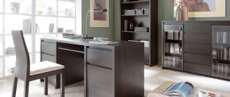
Kitchen
The design of the kitchen is based on the main set of furniture - the set, so when choosing paint you should start from its color and texture.
The basic rule: if the furniture set is bright and dynamic, then the walls should be made a calm background, but if the set is classic and elegant, then the creation of contrasting accents falls on the painting materials.
Pastel shades of beige, cream, pink, and green will help highlight the structure of the wood presented in the furniture. Textured paints in shades of white, gray, dark purple, and dark blue will fit perfectly into loft or high-tech kitchens.
Corridor and living room
Modern spaces are increasingly built on a smooth flow without doors or partitions, which perfectly expands both the corridor and the adjacent living room. The ideal color basis for a large space will be neutral shades of beige, which allow you to create a universal background for subsequent zoning with furniture and color accents.
Hall
The hall is the most suitable room for using the color zoning technique. This method allows you to structure the space without burdening it with shelving, screens, or niches. You can delimit the territory of the hall not only with paint, but also with companion wallpaper.
Bedroom
The color scheme for the bedroom should correspond to the main purpose of the room - comfortable rest. To do this, the number of shades should not exceed seven, including the color of walls, ceilings, furniture, decorative elements, and other accessories. Also, regardless of the warmth or coldness of the chosen wall color, the color bleaching technique is considered a special technique for the bedroom. It makes any shade translucent, watercolor, which is great for a relaxation room.
Children's
It is best to choose a paint color for a nursery together with your child and be prepared for the fact that as children grow older, their taste preferences will change. Painting a children's room is good because it allows you to update the interior at the lowest cost by applying a new shade at the child's request.
Creating a color balance
The merging of colors with achromatic ones (black, gray, white) gives a gradation of temperatures of the final color, changes shades, tones and adds shadows. So in photography there is the concept of “white balance”, which affects the illumination and the final quality of the image.
Neutral white can break up cool or warm colors. If you add white to orange, you get a slightly cooler orange. At the same time, white does not have the magic that can turn a warm color into a cold color, it only brings it closer to neutral. The same principle applies to color gradation, which loses its temperature saturation when black is added.
In interiors it is almost impossible to see pure spectral colors; they are “muted” with gray, shaded with black or brightened with white. And of course, they use multi-component mixtures of chromatic colors.
Let's talk about color combinations in the interior of different rooms
Color solutions in the interior form the basis of design art: color decides everything. This also affects a person’s perception of colors, so we remember that even the slightest change in shade changes the interior.
Living room and hallway
The living room is of great importance where families and friends gather. If the living room is not comfortable, then all the semantic meaning of the room is lost.
Coffee and light green shades can make the living room both brighter and calmer
Cool colors will help visually make the space wider
Warm colors change the picture
Related article:
Interior of the hall in the apartment photo. In a separate publication you can learn about the main directions of decorating a living room in an apartment with a selection of photos.
The hallway is not always spacious and bright, so here you need not to make a mistake with the choice of color.
Light in the hallway can be expressed in color
You can choose soft shades
Related article:
Design of a hallway in a private house : photos of color schemes, the most popular design styles, floor and ceiling decoration, how to choose the right furniture, lighting, convenient little things - read in the publication.
Bedroom and children's room
By its importance, the bedroom should promote rest and relaxation. Here we focus on our own color sensations: if someone is comfortable falling asleep with burgundy walls, then this is a feature of this person.
It is recommended to select pastel colors that can be diluted with some side of the spectrum
Accents, even tones and a simple solution
Related article:
Bedroom design : photo ideas for rooms of different sizes, what style to choose, subtleties of using a color palette; how to choose the right wallpaper, furniture, curtains - read the publication.
How are cool and warm colors distributed for children?
For children who are very active, it will not hurt to reduce their activity with a cool color scheme, and for those who are calm themselves, the opposite side of the spectrum will suit them.
Tenderness is not characteristic of children's hearts
Children love bright rooms
Kitchen and bathroom
The good colors in the kitchen are those that awaken your appetite and good mood.
These are pleasant tones of yellow, orange, light green
Nobody calls for choosing bright acid colors. You can simply highlight something from the furniture, or take not bright shades
The colors for the bathroom can be any; you can choose two or three shades that are pleasant for yourself and your household, placing accents
For lovers of refreshing tones
Cool green and the freshness of the bathroom go well together
Combination
In interior design, combining warm and cool shades is extremely important. To achieve harmony in a room, you need to choose a dominant color scheme (warm or cold) and add accents to the opposite one.
You can correctly combine shades of different temperatures using other techniques:
- Balancing. The principle of balancing one color at the expense of another has revealed to the world the popular combination of cold turquoise, warm brown and beige;
- Gain. An interesting option for combining colors of different temperatures is deliberate mutual reinforcement. So cold emerald with warm marsala makes both tones deeper and more noble.
- Muting, reducing saturation. The effect is achieved by using neutral colors for tinting large areas, as background colors for bright colors.
Warm tones visually reduce the space, as they are perceived as closer, while cold tones can add depth and visually expand the room.
Shades of different temperatures can visually give the room the right shape. In a narrow room, long walls are tinted with cold tones, short ones with warm tones, so visually long walls move apart, and short walls move closer. By painting the ceiling with cool shades you can create the illusion of high ceilings.
In the living room
The living room is the central room in the home, where the family gathers, relaxes and has fun. In large halls of houses, you can choose warm colors as the predominant color scheme, and use cold colors to paint accessories or choose cold colors for textiles. In typical apartments, the living room area is usually small, you want to expand the space, here you can make a palette of cool shades dominant. Often, when decorating a living room, neutral colors are used as the main color, so that the room is not boring; rich tones (cold or warm, depending on the preferences of the owners) will come to the rescue.
Options for non-trivial color combinations for decorating living rooms:
- Grey, emerald, yellow. In general, gray is a good base color for living rooms, and in this palette it can also become a base color. A few accent walls painted in warm yellow will fill the room with an atmosphere of joy, warmth and comfort. A sofa with emerald upholstery will balance out the yellow walls. Emerald and gray decorative elements will help harmoniously combine interior details.
- White, brown, red. Combining only warm or cold shades, it’s hard to make mistakes. The use of white will help to mute the active red, which in such a tandem can be used for textile elements. Brown will become an additional tone for the wooden furniture in the room.
- Grey, blue, beige. Blue will promote relaxation, it is a deep and noble color, its characteristics will be enhanced by gray. A warm shade of beige will add homeliness to the room.
These are just a few options for decorating the halls; you should focus on your own preferences, temperament, size and position of the room, and expectations from spending time in the living room.
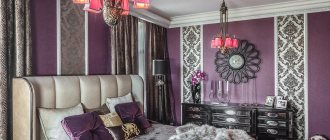
In the bedroom
The bedroom is a place of rest, a reboot of the whole body, which will be facilitated by muted, pastel, inactive, neutral tones.
If there are problems with sleep, the base color of the bedroom can be pastel blue; it is good for calming and will give the owners a restful, restorative sleep. By combining cool blue with beige shades, you can get a harmonious and stylish room.
For the purpose of relaxation, you can decorate your bedroom with ecru paints. This is a natural color, which contains yellow, beige, cream, but this shade does not imply the creation of a romantic atmosphere, so it should be diluted with decorative elements in active colors (burgundy, red in a daring combination with blue).
It’s hard to go wrong when choosing shades of brown to decorate your bedroom; you can use brown from a warmer or cooler palette. If you do not add other colors or bright accents to the design, it is worthwhile to diversify the room with textures and different materials so that the room does not become too conservative.
In the kitchen
If there is a dining area in the kitchen, the colors for it should help whet the appetite (warm honey, tangerine, carrot, and light green tones will do the job perfectly).
Thanks to technology, kitchen facades are no longer made only of wood. Painted MDF and the use of multi-colored films have removed all restrictions on the colors of kitchen furniture. Having chosen bright facades, it is better to paint the walls in neutral shades. In the kitchen, details are of great importance; to add coziness, you can arrange contrasting textiles and dishes made in shades of a different temperature than the set.
If you have no desire to give up classic wooden kitchens. A classic wooden kitchen set in wenge tone in tandem with a bright accent - skinali (glass aprons), blue and red. The blue pattern on the Portuguese tiles chosen for the kitchen backsplash will create a good tandem with the kitchen in the warm color of bleached oak. There are many combinations of wood textures and colorful splashbacks available.
In the nursery
The choice of nursery colors depends on the child’s temperament. For a restless person who is extremely active and easily excitable, it is good to decorate the room in calm, cool colors, using a marine design theme. For a lethargic and passive child, in order to “stir up” the baby, you can dilute the room with bright scarlet and carrot accents (using decorations, decor, multi-colored textiles).
Regardless of the gender of the child, it is appropriate to use shades of yellow in the nursery, which carry cheerfulness and the energy of the sun. When using yellow, you need to be careful, using muted tones or limiting the area of yellow surfaces. For a boy, cold emerald or azure shades can become a companion color to yellow in a children's room. In a girl’s room, yellow will be in tandem with “cool” crimson.
When choosing a color scheme for decorating a nursery, when the child is already aware, you need to be interested in the baby’s opinion and preferences. For children's rooms, it is appropriate to choose bright, pure colors, but they definitely need to be used with basic neutral, pastel colors.
In country houses, children's rooms are often equipped on the attic floors. The sloping ceiling itself can be “pressure”; it is worth choosing light and simple colors to decorate the children’s space in the attic.
In bathroom
The very purpose of the bathroom is to serve cleanliness; all hygienic procedures are carried out here, so when choosing a palette for the design of the room, practicality comes first. Black matte tiles in the bathroom look very impressive and stylish, but cause problems when cleaning, this must be taken into account when making renovations. Taking a risk, you can beautifully complement the black color with warm pink and cold gray (combining tiles, using accessories, textiles)
In the restroom, you can combine tiles with painted walls, laying the tiles in places where drops of water or foam are expected to get in. When painting walls, you can experiment, for example, choose warm olive and combine it with cold graphite.
Since sanitary ware is most often produced in white, a neutral color is already present in the bathroom to soften the brightness of the almost pure colors. An option that combines red tiles, white sanitary ware and blue textiles, as well as decorative elements, can turn out to be unusual and attractive.
What do rooms decorated in warm colors look like?
Anyone who wants to feel the peace of a cozy homely atmosphere should take a closer look at tones that give a feeling of warmth. Of course, a red room is unlikely to allow you to fully relax; rather, it will give you vigor. Therefore, those who crave relaxation should select the colors of the rooms, moving away from the red color in the palette.
Yellow and orange
The color yellow is ready to share its kind, soul-warming rays. If you think through interesting combinations, you can significantly increase your performance and feel a surge of creative energy.
The bright shade drives some people crazy, while others are happy to be in such a sunny room
The colors of tangerine and orange are also sunny and summery. Orange rooms always give off a positive vibe.
Orange color can be moderate
If yellow or orange shades need to be softened and made less spectacular, then dilute the paint with white.
Beige and peach
Beige, despite its warmth in the interior, can also look like a neutral tone that has a calming and calming effect. There are options where beige solos or stands out only in detail.
In any design, beige will still play a certain role.
Peach tones are varied
Peach is chosen where both tenderness and pleasant brightness are lacking. Shades of this color can be unassuming and unobtrusive and playful.
Advice! For those who have difficulty with lack of appetite, it is good to dine in the peach kitchen.
Related article:
Beige color in the interior : photo; features of finishing walls, floors, ceilings in beige color; perception of beige shades in the interior; a combination of beige with white, pink, light green, purple, blue and brown; beige in classic, modern, Provence, country and minimalism.
Red and coffee
Red is strongly associated with something passionate, loving, hot. These are the colors of leadership, strength, and resilience. It seems that shades of red warm the room and excite the soul.
This is a romantic shade in the room
You don’t have to make the room bright red, but choose softer shades. The main thing is not to oversaturate the space with excessive brightness. Coffee colors stabilize mood, working as antidepressants.
The coffee environment is cozy, moderately elegant and positive
How to use a color palette
The red color used in the interior lifts the mood and gives strength. Use it not as the main background, but as a bright element. The hue of fire creates an atmosphere of festive celebration.
Do not use red in rooms of overly active children or sensitive people. An intense shade will lead to irritability and overwork. The downside of fiery coloring is the visual reduction of space. It is better to use it in spacious rooms, but not as a background, but in the form of textiles, furniture or decor.
The yellow interior evokes joy. It invigorates, cheers, gives a feeling of comfort and warmth. Don't go overboard with the shade. Yellow walls, ceiling, and floor can put pressure on a person. Therefore, it is better to use this color as decoration or for the kitchen. The shade improves mood and stimulates appetite. But the yellow tone is not suitable for the living room and bedroom, but just right for the nursery. Children love the color of the sun, the main thing is not to overdo it.
The orange hue creates an atmosphere of celebration, fun, and fills the house with joy. Orange decorative elements are eye-catching and look best when used as pops of color. Citrus color stimulates brain activity and activates creative processes. Suitable for interior decoration in a study or children's study area, fits well into the kitchen and dining room.
A decor created in a Moroccan or Spanish style needs orange. The shade combines well with other warm colors, but does not combine well with cold ones.
Source: liveinternet.ru