The role of color
Color can quickly transform a space, adding personality, life and interest to any room.
There are several ways to apply color in your living room design:
- From the color of the walls themselves to throwing pillows, rugs and wall art in different color schemes.
- When used correctly, color can do even more to a space—change the perception of the room.
Some colors visually move towards or away from you, which can change your perception of the shape or size of the room.
Whether your living room is long and narrow, large with a high or low ceiling, color can be key to making the most of the space.
Pros and cons of painted walls
The main advantages of painting include:
- availability;
- ease of operation, except for special design;
- possibility of washing;
- If necessary, you can quickly update the coating.
On the other hand, there are negative points:
- Over time, the paint fades and loses its saturation, especially in the sun;
- before painting, the base requires preparation; it is necessary to carefully level it and get rid of even small cracks, or use textured plaster that will mask small defects;
Best color for living room
There is no best color for any space; some living rooms will look better with lighter, cooler tones, while others will benefit from a darker, warmer color.
A homeowner's personal taste, overall theme or style, and the accent colors already present in the room can all influence what the best color for the living room is.
When deciding what color to paint your living room, start by determining the size and shape of the room to find groups of colors that work best for the space.
Large living rooms
If the goal is to make a large room feel more cozy or inviting, consider using a warm color on the walls.
- When you look at them, the warm colors taper off and the room appears smaller.
- This is why many people find colors like gold, yellow and red “cozy.”
If you want to create a conversation area in one area of the room, consider using a warm-colored accent wall against three neutral walls to define the space and give the room depth.
What color scheme do designers recommend choosing in 2018?
In 2021, designers recommend:
- Rich muted tones of blue and green.
- Powdery tones – powdery beige, pale pink. The combination with black looks impressive.
- Coffee.
- Bright floral.
- Pumpkin and yellow.
- Combination of orange and black.
Comfort and coziness are an area of a person’s internal state, something that cannot be put into a framework, because people are individual. Designers' advice contains a lot of useful information for creating a harmonious space around and should definitely be used. However, the main secret is that a person should like it.
When choosing paint for the walls in your apartment, it is better to pay attention to your favorite colors, and then adjust the shades to the desired conditions, use the entire spectrum, and then the result will definitely please you.
Rooms with high ceilings
If your living room has very high ceilings, anchor the room with dark or medium-dark colors on the walls.
Paint the ceiling itself a lighter color from the same series to visually lower it.
Lots of natural light
If your living room has a lot of windows, skylights, or other sources of natural light, consider using a dark color on the walls to give the room richness and depth. Lighten your accent colors to balance this effect.
Choosing a living room color
The best color for the living room in your home is one that suits the needs of the space and goes well with any accent colors already present in the room.
- Be sure to take a look at your curtains, rugs, pillows, and wall art for inspiration when choosing living room colors.
- Look at other rooms nearby to create a colorful story as you move from room to room.
By paying attention to what your living room tells you, you'll be sure to find the best color for your main room.
Types of paints for room design
When choosing a finish, it is recommended to purchase special interior paints. Compositions for indoor use dry quickly and are odorless. During the drying process, interior paint does not release toxic substances into the environment. The palette ranges from pastel to bright colors.
It is important to properly prepare the base before applying any paint. The walls are puttied and leveled, since after applying the decorative finish even minor irregularities will become clearly visible.
Paints suitable for the living room can be alkyd, emulsion, textured. When choosing the optimal composition, it is recommended to take into account the properties of each composition.
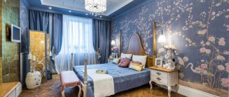
Universal Blue
Blue is said to be a firm favorite for living rooms, evoking a sense of calm and order but also valued for its versatility. Blue is a color that goes well with many styles of furniture, from traditional to modern designs.
Choosing the color blue is a very personal matter. Some people want a deeper shade with warm undertones to create a cozy feel in the room, while others may go for something light and airy.
Do the colors of the walls in a room affect the mood?
The color of the walls usually serves a decorative function. The combination of specific shades gives the interior character , so the colors of the walls in the room acquire important symbolic value in a person’s life. In addition, they can affect the psyche, enhance positive or negative emotions, and even cause permanent mood changes.
What wall colors in a room evoke a positive mood?
Green is a color that will surprise no one. This color is associated with peace and relaxation . Dark green colors, such as bottle green, subconsciously relieve tension and stress. All shades of green, from light to dark, are suitable for both the living room and the bedroom, which should be a place of relaxation and tranquility.
Gray color would also be a good choice , as it calms and relaxes the human body . For this reason, it can be successfully used in any home room, with the exception of the office, where yellow can be much better in inspiring and stimulating creativity. In addition, yellow revives a sense of organization and adds self-confidence.
Blue is the perfect color for a bedroom . Cool shades are good for sleep and can help with insomnia. After all, it is most often used in bathrooms, most likely due to its involuntary association with water.
Although the color blue has a positive effect on well-being, when choosing it as a color for a room, you must be careful not to overdo it with the amount and intensity because too much of it can have a depressing effect, which will be counterproductive.
Room colors to avoid
A color that should definitely be avoided in large quantities is black. Although it is versatile in itself and may be liked by many, in most cases it is better not to use it. But black lovers shouldn't give it up completely. By choosing slightly more muted tones of the walls in the room, it can be successfully used in accessories.
The second color of this type is red . Although it is associated with positive emotions such as love and passion, it can also cause great frustration . Staying in a room with such an intense hue is overwhelming and makes the human body get tired much faster than usual.
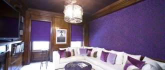
Energetic red
Red is one of the brightest colors. It adds energy and life to the living room.
However, to avoid being overwhelmed by this bright shade, it is best to focus it on one wall. Accent walls are great if you want to use a bold color like red but don't want it to completely overwhelm the room. Choosing the best shade for your home may depend on the room's lighting and architectural elements.
Combination with style
You can create a living room in any genre or select several elements from different directions, getting a new solution. A modern style is suitable for a small room; a classic style is suitable for a spacious room in a country house.
- The design of the living room in a modern genre allows the room to be cozy and rational. Maximum emphasis is placed on the convenience of household members. In such an interior, each family member can find something to their liking. Depending on the lighting and the size of the room, you can correctly combine colors.
- Minimalism is characterized by dividing the area into zones with a small amount of furniture and purity in colors. The palette used should be compatible or monochrome. The surface texture is extremely uniform.
- High-tech symbolizes simplicity, the use of metal and glass coatings. Light walls and ceilings harmonize well with dark laminate or parquet boards.
- An Art Deco living room looks good in pale and neutral colors, which are an indispensable base for bright interior elements.
- Lofts are loved by creative people. To create this atmosphere, walls painted to look like brick, combined with a dark floor, are suitable.
Atmospheric gray
Dark gray shades are gaining popularity in interior design these days. At first glance, this moody, sooty gray color looks stunning on a center wall behind a sofa, or on all four walls to make a room feel cozier.
- If you find yourself deciding between several shades of grey, try getting samples and painting posters that you can tape up and live with for a few days.
- Observe how colors look at different times of the day and move swatches around to see how they are affected by light.
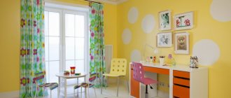
Bright yellow
A classically decorated living room in cheerful yellow tones is a common sight in period homes, perhaps because candlelight could illuminate the color particularly nicely.
Today, yellow continues to attract homeowners who appreciate its brightness.
- Yellow living rooms can be cozy, inviting and even sophisticated for both formal and family styles.
- Warm gold tones tend to look better in more saturated variations, while more lemony and cooler yellows look better if kept pale and less saturated.
Presence of warm tones
The use of these shades is a traditional solution. When there is a lack of natural light, choosing red and yellow colors makes the space brighter and more pleasant.
- Orange is the most cheerful shade. A bright, rich or muted peach tone helps to charge you with positive energy. It is chosen by active or creative individuals.
When using orange, it is important to dilute it with other shades. A large amount of saturated tone can cause anxiety and fatigue.
- Yellow color is a real find for apartments that have a lack of natural light and a small area. This color scheme is a guarantee of peace of mind and a symbol of peace.
- The light green color will add notes of summer freshness and coolness. The main thing is not to overload the room with them.
- Brown and gold are classic warm tones. This palette is suitable for decorating a living room in any style.
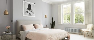
White living room
White is the perfect backdrop for any living room style. And because it's highly reflective, it will brighten up a room if there isn't a lot of natural light in the living room.
Evidence of the constant presence of white in decor can be seen in the growing combination of this color with charming shades of green, gray, pink and other colors.
Interior color and style
Some interior styles require the use of appropriate colors in the finishing process.
To emphasize the concept, you need to choose the right paints for the chosen design solution.
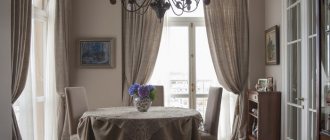
Classic
Muted, pastel colors of decoration help to emphasize the restrained aristocracy of the classic style. Light green, blue, yellow, and lilac colors are acceptable.
Living room in classic style.
Modern
Contrasting combinations of bright and pastel colors look impressive. For coloring, rich turquoise, blue, emerald shades are used in combination with white and gray tones. Make one wall bright, which avoids overcrowding. It is advisable to choose furniture in light colors.
Country
Designers call the peculiarity of country music the consonance with life in the countryside, serenity and closeness to nature. Therefore, it is necessary to select natural colors for finishing, for example sand, pastel green, beige.
Loft
This is an interior in cool colors. Mostly the walls are painted white. Bright orange paints that match the shade of the ceramic brick are also suitable.
Scandinavian
Scandinavian-style walls are painted in pastel colors, such as blue, white, beige.
Scandinavian style in the living room interior.
Provence
Provence is distinguished by decoration in subdued colors. The walls are painted white, pastel olive or lavender.