Features of choice
By choosing the color scheme of the walls, you can visually increase or decrease the size of the living room.
Factors influencing color choice:
- Room area
- Lighting
- Personal preferences
- Functional requirements
For compact living rooms, light colors are suitable, making the area of the room seem larger. A pattern on one of the walls will successfully complement the interior, in harmony with the overall color.
In spacious rooms there are much more opportunities for realizing fantasies. The color palette can be soft or contrasting.
Vertical stripes on the wall will stretch out the space, while horizontal stripes will expand it.
Adjusting a room using wall color
Using the right wall color, you can visually manipulate the architecture of the room: expand and narrow the dimensions of the room, optically make the ceilings higher or lower, and also, if necessary, highlight functional areas.
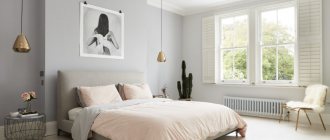
Cream and blue living room
Correctly chosen tones will help correct wall imperfections in the form of cracks, surface unevenness or stains. For this occasion, you will need paints in soft, desaturated tones. But at the same time, take into account the intensity and amount of sunlight entering the room.
Rooms facing north should use light colors, while rooms with windows facing south or east should use intense shades.
Not only the walls, but also the floor and ceiling, as well as the furniture, should be in harmony with each other for a harmonious combination of the color palette in the future interior.
Wall color and cardinal directions
When choosing the color of the walls for the living room, you should pay attention to the lighting of the room. The same shade will look completely different in natural and artificial light.
Turning the room towards any of the cardinal directions also affects the overall “picture”. For the north side, soft and warm shades are suitable; they compensate for the lack of sunlight. It can be yellow, green, beige or chocolate.
If the windows face south, then the living room can have cool shades, since there is enough daylight in the room. Sky blue, turquoise and white.
For the eastern side it is better to use warm light colors, for example, soft pink, honey, peach.
For a living room with windows facing west, preference should be given to cool colors. The walls can be painted gray, blue, mint.
Recommendations for choosing colors for decorating a living room
The choice of color for the living room walls should be based not only on the personal preferences of the owner, but also on the basic rules for combining shades. The wrong choice will lead to interior dissonance, and maybe psychological discomfort. When developing a project, you should adhere to the following recommendations:
- Use color schemes of the same shades. For example, green, light green, dark green. The palette is diluted with neutral tones: gray, white, beige.
- Use options that are in harmony with each other. For example, take a universal color (gray, white, beige, black) as a basis and dilute them with bright contrasts.
- When using a contrasting combination, it is necessary to take into account the palette of color combinations in the interior. The following options combine perfectly: yellow with purple, orange with blue, green with red. An important nuance in this situation is the proportional amount. The presence of one of the contrasts must be dominant.
- Apply adjacent colors. In the tonal spectrum it will be blue and blue, orange and red or violet.
Beige sofa in the living room interior Source dizajn-gostinoj.com
Wall color in the living room interior Source pinimg.com
In addition to the rules for color combinations, you should adhere to the requirements for proper interior design:
- Don’t use more than 3-4 colors for the interior of one room. One is used as the main one, which should have a neighboring tone, the so-called companion. The rest serve as added ones.
- Use percentage color application. The main background should account for 70%, 25% for its “companions” and 5% for bright shades.
- Only neutral tones are used as the background.
- Monochrome design is likely to be boring. “Revival” is carried out with bright decor.
Fireplace against the background of a yellow wall in the living room Source journal.homemania.ru
Green color in a bright living room Source modernplace.ru
Healthy! Decoration according to Eastern Feng Shui, occurs with the division of the living room according to the principle of masculine and feminine principles. The first group includes light, warm shades, the second – darker, deeper variations.
See also: Catalog of companies that specialize in paints and finishing materials.
Feng Shui wall color
Feng Shui is an ancient and very interesting theory, the purpose of which is to have a beneficial effect on life with the help of objects and colors. It is believed that any colors affect the energy of the house and affect the spiritual state of a person.
According to the rules of Feng Shui, the color palette of the living room can be chosen based on the principle of masculine or feminine, or based on which side of the world the room is facing.
Light and warm colors such as red, yellow, green and white are associated with masculinity.
Dark and deep colors are assigned to the female part, for example blue, purple, black.
For a living room located on the north side, blue color is suitable. Shades of blue promote relaxation and reduce activity. For interior decoration, you can choose paintings depicting bodies of water.
For the southern part, it is better to choose orange and red wall colors; it protects against negative energy and increases vitality. These colors should be treated with care. According to Feng Shui theory, the color red can increase blood pressure and have a negative effect on the nervous system. For the living room, it is better to use more muted shades of these colors, soft coral and peach. Red color
For north-eastern and western rooms it is better to use a cream, beige and honey palette. Colors help improve mood, cheerfulness and inspire optimism.
How do wall colors affect the psyche?
- White color creates a feeling of spaciousness, but if there is a lot of white color, then the room will be boring and uncomfortable.
- Red – revitalizes, activates, excites the senses.
- Yellow – tones, strengthens the nervous system, gives strength.
- Blue – calms, increases concentration.
- Green – puts you in a lyrical mood.
- Orange – restores, warms, awakens the vital forces of the body.
- Violet – inspires, calms nerves, promotes mental work.
Popular colors for the living room
Beige
Beige color is universal; it looks harmonious in almost any style. The living room will be warm and cozy; the character of the room can be changed with the help of decor. The finishing can be brickwork or an unusual application of paint.
Grey
A modern and fashionable color, which is often used to create loft, classic, and modern styles. The walls of the room can be complicated with a variety of textures and geometric shapes.
Blue
Various shades of blue have a relaxing effect. For people with high workloads, it will be the best solution for decorating a living room. Corresponds to oriental, maritime, Mediterranean and shabby chic style.
White
White color is considered neutral, but by playing with colors you can create absolutely any interior. It has a lot of shades, and thanks to the complex application on the walls, the living room will turn out to be original and completely unusual. White walls will become the basis for creating the character of the living room. For a dark living room, white color will be a salvation; there will be more light in the room.
Decorative elements will make the interior strict and refreshing, or, on the contrary, will give comfort and warmth.
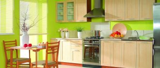
Green
A trendy color for recent years, which is associated with greenery and nature. The walls can be painted in different shades, zoning the space of the room. Wallpaper with a bright print will highlight the eco-style of the living room.
In addition, green has a beneficial effect on vision and has relaxing properties.
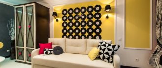
Yellow
A bright, summer and sunny color, it is subconsciously associated with something warm and pleasant. Suitable for covering the walls of a spacious living room.
A too bright and poisonous shade of yellow in a small living room will be oppressive, while pastel and light colors will promote communication and increase attention and mood.
Olive
Olive is a shade of green; it envelops you with its noble shade and gives a state of comfort.
Wall decoration in olive color will look harmonious in classic, Scandinavian and country style.
Peach
Peach-colored walls will fill the interior with rich colors of summer and early autumn. Suitable for classic, modern and fusion styles.
Peach is combined with gray, turquoise and burgundy.
Turquoise
Painting the walls turquoise will give a feeling of freshness and spaciousness to the living room. It has different depths of color from weightless pastel to rich and deep. Combines with almost any color without overloading the overall interior of the room.
Useful tips
Consider the texture of the wall. Textured plaster makes the wall color darker. This effect can be explained by the fact that an uneven surface darkens the shades and creates a grayish shadow.
The final color will be revealed after drying.
The saturation and shade of a larger range of paints will appear only after complete drying. Even under ideal conditions, water-soluble paint dries within 5 hours. However, it is better to wait a few days to ensure the final result.
White wall color
White is a universal background and goes well with other colors. If it has dominated your apartment so far, feel free to “dilute” it with all the colors of the bright palette!
Pink wall color
By skillfully using paints, you can simulate the architecture of an apartment - for example, divide an elongated room into zones (dining room and relaxation area). It is enough to paint one of the walls with a bright color.
If you have a large room in which light shades predominate, do not be afraid to use rich colors, which in combination with neutrals will give an excellent effect.
Wall color compatibility: combine cream carpeting and light furniture with a fuchsia wall. Choose accessories in the same colors to complement the interior.
Orange wall color
Harmony is achieved through colors of equal intensity. Their skillful combination organizes the space: in a wide room it seems that a wall painted orange brings the distant part of the room closer.
Wall Color Matching: A rich orange wall color will pair well with green flooring or carpet. For this composition you can choose elements of yellow-green, white or cream shades.
Blue wall color
This color scheme will create an atmosphere of peace and relaxation. Cool colors, such as blue and gray tones, which have a calming effect on the nervous system, balance thoughts and feelings, and induce sleep.
Wall color matching: If you sleep in a bright room with a large window, choose a rich blue color for one wall (for example, the headboard) that goes well with the blues and grays of the rest of the walls and floor.
Spicy wall color
If you want to create a truly exotic project in a warm color scheme, we can recommend using the bright colors of oriental spices. Soft, unobtrusive tones of turmeric, spicy cinnamon and cardamom create a wonderful combination in a room that is reminiscent of the interiors of North African homes.
Wall color compatibility: the spice palette can be varied with many other subtle tones.
Earthy wall color
Earthy tones echo the natural colors of our environment and can be safely combined and mixed. They are often successful due to their naturalness and softness.
Wall color compatibility: the warmth of textured wood is combined with muted tones of brown and sand, which in turn create a natural, soothing color that is pleasing to the eye.
Elegant warm wall color
The warm, soft tone of the plastered walls - milky, baked milk, soft pink - will definitely be an excellent starting point when decorating the living room.
Wall color compatibility: a great combination with a dark blue curtain and a chair in an elegant tan color will look better than ever!
Neutral color
The most reliable and widespread is the use of pastel desaturated shades. If there is already some kind of decoration or furniture in the room, be guided by their shade. If the tiles or carpet in the room are not colored, neutral tones will look great on the walls in the room.
A color scheme
The monochromatic use of shades of the same color allows you to visually preserve and increase the area of the room. Each color has many shades; combinations of them will allow you to create an original and unique interior of the living room.
Without overloading the interior, by painting the walls in different shades, you can zone the space or focus attention on a certain area.
The neutral color of the walls gives more opportunities for flight of fancy. Muted and delicate shades are suitable for the classic style of living room decoration.
Furniture or decorative elements that become boring over time will allow you to change the character and style of the living room. Neutral colored walls can be set off with bright accents in your living room decor. For example, light gray in combination with beige will give home comfort. The calm colors of the walls will relax you after a hard day and will play in the evening sunset.
A contrasting combination is suitable for a more modern stylistic direction.
This option is suitable for brave owners. When executed correctly, the most unexpected combinations can occur.
A harmonious combination of two colors from one half of the spectrum will give the living room the interior of a garden of Eden. The walls of the room can be made using a gradient method or a smooth transition of colors from one part of the living room to another.
Using this method is preferable for spacious rooms, although if you use light shades, a small living room will also be harmonious.
Earthy color
The naturalness of earthy colors goes well with each other, they can be mixed at your discretion, in any case the result will be excellent. The success of this color lies precisely in its naturalness and unprecedented softness.
Earthy colors in the living room
Warm wood tones pair perfectly with brown and sand tones. The union of these colors in turn creates a calming effect and natural color.
Combination of earthy and beige in a small bedroom
How to combine wall color with furniture color
When creating the interior of a living room, it is worth deciding what the focus will be on. If the walls of the living room are rich and bright colors, then it is better to choose furniture elements of restrained and monochromatic colors.
White furniture can be decorated with pillows that match the color of the walls.
If you choose more restrained shades for painting the walls, the main accent in the interior can be bright furniture. A sofa, as an independent element of the living room or in tandem with brightly colored armchairs, will become the main object of attention in the room.
Also, the entire living room concept can be made in one color scheme. The interior will be discreet, but tasteful.
Windows facing north
In a room with windows facing north, there is almost no direct sunlight, so the shade of the walls will be cool and gloomy, tending towards gray-blue. Therefore, in such rooms it is not advisable to paint the walls green, blue or gray. The result will be a room for increasing depression and gloomy mood.
All colors with a yellow pigment are perfect for rooms with windows facing north - for example, pale yellow or cream. They will fill the room with warmth. However, if someone likes gloomy interiors that tend to gothic, you can choose black. This is a matter of taste of the apartment owner.
5 interior trends from the Lanskoy shopping center
Understanding trends is only half the battle; you also need to know where to find them. We have compiled a mini-guide to the hot interior hits of 2020, which can be found in the salons of the Lanskoy shopping center.
Interior color and style
Classic
The classic style corresponds to restrained and muted colors, such as green, blue, pear. As a rule, the walls are painted in one color or covered with wallpaper with a discreet pattern.
Modern
A living room designed in a modern style will allow you to use more colors. The walls can be bright colors such as turquoise, grey, blue or emerald.
Most often, only one wall of the living room is painted in a bright color; in this case, the space is not overloaded and an oppressive feeling is not created. Light furniture will look interesting in contrast with the bright color of the wall.
Country
Country style is directly associated with nature and rustic themes. Accordingly, the use of any natural shades is suitable.
A distinctive feature of the stylistic direction is the ceiling beams.
The colors of the walls can be painted in any natural shades, green, brown, gray.
Loft
A trendy trend used to create a modern living room. Literally, loft translates as attic or basement. Accordingly, the interior is done primarily in cool colors.
The photo shows a loft-style living room, the accent wall is decorated with brickwork.
Scandinavian
The walls of the living room are made in light colors, white, beige, blue. A distinctive feature of the style is maximum functionality and simplicity of the interior.
Provence
Provence style has a restrained palette. The walls are decorated in olive, lavender and other pastel colors.
How to paint the walls in the hall?
The design of the walls in the hall depends on the location of the room. Before you make a choice of what color to paint the walls, you need to pay attention to this.
For a room facing north, warm shades are suitable. A brightly lit room on the south side should be painted in cool colors. If a light color scheme predominates, then you can use it to adjust the proportions of the room.
If you are decorating with your own hands, then choose darker or warmer colors for the side walls. Thus, the elongated room will expand and decrease in length. To do this, you need to decide what color to paint the walls in the hall.
For spacious rooms, yellow, blue, gold, gray-green tones are suitable.
For a small room, more saturated shades are allowed: peach, lilac, azure. A combination of milk and brown will make the room look respectable and elegant.
Taking into account the design of the room, you need to choose the colors that are best suited for the interior. Bold combinations of brown and lilac or brown and blue are characteristic of fusion or eclectic styles.
Related article: Purple color - royal luxury in the home (+50 photos)
For Scandinavian style, calm pastel colors create a feeling of comfort and spaciousness. Classic design is characterized by the use of beige and brown.
Features of choosing colors for the kitchen-living room
To create an ideal interior, you should adhere to a number of rules:
- General color palette
- The choice of wall color depends on the lighting
- The lighter the color, the more spacious the room seems
How to paint your living room to make it look bigger?
Small rooms have a certain charm and can be really cozy. However, if you have a small living room, you should be especially careful because a small space, unlike large, spacious rooms, is much more difficult to arrange . However, the room can be optically enlarged by choosing the appropriate wall color.
The most effective way to paint your living room to make it appear larger is to choose a solid, light shade . Some of the most commonly chosen colors include beige, soft grey, powder pink or blue.
When choosing a wall color for a room, pay close attention to the temperature of the shade. This is especially important in small rooms because warm colors visually pull the walls closer together, making the room appear smaller.
However, different room colors can't compare to the unbeatable pure white , which is by far the most popular shade in interior design. This is an ideal color for small spaces, most often used in minimalist interiors. Although there are many shades of white available in the market, classic crisp white is the preferred choice.
Color scheme in the interior - what dictates the style?
Style and color go hand in hand in our preferences: often we ourselves don’t even know what we choose in the first place. However, if you have definitely decided on the style, this can significantly help you with the color scheme:
- Styles such as shabby chic, vintage, Provence, French have a light pastel palette without too bright accents.
- Classic style, art deco, modern are also not very bright, but they can have darker and more saturated colors and high contrast.
- Scandinavian style has a light and natural base, but does not exclude bright accents.
- Loft and English style love to play with muted dark shades.
- Pop art, kitsch, retro and boho chic are the brightest and most colorful interior styles.
- Contemporary, eco-style, country and chalets will be based on the natural colors of wood, stone, sand, and foliage.
Read in detail about the chosen style and study photographs of interiors - maybe you will find a ready-made solution there. Don't forget that with good taste you can mix elements of different styles, creating interesting mixes: the choice of color in this case can also become a field for experimentation.
If choosing a style is difficult, read: “How to choose an interior style for your future apartment.”
Checking colors in real conditions
When choosing colors in the store before renovating, do not forget to check. You should always have samples of primary colors with you, without relying on memory, and you should take a piece of the final material or a painted sample home and see how the shade changes under different lighting conditions in the interior.
Check in person the colors that will coexist in the room by placing them side by side in different combinations: due to the way our vision works, the same color can look completely different if it is surrounded by different colors.
Everything about the rules for choosing the color of furniture, interior design and the psychology of colors on the human body
Color therapy is an ancient science. It appeared in the IV-III millennium BC. The founders of color therapy were China and India. This science was highly valued by famous scientists of that time - Avicenna, Hippocrates, Paracelsus. Colors were prescribed to treat various ailments. Doctors recommended covering windows with curtains of a certain color and taking baths with colored water. Wearing colored clothes also produced the desired effect.
Today, these color therapy techniques have been preserved. You can use different colors to organize the interior of the room, use shades in clothes and surrounding objects. If you choose colors wisely, you are guaranteed success in life.
Color combinations. Contrasting are 2 colors that are opposite each other. Related - located in the same color sector. The sector is located in the sector between the primary colors: red - yellow, yellow-green, green-blue, blue-red. There are 4 sectors in total. Related-contrasting - colors from two adjacent sectors
Psychologists talk about the different effects of color on people. Do not neglect the advice when choosing furniture for yourself and your loved ones. The choice of color in the interior of your home largely determines the atmosphere that will reign in it. Therefore, it is important to make an informed choice of colors. First of all, the color in the interior should be in harmony with the inner world of the household. Chromotherapy is the therapeutic effect of color on the body. It is used to prevent and treat diseases and stressful conditions, such as sleep disorders, headaches, chronic fatigue syndrome, nervous disorders, musculoskeletal diseases, respiratory organs, digestive organs, heart and blood vessels, joints, etc.
In many ways, the color of the interior depends on the taste and personal preferences of the home owner. Every person eventually faces the solution to a similar problem. Lately, people have begun to think about the impact of the chosen color on their mood and even their well-being. Each color has a specific effect on the subconscious, as well as on the physical and emotional state. The duration and intensity of exposure to certain colors have specific meanings. Some colors can evoke positive emotions, others negative. There is an opinion that women are more sensitive to color and its shades than men .
The second point that is important to consider is the psychology of color. Therefore, it is important to know exactly what influence is typical for each of the basic colors.
And, the third point that is important to say is that the choice of color depends on the nature and purpose of the rooms in your home. Warm, active colors are perfect for the kitchen, dining room, living room, but for our places of relaxation and rest we need calmer and muted tones.
Here are some simple tips:
- melancholic introvert - furniture in warm colors (yellow, coral pink, scarlet, orange). Such tones will help you improve your performance and activate the capabilities of your body;
- extrovert - you better choose tones that can bring calm: blue, green, indigo;
- optimist your color is pink.
By the way, experts say that this color can slow down the aging process, but you shouldn’t overdo it, otherwise you might fall back into childhood. White color in the interior. - In Western culture, white is associated with purity and elegance. It’s not for nothing that this is the color of weddings, celebrations, and angels. White color in the interior can open up the space and let in more light and air. However, an excessive amount of it can make the interior lifeless and boring. Its incorrect use can cause unpleasant associations - with hospital wards and sterility. Therefore, the white color must be “softened” using various shades (baked milk, ivory, etc.). As well as different textures on walls, textiles and floor coverings. This will help make a white room warmer and more attractive - both perceptually and physically. White color symbolizes cleanliness, health, freshness, cheerfulness and lightness. Due to this color, you can increase the illumination of the room, but also visually increase the space. White color is successfully used in a small space to enhance the lighting of the room. It is also used as an excellent background for bright interior elements. The white color scheme inspires, invigorates, encourages action, however, it should not be used in large quantities in bedrooms. An excess of white color negatively affects intimate relationships.
Psychologically, white color helps relieve tension, free yourself from annoying thoughts, concentrate, discard everything unnecessary and make the right decision.
Black color in the interior.
- The most commonly used color is black. It is versatile and goes well with other colors.
- If there is a lack of lighting, do not overuse black. This color goes well with mirror surfaces. Although black symbolizes emptiness and denial, it is still among the most sought-after colors not only on the world's fashion catwalks, but also among famous furniture manufacturers. Design experts recommend its use in bedrooms.
The correct use of black in the interior can emphasize the atmosphere of sophistication and elegance. It will perfectly highlight details against a background of light or neutral colors, highlight architectural nuances, pieces of furniture and decor.
Black is often used to convey an air of power, authority and social prestige (think black Mercedes, black tuxedo).
- However, be careful and use it very sparingly. Otherwise, he can create a threatening, dark, oppressive environment. Constant exposure to the color black can negatively affect a person’s psyche, suppress him, and create a feeling of depression and hopelessness.
- Even if you find yourself in a difficult life situation and you are involuntarily drawn to black colors, take a step to the side and reduce the amount of it in your life.
- It is perceived by us as difficult and can set a person up for melancholy and despondency, lead him into loneliness and isolate him from the outside world. These are the disadvantages of black.
- Among the advantages, the following can be highlighted: this color allows you to focus on spiritual ideals; with its help, you can isolate yourself from external hustle and bustle and concentrate on solving complex problems or internal crises. Black is very elegant and sexy and at the same time it looks businesslike and serious. It is believed that black color has sophistication and culture, it seems to be opposed to the whole range of vulgar colors
- For children, black color is categorically contraindicated - children, even in adolescence, are very delicate and impressionable natures. Therefore, there is no need to deprive them of the colors of life and normal living emotions, even if your child follows some fashionable musical trend and insists on a dark interior.
- Brown color in the interior.
- Shades of brown evoke associations of comfort, home, and warmth. Brown color is perfect for the element Earth and the primary element Wood. After all, nature is full of brown.
This is why the psychological impact of the color brown is often described as reassuring, creating a feeling of security, stability, groundedness, solidity, common sense.
- A large amount of brown in the interior helps to make calm, informed decisions.
- Brown is wonderful for the interiors of those people who, due to their occupation, are forced to spend a lot of time in bright, colorful places or constantly move around and meet a lot of people. This color in the interior is also suitable for those who work or relax in places with loud music, multi-colored decoration, and illumination.
- Psychologists note that brown color is often chosen by people in need of psychological relaxation and detachment from bustle and worries. Those who are in search of ways to express themselves, their own style and something they like, reject brown. Thus, the predominance of brown in the interior can be recommended to accomplished, self-sufficient, self-confident people.
- In interior design, brown can add warmth and depth. It can warm up cool or neutral color combinations and make a room feel more comfortable and cozy.
The neutral color that best suits cabinet furniture is brown. Light tones of this color are ideal for kitchen or bedroom interiors.
- Brown color has a calming effect that adds strength; it creates the impression of perseverance and good quality, freeing up the flight of imagination. According to some beliefs, this color can have a beneficial effect on your financial situation.
Gray color in the interior.
- The correct use of gray in the interior can give an elegant rigor, which at the same time will not be boring and conservative. Use it if you want to create an atmosphere of calm, reliability and trust. This works best when paired with white and other neutral tones.
Gray color in the interior can be an excellent background for other, more intense colors. If you choose the right shade of gray and use it with bright colors such as pink, fuchsia, turquoise, or orange, it will unify and harmonize the overall look.
The danger with using gray is that if the color covers too many surfaces without combining with other colors and bright accents, it can create a dull, dull and even ominous atmosphere.
A gray background can serve as a wonderful backdrop for luxury items. It is believed that this color can help relieve stress by being practical and calm.
Red color in the interior.
- Red is an extremely powerful color. As with other colors, the psychological effect of red depends greatly on its intensity. It has been established that bright shades of red cause a person to have a rapid heartbeat and increase blood pressure. But you can feel quite comfortable among muted, warm brownish shades of red.
The color red is also associated with danger (think fire, brake lights). But it is also the color of action. Do not overuse red in the interior. It visually brings the walls closer and narrows the space. But as an accent or even the color of one of the walls, it can be very effective if you want to give the atmosphere a mood of cheerfulness, encouraging action and activity.
Red color in the interior should be used in rooms where you meet with friends, spend time actively and should be avoided in places where you need rest and relaxation.
Shades of red emphasize luxury, wealth and beauty. This color is believed to induce positivity. Designers recommend using red tones when decorating the interior of a kitchen, hall or living room. Care should be taken when using this color for children's rooms and bedrooms. In this case, you should choose the right shades.
- Shades of red create a feeling of joy, fun, activate the subconscious, helping to raise a person’s vitality, and stimulate his determination.
- It is assumed that it has a healing effect, has a beneficial effect on the functioning of the liver, kidneys and circulatory system. In addition, the color red increases sexual activity in people.
Orange color in the interior
- Orange is the warmest color. It is perceived as emotionally stimulating, energetic, lively and fun.
Rich orange attracts attention and stimulates the appetite. That is why it is often used in advertising, cafe and restaurant interiors. The effect of orange depends on its intensity (it can be more yellow or more red) and its hue (dark, neutral or light).
- Orange has its greatest impact in its pure form, when it is not lightened, darkened or mixed with other colors. It becomes softer in its pastel and earthy shades.
- The yellow-orange robes of Asian monks evoke feelings of spirituality and tranquility. On the other hand, in Mediterranean style, orange is mixed with brown tones to create different shades of terracotta. These shades convey the warmth and richness of southern countries.
Orange color in the interior can energize, uplift, invigorate, inspire confidence, evoke positive feelings and joyful emotions. Therefore, it should be used in those rooms where you want to feel exactly this state.
Orange shades of color encourage communication and create an atmosphere of harmony. Orange color has a relaxing effect not only on the emotional, but also on the physical level.
- Orange tones are used by designers for living rooms and kitchens, since it is in these rooms that family members most often communicate.
- It is most appropriate to use these tones in a room that is reserved for a child’s activities, since the orange color promotes fruitful mental activity, increased energy and mood, and is conducive to work.
- The color symbolizes joy and activity. Has a beneficial effect on the functioning of internal organs. Green color in the interior
- A lot can be said about the benefits of green, but its main property is its positive effect on the eyes. Unlike other colors in the spectrum, green is perceived by the eye without distortion. Green color in the interior is associated with wildlife, herbs and trees. Perhaps that’s why it helps you relax, calms you down, and brings pleasant thoughts to your mind. This color in the interior is ideal for meditation, and just relaxation after a busy day at work. Green color has a calming effect, rejecting bad energy and negative emotions. This color can be safely used when designing the interior of a bedroom or children's room. This color has concentrating abilities that help achieve good results in work. For this reason, work rooms are often designed in these colors. Green is rightfully considered a symbol of movement and growth; it helps to calm down and find self-confidence. It has antiseptic properties and has a positive effect on the growth and strength of muscle tissue.
- Yellow color in the interior
- Yellow is rightfully considered the “warmest”. It is recommended to use this color in the interior of rooms located in buildings on the north side. It is believed that warm yellow tones have a positive effect on the liver and digestive organs, increasing appetite. Sunny color is the color of optimists; it helps in achieving the desired result. Symbolizes intellectualism. Positively affects the nervous system and skin.
Psychologists say that yellow is the happiest color of the spectrum; it inspires optimism and joy. The abundance of yellow in the interior can quickly tire you.
- Yellow is the brightest, warmest and most cheerful color for a children's room. Children love him very much! It simulates activity well, sociability, and helps maintain physical tone, and this is exactly what children need for full development.
- Taking into account the influence of yellow on intellectual functions, use it to decorate your study space. In combination with red, it can increase the thirst for knowledge and push the child to learn something new. This color is not suitable for the bedroom; it is overly bright and stimulating and will not give you the opportunity to properly relax.
Blue color in the interior.
- For many people, blue is their favorite color.
In the interior, you can use blue to create an intellectual atmosphere that brings clarity to thoughts. It is practically impossible to feel increased aggression, emotionality or overexcitement while in a cold blue environment. The color blue lowers our blood pressure and heart rate.
- It can also symbolize kindness, fidelity, constancy, favor, and in heraldry it denotes chastity, honesty, good reputation and fidelity.
- You can use blue in your interiors to cool down hot, sunny rooms. Obviously, blue color will not lower the temperature physically, but psychologically we will feel cooler. The opposite is also true; if you add blue to north-facing rooms, the space can take on a chilling tone.
The wide range of shades of blue affects us in different ways. Blue - brings peace and tranquility, allows you to understand yourself, turquoise - stimulates performance, helps increase our self-esteem, and relieves stress. Indigo is a rich, deep blue associated with intuition and understanding.
- The color blue also conveys a sense of trust, which is why it is often used in advertising for banks and other financial institutions. Light blue is a combination of blue and white, so it combines the effects of both colors. One part of it helps you relax and calm down. It creates a cool and refreshing effect. The second part stimulates the imagination and promotes attentiveness. Blue color is often found in school classrooms and office spaces. Blue is also good in the office, in the room where controversial issues are resolved and conflict situations are frequent.
- In combination with yellow and red, blue is suitable for decorating children's rooms. It contains a playful element, we can also combine it with pink, light green, ocher, orange, lilac and other colors that will make the baby’s room cheerful.
Using delicate shades of blue and blue in the interior is most useful. An atmosphere of calm is created, allowing you to relax and calm down.
- Most often, these colors are used in design projects for bedrooms. Desaturated and fresh tones are used here.
- Blue and cyan colors have a negative impact on appetite, so their use should be meaningful. But those who want to lose weight can use it to their advantage: the color of the walls, tablecloths or dishes will help in this case to reduce their appetite.
- It is believed that such colors contribute to the development of intuition. “Blue blood” has always been considered a sign of nobility, so it is not surprising that the color itself symbolizes spiritual nobility.
- Some scientists believe that the color blue helps in the treatment of deafness, cataracts, bleeding and insomnia. It has calming properties that constrict blood vessels, having a positive effect on sleep.
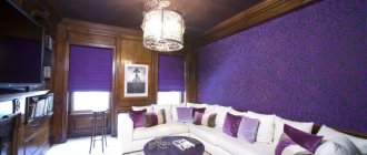
Purple color in the interior.
- Purple color is quite complex both in terms of perception and in terms of its origin. In the west, purple is the color of royalty. The Roman Emperor Julius Caesar decided that he would be the only person allowed to wear purple.
When it comes to interiors, purple can be that rich and complex color that brings true luxury to a room. On the other hand, there is a danger that purple in the interior in its wrong combination and shades can look bright and cheap.
The psychological effects of purple depend on the “warm” or “cool” shades you use. Violet with blue notes can have a calming effect and impart a mystical depth. Reddish purple is likely to dominate the room, so it should be used with caution. In general, it is better to give preference to light shades, since deep dark colors can cause nervous tension and even psychological instability.
Violet tones are most often chosen by people who are inclined to philosophy. This color is considered one of the most mysterious. Purple has a beneficial effect on the formation of mental flow and observation.
- True, designers do not recommend focusing on this color. Do not forget that dark shades of purple are a little tiring. Although this color symbolizes mental abilities, the use of this color in the interior of residential premises should be minimized. It harmonizes with many other colors.
- Violet tones help reduce pain and temperature, relieve migraines, insomnia and depression, restore and strengthen the nervous system, and bring calm.
- Typically, little girls prefer lavender, especially when combined with pink. Lavender is Barbie's favorite color, so don't expect boys to want to live in a similar atmosphere either!
- Pink color in the interior.
- Pink color has a very wide palette of shades. The color pink creates an atmosphere of tenderness, softness and care. It symbolizes femininity, happiness, positivity. We often associate the color pink in the interior with a girl’s children’s room. However, there are many exquisite shades of pink that famous designers use in their work for both men and women.
The psychological effect of the color pink is that it calms, relaxes and softens us. Pink tones have an amazing property: they neutralize the aggressiveness hidden in many of us and provoke friendliness. Its violet (red-violet) hue indicates that it is most often chosen by people who do not recognize slavery (their motto is freedom in everything). It allows us to focus on the inner world, makes us more sensitive and sentimental. Therefore, if you are a very sensitive person, it is better for you to avoid it, so as not to aggravate this quality, but to compensate for it with those colors that will give you determination and bring you back to earth.
- Pink color – symbolizes romance, kindness, love and passion. He is fueled by an aura of innocence and purity.
Pink is a mixture of white and red. Tenderness, masculinity, lightness, inspiration, strength, stability and self-love “live” in this color.
- Pink tones help in times of crisis. Often, interior elements in pink shades are used for meditation, as they can evoke a feeling of security and happiness, while increasing the overall immunity of the body. And doctors say that shades of pink help with insomnia, promote peace and reduce blood pressure.
- There are methods for arranging flowers depending on the purpose of the room. For example, a bedroom or study is not a place for rich colors. If you create wide, monochromatic spaces, the color will act depressingly. Contrast is not the best solution for break rooms and work areas. Incredible acid combinations used to be all the rage. But experience with the use of contrasts has shown that they contribute to the development of nervous disorders. It is possible that bright combinations will be appropriate at a disco, but it is better not to use them at home.
- Adding other color accents to the main color of the interior will make the room more interesting and pleasing to the eye. So, the main color of the interior is green. Additional colors: blue, light green, yellow, lime, black. The main interior color is blue. Additional colors: gold, turquoise, silver, white, red. The main interior color is red. Additional colors: pink, white, silver, orange, gold, black, blue.
- The energy of color is the shortest path to harmony and success. If you use color therapy techniques, your life will soon change for the better.
You can consider several methods of how colors affect a person:
- ACCENTS. Some colors have a strong effect; if they are in excess, the effect can be negative. Therefore, you should not completely stick to one color. For example, small red wardrobe items will have a positive effect on vital energy. You can use multi-colored pillows in the room, arranging them according to the method. Then the energy will spread throughout the room.
- LAMPS: The light from lamps can be not only white. Bright lampshades will fill the room with the right color.
- DECORATIVE STONES: The color of the stone affects your health and emotional state. Colorful minerals on the shelves will not only be a pleasant addition to the interior.
- FLOWERS: Beautiful flowers have a similar effect. Bouquets can be made in the same color scheme, or you can use different colors.
- LIGHT: In the theater, special filters are often used that change the light of the lamps. Use them in your interior.
- FOOD: Creating dishes from colorful foods is taking care of your digestion.
BRIGHT WINDOWS: Stained glass is a well-known decorative technique that has been around for many years. Today, a similar rainbow can be created using stickers.