What to consider when choosing?
Unsuitable wallpaper can ruin the interior. When choosing, you should consider:
Purpose of the room. For example, it is better to use warm shades in the kitchen, and calm, not very bright colors in the bedroom.
Apartment layout, room area, ceiling height. Dark walls create the illusion of cramped space, while light walls increase the space.
Furnishing style. If there is strict classical furniture in the room, cheerful and bright wallpaper with flowers will look out of place and ruin the impression.
How to choose the color of wallpaper?
The background color of the wallpaper should be selected depending on the location of the windows. Northern windows will not provide much light, and this can be compensated for by wallpaper in warm colors. South-facing windows do not exclude the possibility of creating a cozy atmosphere even with the help of cold, heavy colors.
Wallpaper for a large room can also be in rich colors. While wallpaper for a small room is allowed exclusively light, unless you want to achieve the effect of a monastic cell.
Which wallpaper to choose to make the room seem larger? In addition to the fact that they should be as light as possible, they should not have a clogged pattern with large elements. Only light stains, twigs, small flying elements. If the room is small, then contrasting colors should be avoided, as they visually make the room smaller. It is very desirable that the walls and ceiling and even the floor are the same tone. This simple trick seems to continue the space.
Many modern new buildings have low ceilings. In apartments where the ceiling height is low, residents feel as if they are hanging over their heads and are oppressive. To visually raise the ceiling and get rid of these very unpleasant sensations, hang vertical striped wallpaper. And in order to visually expand the space, you need to alternate or vary striped wallpaper with horizontal and vertical lines.
- It's blowing from the window - what to do?
General selection criteria
Modern design often uses non-standard solutions. But there are generally accepted rules that must be followed:
Dark wallpaper requires good lighting. If there is little light in the room, it is better to choose white wallpaper without a pattern at all or with a small, non-contrasting pattern.
When the windows of the room face north, this must be compensated with warm shades. Cold tones look good in “southern” rooms.
When choosing complex combinations, you should remember that there should be moderation in everything. If wallpaper of two colors looks beautiful and stylish, then the combination of many different shades indicates a complete lack of taste.
Variety of colors
What material is the wallpaper made from?:
- Paper - they are made from paper, then a design is applied to the surface, mainly using a typographic method.
- Vinyl is more durable, but expensive.
- Textile - on a fabric basis.
- Glass wallpaper - the composition includes soda, limestone, quartz sand, dolomite. Such canvases can be painted.
- Liquid - they are sold in bags. They are similar to dry plaster, which is diluted with water and then applied to the walls.
You can choose wallpaper of any color: the construction market allows you to do this. Rules for choosing shades:
- Dark-colored wallpaper will look good in a room with good lighting.
- If the room is poorly lit, then it is better to choose canvases in warm colors. If the windows face south, then buy wallpaper in cool colors.
- Recently, combinations and zoning have come into fashion. The kitchen and dining room can be separated by different wallpapers: in the dining area the walls are decorated with colorful, brightly patterned or photo wallpapers; plain wallpaper is pasted in the cooking area (read about how to choose photo wallpaper for the kitchen, living room and other rooms here).
- Another option for combinations is that in the kitchen the sink area is highlighted with wallpaper with large patterns, and the kitchen itself is covered with plain linens.
- The living room is a place where you can let your imagination run wild. Here you can combine matte and glossy, glue different shades of the same wallpaper.
Attention
When choosing compositions and color combinations, follow one rule - your eyes should not ripple from the many different shades. Make sure that the furniture also matches the color of the walls. If the furniture is classic or expensive, it is best to choose chocolate or beige wallpaper. Here you still need to adhere to the canons of the classics.
Zoning of premises
Nowadays it is fashionable to divide living space into different areas. This technique is called zoning. By covering certain parts of the room with different wallpapers, you can create a complex, non-standard interior:
- Highlight the dining area in the dining room with bright, colorful wallpaper that will stand out against the overall calm background.
- In a simple and bright room, create a place to relax with warm, rough walls.
- Use photo wallpaper.
Choosing paint for wallpaper
The palette of colors for wallpaper today is the most diverse. You can find the most interesting colors and shades. The palette of colors for painting wallpaper does not leave users disappointed. A wide range helps solve the problem of optimal choice. In addition, you can consult with the manager of a hardware store or refer to reviews about the products you need. In the photo you can see an assortment of various colors.
Color palette
Consumer reviews about the best options for choosing wallpaper paint for painting
The most popular and popular option is acrylic paint for wallpaper that can be painted. They give preference to it because it has excellent performance qualities. Acrylic paint for wallpaper is wear-resistant and durable. In addition, it can be washed.
Kitchen color scheme
The kitchen should be cozy, bright, with “warm” walls. Green wallpaper, as well as yellow, beige, milky shades, will look good there.
If the room is spacious and well lit, you can use darker or brighter, rich colors. You also need to take into account a few simple rules:
- You should not paste over a small kitchen with too colorful, flashy wallpaper. This will only irritate people.
- Separating the dining area (zoning) looks good only in a spacious room.
- It makes sense to tile the stove and sink area, as it is easier to clean.
Kitchen
It is advisable to choose a warm palette for the kitchen, for example, orange, red, yellow shades. This range will increase the feeling of hunger and give a positive attitude.
For the corridor and hallway it is better to choose dark colors. Moreover, it is necessary to combine the color of the wallpaper with the rest of the walls.
Today, manufacturers offer a huge range of wallpapers in a wide variety of colors, which makes it possible to bring quite bold design ideas to life.
We hope that this article will help you choose the right wallpaper color. Just don’t forget to take into account the lighting in the room, because depending on the lighting, the color can take on one shade or another. Good luck!
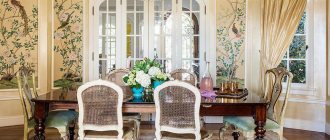
Wallpaper for the living room
The living room is a formal room, so its interior should be thought out especially carefully. When choosing wallpaper, it is important to take into account the size of the room, the furniture already there, and the general style of the interior:
Wallpaper with alternating olive and cream stripes goes well with dark furniture. A light background and a large plant pattern will look good. This is an always up-to-date classic style.
Note!
- Wallpaper for the bedroom - 125 photos and videos of stylish and beautiful ideas for decorating a bedroom using wallpaper
- Paper wallpaper: TOP-130 photos and video reviews. Advantages and disadvantages of paper wallpaper. DIY gluing instructions. Colors and shades
- 3D wallpaper - 130 photos and videos describing how to use 3D wallpaper with your own hands
If the room is furnished in Art Nouveau style, you can use wallpaper with images of geometric shapes, flowers or butterflies on a light background.
A room furnished in a minimalist style can be “revived” with warm shades and delicate and discreet floral patterns.
How to choose wallpaper?
When choosing, you should first of all pay attention to:
- texture (embossing, silk-screen printing, vinyl, velor or regular paper wallpaper);
- pattern (stripes, flowers, large spots, as well as smooth or spotted backgrounds);
- color (light, neutral or dark).
All these positions are interconnected and therefore, telling how to choose the right wallpaper color, we will, to one degree or another, talk about their patterns and textures.
Before starting work on decorating a house or apartment, you must first decide on the style and color scheme of your interior.
This task can be completed more quickly by taking into account the following general recommendations:
By color
Location of windows . If the room faces north, then wallpaper in warm shades - yellow, orange, cream, pink - is suitable. If to the south, then cold ones - green, bluish-gray, bluish-green.
Daylight . In good lighting, dark-colored wallpaper is used - blue, terracotta, dark blue. If the room is shaded, then use wallpaper that perfectly reflects sunlight - golden, yellow, orange.
Lightfastness of paints . Blue and light blue wallpapers fade greatly when exposed to sunlight, and blue wallpapers in dark rooms take on a gray tint.
Color of curtains and furniture . Light furniture harmonizes perfectly with light wallpaper, and dark furniture with dark wallpaper. If the curtains and upholstery are decorated, and carpets, photographs and paintings are hung on the walls, then smooth wallpaper or with small patterns would be appropriate.
According to the drawing
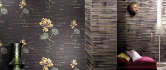
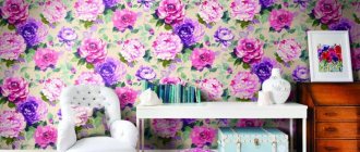
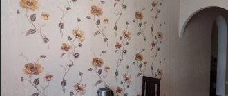
The wallpaper is made in the form of “flowers”, they can be:
- large or small;
- contrasting or blurry;
- rare or frequent.
Large and frequent flowers visually make the room smaller, while rare and small flowers significantly expand it. In addition, a large “floral” pattern dominates within different styles, while a small one is used mainly as a neutral style background.
If you want to focus on stylish furniture or other bright interior items in the room, then choose wallpaper with discreet and vague patterns and vice versa.
In addition to “colorful” ones, “striped” wallpapers have also found wide application , because they go well with almost objects of various styles. Vertical stripes visually reduce the space of the room, but at the same time significantly increase the height of the ceiling.
And if you use wallpaper with wide vertical stripes or the borders of the stripes are less contrasting, then you can immediately solve these problems, which is important for small rooms.
The next version of the wallpaper pattern is “large spots” , which can be ordered, ornamental or chaotic. They stand out very clearly on the wall, so it is not advisable to cover the entire room with them, but you can only highlight certain areas (one or part of the wall).
In addition, blurry “spots” create a decorative effect in the form of a play of light and shadow.
Another type of wallpaper is “spotted backgrounds” (grainy decor) , which are small droplets-speckles of various shades, as if sprayed with a spray bottle. They perfectly hide and mask all the flaws of the pasted surfaces, and also scatter light rays in different directions.
This allows you to use wallpaper with such an interesting pattern for almost any surface and various modern styles.
In addition to “spotted” wallpapers, there are also “smooth” or plain ones. Against their background, all the objects in the room stand out perfectly, for example, decorative panels, photographs, paintings. And here it doesn’t matter what style you choose: classic or avant-garde.
The only drawback of such wallpapers is that they must be pasted on perfectly smooth walls, since all the irregularities and defects will appear and be visible. Of course, experts are trying to solve this problem as well - they have now launched plain wallpaper with a denser and more embossed texture.
Rules
White color is considered universal and goes well with any furniture. It expands the space and enhances the lighting.
Plain gray wallpaper allows you to create a sophisticated, even sophisticated interior.
Light furniture looks good on a brown or light background.
The use of soft green, light lilac, beige, cream, milky and other pastel shades gives the room elegance and evokes a feeling of calm and tranquility.
If the living room windows face north, low lighting can be compensated for with yellow wallpaper.
Wallpaper colors - primary colors
Now let’s look at several of the most popular wallpaper colors individually:
Beige
Beige color belongs to the galaxy of pastel shades, which means that in the room where you need to create an overall peaceful and calm atmosphere, it is best suited. This color will create a comfortable and warm atmosphere in the room. Typically, beige color is used in spacious living rooms and cozy bedrooms.
Beige washable vinyl wallpaper, texture clearly visible
Beige wallpaper - with the help of wallpaper of this color it is easy to achieve a cozy and pleasant atmosphere in any room.
Beige in combinations with darker, richer shades gives the room a unique style and a certain severity, and if combined with other pastel shades, you get a bright and calm environment.
White
The white color of the wallpaper will give complete freedom without restrictions for the decor of the room, and it will also bring some lightness and openness.
White vinyl wallpaper on a non-woven backing, soft but precise brick texture
White color is the most popular color used for wallpaper.
It is definitely easy to complement with absolutely any colors, and it is better not to use it as one main color for the room, since this technique causes some feelings of isolation and overwhelming boredom.
See how high-quality and clear the outline of a pattern on vinyl wallpaper can be
You can cover the walls of any room in the house with white wallpaper, and it will look normal. But if you decide to combine, then try to create combinations with bright and expressive colors.
Related article: Do-it-yourself pond at the dacha made from a tire. Photo
Blue
The blue color reflects simplicity, limitlessness and lightness; this tone in wallpaper is mainly characteristic of romantic individuals. Blue in the interior of a room brings a feeling of comfort and is somewhat calming, so it is recommended to use it not only in apartments, but also in work spaces, for example, in an office, to create a comfortable, peaceful, but at the same time working atmosphere.
Blue wallpaper with a very light shade close to white, quality - vinyl
Even if there is too much blue in a huge room, it still won’t seem lifelessly cold and gloomy. This color is beautiful and simple in small rooms, as it can visually expand the space.
Blue wallpaper can go well with wallpaper in pastel colors, such as light gray, light green, pink and so on. However, try not to combine blue with warm colors, such combinations do not look good at all.
Yellow
All people certainly associate yellow with joy, bright sunshine and a great spring mood. This color has the ability to visually make the room very light, so yellow wallpaper will look great in rooms where natural light is limited.
Yellow wallpaper in the bedroom interior, pleasant calm tones
Yellow color - the use of yellow on wallpaper, interior examples, design and description.
By and large, yellow is suitable for decorating walls in a variety of rooms, but to a greater extent it is applicable to creating a favorable atmosphere in the bedroom, kitchen or living room. Yellow wallpaper looks very good with wallpaper of other colors; designers are constantly finding more and more new combinations and combinations.
Greens
Green color symbolizes our life, confidence in the future, it is natural and as natural as possible. This is a favorite color for creating designs in completely different rooms, especially small ones, because green tends to visually expand the walls, increasing the space. Another plus of green is that it helps people cope with irritability and negativity accumulated during the day, as well as stiffness and tightness.
Bright green room design, combination of furniture wallpaper and curtains
Green wallpaper - interesting combinations with other colors, examples of interior design, general recommendations for using color.
This effect on a person occurs at any age. And if we consider the effect of different tones of green on people, we can come to the conclusion that rich and dark tones are more stimulating, while light ones, on the contrary, relax.
Gold
The golden color has always stood out favorably in the familiar and standard overall color scheme. Just like beige wallpaper, which allows you to create a unique atmosphere of tenderness and warmth, gold wallpaper adds a certain solemnity to the decor, this is especially true for large and pompous rooms, such as a hall or living room.
Golden wallpaper with a pattern of tree branches, hallway interior
Often, golden shades are used to create autumn decorations. But you shouldn’t overfill the room with this color; it’s best to use it in certain combinations with pastel colors. Try not to use gold in combination with dark shades and colors, as the result will be a very gloomy room.
Reds
The color red has always represented energy, excitement and a stimulus to action. To create an interior, it is chosen mainly by self-confident and very passionate people. When creating a room design, red is dominant; it can give the atmosphere a feeling of festivity, enthusiasm and some pomp. This color combines whimsically with different shades; it looks good with pastel tones, and even better with its own shades.
Related article: Varieties of fastening the Mauerlat to aerated concrete
Red plain wallpaper in the living room interior
Red wallpaper - you need to use an active, passionate color very carefully, in this case it will be most effective.
Psychologists strongly recommend using red in active areas of the apartment, for example, in the living room or kitchen.
By the way, scientists have long proven that the color red improves a person’s appetite.
However, if the conversation turns to the bedroom, then for the most part it is not worth using this color, unless it is done in minimal quantities or, even better, in combination with light shades.
Orange
Orange color is a symbol of frantic energy and enormous strength; it has a beneficial effect on a person, helps improve communication, helps with mental activity, and evokes joyful, very bright emotions. Wallpaper in orange tones will look natural in rooms where your family often gathers, this could be the living room or even the kitchen.
Orange vinyl wallpaper produced by the Erismann factory
Orange wallpaper is categorically not recommended for the bedroom, it is not the right color. If you want to hang such wallpaper in the nursery, then use combinations with white color. Too bright and catchy orange shades on the walls can cause some aggression in children, we definitely don’t want that.
Pink
Oh, this sweet and delicate pink color, it is more characterized by a romantic note, it opens up sensuality and emotionality for a person. Everyone perceives this color differently, it all depends on the character, on the emotional worldview of a particular person.
Pink wallpaper in a child's bedroom, combination with white
Some people perceive it as a bright, exciting color, while others perceive it as a light, calm color, filled with relaxing influences. Designers and psychologists, based on constant experiments, are more inclined to believe that pink is a calming color rather than exciting, so they recommend using it to create the right atmosphere in the interior of rooms such as a bedroom, bathroom or children's room for a little girl.
Pink is combined to a greater extent with classic colors: white, gray, red and purple.
Gray
Gray color in the design sense is quite complex, but also universal. You need to be especially careful when using such colors, otherwise you may end up with a depressive and dull atmosphere in your interior, especially when dark shades are overused. But, if you try and do everything wisely, then you will get a spectacular and elegant room.
Gray kitchen wallpaper vinyl quality, washable, non-odor absorbing
Gray wallpaper - this color is most often used in the interior of rooms, as it easily combines with most other colors.
Gray is best combined with simple colors: black and white; this combination creates a cozy and calm atmosphere. If you want to add a touch of sharpness to your design, then try choosing black furniture for this room, but not in large quantities, otherwise it will turn out completely dark.
Blue
Blue color belongs to the galaxy of popular cool colors, since it simultaneously performs two roles - it reduces human activity and calms. Pasting or painting walls in modest small rooms with this dark, cool color is strictly not recommended, since the visual effect of such a color will certainly narrow the small space even more.
Futuristic blue room interior design
Blue wallpaper is a very intense and interesting color that is loved mainly by specific people.
Blue is quite acceptable to use in large rooms, kitchens and even bedrooms; it’s okay that the room will become slightly visually smaller, but much more comfortable and cozy. For the bedroom, perhaps, blue is the most suitable color; the fact is that it is able to relieve a person’s fatigue and plunge him into a restful sleep.
Related article: Is it worth covering the façade with porcelain stoneware?
Delicate blue wallpaper in the bedroom
Of course, blue masculine color is perfect for a child’s bedroom for a little boy; use combinations with warm shades and light decorative elements to dilute it.
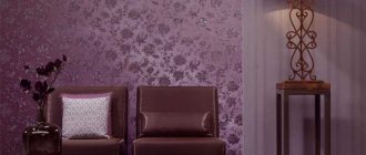
Lilac
Lilac color can definitely become the base color for decorating the interior of absolutely any type of apartment. It has become very relevant lately. Many people associate the delicate and romantic lilac color with the arrival of the long-awaited spring. According to experts, there is a certain spirituality and sophistication in it.
Lilac wallpaper in the interior of a small living room
To a greater extent, these qualities are expressed in the fact that lilac is a very difficult color to perceive; it contains some mixture of pink and simple purple tones. Psychologists believe that it is most often chosen to decorate the walls of their homes by extraordinary individuals who are famous for their rich inner world.
Lilac influences each person differently, some are irritated, some, on the contrary, are inspiring. Therefore, when you choose lilac wallpaper, listen, first of all, to yourself, and do not follow fashion.
Purple
Recently, since the advent of the 21st century, purple wallpaper has attracted great interest among a large public. This is probably due to the fact that the purple color contains a pleasant and soulful warm red tint and a deep spiritual blue.
Lilac wallpaper in the bedroom, very soft and deep color
Designers advise creating the interior of small rooms in this tone, since this color is receding, which means that, like blue, it visually expands the space of the room.
Purple wallpaper is successfully used by designers to decorate such areas of the house as the kitchen, bedroom, living room, but in this case there is a need to correctly and harmoniously combine with other colors, in this case you need to pay attention to a deep selection of tonality.
Hall decoration
The hall is decorated according to the same rules as the living room. Here is additional information on what color of wallpaper is suitable for the interior of this room, taking into account the psychology of perception of different shades:
- A blue background is associated with success in business.
- Different tones of green help to find harmony and balance.
- White is the color of luck.
- Yellow and orange shades give self-confidence, treat depression, and evoke joyful emotions.
- Red color creates a good mood. But it should be used in limited quantities, supplemented with calm or dark tones.
Complex combination of shades
The most popular and versatile way to create stunning decor. The color scheme is based on classic tones: white, beige and gray. They can be combined with other shades, correctly placing accents. If you want changes in the future, you can leave the basic colors and complement them with new colors. An option is to use pink in decor.
To combine classic shades in the interior, it is not necessary to use a color wheel. However, with its help it will be more convenient for you to distinguish even the slightest tints of tone and catch the contrast. You can use special online programs to select shades.
An example of a complex combination of colors in the interior
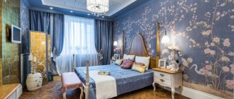
Wallpaper for the bedroom
The bedroom is a place of rest. For this room you should choose calm, soft colors and combinations:
Green (except for poisonous and too bright shades) calms and helps to relax. It can be used in combination with white, yellow, orange or pastel color.
The blue background is also calming. But you should not choose very dark and rich colors for the bedroom. Also, you should not combine blue with mourning purple or black.
White and beige wallpapers are universal and suitable for any room. Velvety and embossed options look especially good in combination with contrasting shades.
Choosing wallpaper for the living room
For this room, which is a guest area, bright colors and rich decor are preferred. The most daring decisions on color composition can be used in this room.
Furniture plays the main role in arranging the style of the living room, so the wallpaper should highlight the furniture design from the overall picture with its shades.
An excellent solution would be wallpaper in light yellow or sand tones with bright decorative patterns.
Several ready-made options
Recently, in interior design there has been a tendency towards bright colors and rather bold combinations.
To make the room look modern, you can use one of the following techniques:
Cover the main part of the room with plain light green wallpaper. And highlight the recreation area in a more saturated tone of brown, beige or gray. Add contrasting inserts at the junction.
Make a blue relief background with glossy inserts of a light shade with a geometric pattern.
Red color is considered fashionable. But it must be used carefully. It is better to choose muted shades and add brown fragments. This option goes well with photo wallpapers that contain Japanese motifs.
The classics are still in trend. Therefore, beige, gray, pastel shades remain popular. To make a more complex composition, you can use zoning and a combination of different tones and textures.
General selection rules
Determining the color when choosing wallpaper can be difficult, but you can rely on generally accepted rules. To decorate your bedroom, you should not choose bright colors; give preference to muted shades. After all, a place to relax should be peaceful, not annoying.
Wallpaper should be in harmony with the furniture in the room . It also takes into account where the windows of the room face. For southern rooms you can choose cooler shades, for northern rooms - warmer ones.
If the walls in the room are uneven, it is important to choose a pattern. A small print or diagonal will visually hide this flaw.
Light wallpaper will visually enlarge a small room.
To combine materials, you need to learn how to combine colors:
- Some colors don't go together at all, like red and green. But shades of the same color will look advantageous (blue and cyan).
- Saturated, juicy ones need to be complemented with dim ones: it can be beige, which sets off many dark tones well.
- In the bedroom you can successfully combine cold shades (blue and white) or cold and warm (green and yellow).
We invite you to watch a video on how to choose the right wallpaper:
Wallpaper photo
Color palette in the living room
The choice of wallpaper color palette for the living room depends solely on the preferences of the apartment owners. So, active and creative people will probably choose rich and bright colors for decorating such a room, but warm colors will most likely be chosen by people who like to lead a measured lifestyle, since such a palette will stimulate their activity.
The overall impression will depend on the design of the living room. So that such a room does not become boring over time, the best design solution would be to select two or three shades of stripes that will harmonize perfectly.
The base can be white paint. If the choice fell on a cool white paint color, you need to make bright accents in the room, so, for example, you can choose orange accessories that will complement the wallpaper. Pastel shades will look amazing in the room. Pastel color has a relaxing effect and puts you in a lyrical mood, so relaxing in such a room will bring real pleasure.
Another good solution would be a combination of neutral tones in the design of the living room. An excellent design solution would be to select one or two warm shades: sand, cool blues, earthy, moss shades, as well as gray-blue and light gray - these colors will be the best in interior design.
Related article: What color to paint the walls: combination and nuances (+40 photos)
Wallpaper shade and room size
What wallpaper color is suitable for owners of small apartments and rooms? Of course, white or any light shade. The pattern may be present, but it should not be bright and stand out strongly compared to the main shade.
But to make the ceilings in the room seem higher, you need to glue wallpaper with thick vertical stripes or any other vertical pattern. To make the room wider, not only beige wallpaper will help, but also a horizontal pattern on it.
Let's assume the option of wallpapering in two colors. Light wallpaper is glued at the top of the wall, a little darker at the bottom. The joint between the connection of two shades must be glued with a border.
If the room seems too large and needs to be visually reduced, you can use dark tones or different color combinations of wallpaper, for example, combine light shades with dark ones. A bright pattern or accent will also fit into a large room. Walls covered with wallpaper with elements of nature will look good.
Combination of furniture and wallpaper tones
- 1) White furniture is always universal; it can be matched with both light and dark wallpaper. One nuance needs to be taken into account: with similar shades, the furniture and the wall can merge. In this case, a bright accessory on it, for example, a painting or panel, will help to highlight the wall.
- 2) Brown furniture can symbolize both natural shades and carry a classic style. In the first case, wallpaper in natural shades will go well with the furniture. In the classics, it is good to combine beige or burgundy colors
- 3) On the contrary, light walls should contrast with dark furniture. Ornament may be present, but it should not be too flashy
- 4) Furniture of different colors, for example, a kitchen set, goes well with pastel colors. A drawing may be present. To avoid scattering of colors, the pattern on the wallpaper should be the same color as the furniture
Furniture and walls should not only be combined with each other, but also emphasize the advantages of the room and hide its shortcomings.
If you have doubts about color compatibility, then a color harmony table can always come to the rescue.